")
How to Add Drop Shadow Effect In Flutter?
")
During app development, specific modules are necessary to add to fix or insert additional features or optimize some functions. In Flutter app development, one common action that project leaders require is adding a shadow effect. For this, the DropShadow plugin of Flutter is a useful component that one can apply to pictures and widgets.
You can hire Flutter developer to handle the process of implementing the demo program for drop shadow in Flutter projects and properly apply this plugin. Flutter development company have experience with handling the drop shadow packages within Flutter apps. But first, knowing what it means is important. Here, you will read about all the necessary details on this Effect.
Short Overview of Drop Shadow Effect
The Drop Shadow is an effect that can apply to widgets or any image during the development process. Flutter programmers use the drop_shadow package to apply this coding in Flutter-made apps and optimize the UI quality. With this, a shadow effect is noticeable in different types of elements, like asset images, networking images, text widgets, and container widgets.
Example of Drop Shadow Types
Here are some examples of different types of coding that go into specific types of drop shadow implementation.
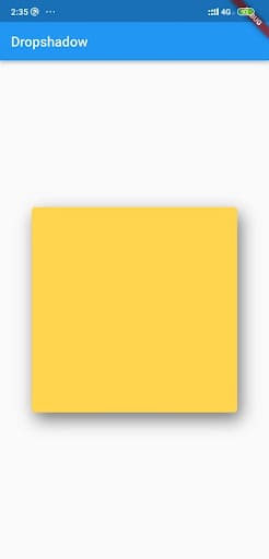
Solution 1: Box.Decoration.boxShadow
This type of code would help prepare a type of amber box using the drop shadow. The benefit of using the BoxDecoration.boxShadow is that one can monitor and control multiple shadow characteristics carefully. Here are some of these characteristics:
- BlurRadius- This sets the shadow radius.
- color- Specifically for the shadow color.
- Offset- Sets the shadow offset.
- blurStyle- This sets the blurring style and holds the default value of BlurStyle.normal.
- spreadRadius- Before applying blur, the box should inflate for a specific limit. This is that amount.
The code:
Scaffold(
          appBar: AppBar(title: Text('Dropshadow')),
          body: Center(
            child: Container(
              width: 300,
              height: 300,
              decoration: BoxDecoration(
                color: Colors.amber.shade300,
                borderRadius: BorderRadius.circular(5),
                // implement shadow effect
                boxShadow: const [
                  BoxShadow(
                      color: Colors.black54, // shadow color
                      blurRadius: 20, // shadow radius
                      offset: Offset(5, 10), // shadow offset
                      spreadRadius:
                          0.1, // The amount the box should be inflated prior to applying the blur
                      blurStyle: BlurStyle.normal // set blur style
                      ),
                ],
              ),
            ),
          ));
Output:
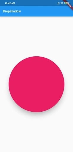
Solution 2: Material Widget
Developers can create the drop shadow effect with the help of a Material widget.
The code:
Scaffold(
        appBar: AppBar(title: const Text('Dropshadow')),
        body: Center(
            child: Material(
          elevation: 20,
          shadowColor: Colors.black,
          color: Colors.pink,
          shape:
              RoundedRectangleBorder(borderRadius: BorderRadius.circular(150)),
          child: const SizedBox(
            width: 300,
            height: 300,
          ),
)));
Output:
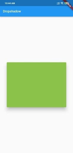
Solution 3: Card Widget
Developers can add drop shadow by using a Card widget to wrap the primary widget. This is one of the quickest and simplest solutions to try, and one can customize this drop shadow type further. The elements for that include:
- shadowColor- This signifies the shadow color.
- elevation- This customization helps control shadow size behind the Card widget.
The code:
Scaffold(
        appBar: AppBar(title: const Text('Dropshadow')),
        body: const Center(
          child: Card(
            elevation: 16, // the size of the shadow
            shadowColor: Colors.black, // shadow color
            color: Colors.lightGreen,
            child: SizedBox(
              width: 320,
              height: 240,
            ),
          ),
));
Output:
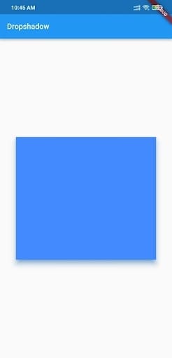
Solution 4: PhysicalModel Widget
It is possible to use the PhysicalModel widget for implementing the drop shadow effect in Flutter apps.
The code:
Scaffold(
        appBar: AppBar(title: const Text(‘Dropshadow')),
        body: const Center(
          child: PhysicalModel(
            color: Colors.blueAccent,
            elevation: 10,
            shadowColor: Colors.blue,
            child: SizedBox(
              width: 320,
              height: 280,
            ),
          ),
));
Output:
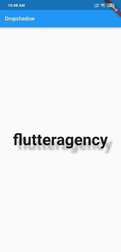
Solution 5: Drop Shadows for Text
You can use the simple_shadow plugin type to insert a drop shadow effect within text components.
The code:
Widget build(BuildContext context) {
    return Scaffold(
      appBar: AppBar(
        title: const Text('Dropshadow'),
      ),
      body: Center(
        child: Text(
          'flutteragency',
          style: TextStyle(fontSize: 60, fontWeight: FontWeight.bold, shadows: [
            Shadow(
                color: Colors.black.withOpacity(0.3),
                offset: const Offset(15, 15),
                blurRadius: 15),
          ]),
        ),
      ),
    );
}
Output:
Constructor
Notably, it is important to call for the constructor element underneath to utilize the DropShadow plugin properly.
The code for this is as follows:
const DropShadow({
  Key? key,
  required this.child,
  this.blurRadius = 10.0,
  this.borderRadius = 0.0,
  this.offset = const Offset(0.0, 8.0),
  this.opacity = 1.0,
  this.spread = 1.0,
})
Make sure the required fields must not be empty when the constructor called.
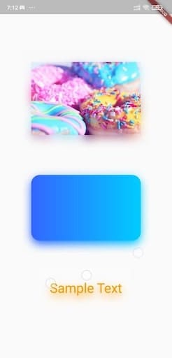
Implementation of DropShadow
The sequence is explained hereafter for implementing the DropShadow effect accurately. It is important to understand and follow the steps accurately to avoid coding errors.
Step 1: Insert the dependencies
In the pubspec-yaml file, add the available dependencies.
e.g.,
dependencies:
flutter:
sdk: Flutter
drop_shadow: ^0.0.1+4
Step 2: Include the assets
Following the dependencies, add the available assets to the file.
assets:
– assets/
Step 3: Handling the importing steps
Run the following sequence:
import ‘package:drop_shadow/drop_shadow.dart’;
Step 4: Run package
Finally, you can run the Flutter packages within the app’s root directory.
Sample Code:
class HomePage extends StatelessWidget {
  const HomePage({Key? key}) : super(key: key);
  @override
  Widget build(BuildContext context) {
    return Scaffold(
      body: Center(
        child: SingleChildScrollView(
          child: Column(
            mainAxisSize: MainAxisSize.min,
            children: [
              DropShadow(
                child: Image.network(
                  'https://images.pexels.com/photos/1191639/pexels-photo-1191639.jpeg',
                  width: 250,
                ),
              ),
              const SizedBox(height: 35),
              DropShadow(
                child: Container(
                  height: 150,
                  width: 250,
                  decoration: BoxDecoration(
                    borderRadius: BorderRadius.circular(20),
                    gradient: const LinearGradient(
                      colors: [Color(0xFF3366FF), Color(0xFF00CCFF)],
                    ),
                  ),
                ),
              ),
              const SizedBox(height: 35),
              const DropShadow(
                child: Text(
                  'Sample Text',
                  style: TextStyle(fontSize: 35, color: Colors.orange),
                ),
              ),
            ],
          ),
        ),
      ),
    );
  }
}
Output:
Wrapping up:
Ultimately, this approach will prove beneficial if you carry out the steps properly.
Frequently Asked Questions (FAQs)
1. What is a material widget in Flutter?
The material widget is liable for Clipping if clip behavior is not Clip. none, then the material clips its widgets sub-tree to the shape already defined by shape, type, and borderRadius.
2. How many types of widgets are in Flutter development?
There are usually two types of widgets in Flutter: The stateful widget and the Stateless widget.
3. Why is a widget used in a Flutter application?
Flutter widgets are used to create a modern framework that has taken inspiration from React. The main idea is to develop the UI out of the widgets. It describes what their view will look like with the current configuration and state.

Contemporary ventures
Recent blog


Join our newsletter
Read and share new topics about all things Tech.
ready to get started?
Fill out the form below and we will be in touch soon!
"*" indicates required fields