")
What is TabPageSelector Class in Flutter?
")
The new-age application is gaining massive traffic because of its engaging interface and creative build quality. Intuitive and multifunctional widgets play an integral role in upgrading the experience and performance of the apps.
The web development company usually hire Flutter developers to implement these widgets to create a multifunctional app. Flutter apps provide distinct categories and features that allow users to explore more functions built within the app.
Flutter expertise builds the app with the quality which engages the user with an informative glance inviting them to separate options within specific categories which function with a simple click or swipe. Flutter TabBar is such a function that implements the different functions in the app through distinct categories.
Tabpageselector is a crucial part of the TabBar, which functions distinctly and plays a major role in increasing the user experience while exploring the app. This article will discuss the TabPageSelector with its build method, attributes, and other related aspects. Let us start:
TabPageSelector Class:
Tabpageselector class is a part of TabBar, frequently used in conjunction with the highlighted view. For instance, when the TabController is unavailable in the app, the DefaultTabController must be present as an ancestral element in the flutter app. let us discuss more aspects of Tabpageselector class:
-
Inheritance:
The Tab page selector is inherited with the following sequence in the flutter app.
Object > diagonsticable Tree > Widget > Stateless Widget > Tabpage selector.
-
Constructor:
The constructor of the Tab page selector mentions the detailed information to be entered in the application.
TabPageSelector(
{Key? key,
TabController? controller,
double indicatorSize = 12.0,
Color? color,
Color? selectedColor,
BorderStyle? borderStyle}
)
It creates a compact widget that indicates the selected tab.
-
Properties:
Specific properties must be entered in the Tabpageselector for the proper functioning of the Widget.
Below are the mentions:
color – Color
These options fill color for unselected pages by indicator circles.
Final
controller – MotionTabController
This Widget is about the selection and animation state in the flutter app.
final
hashCode – int
The hash code is used for this object.
@nonVirtual, read-only, inherited
indicators – double
It is about the diameter of indicator circles (Its default value is 12.0).
Final
key – Key
It controls the widget replacement by another widget within the tree.
Final, inherited
runtimeType → Type
It represents the runtime type of the object in the flutter app.
read-only, inherited
selectedColor → Color
It fills color for selected pages and border color for all indicator circles.
Final
-
Method:
A certain method is used in the Tabpageselector widget for the smooth functioning of the flutter app. A Flutter development company has the Flutter experts which can create such multifunctional Widget in the Flutter app development. let’s have a look at the methods:
build(BuildContext context) – Widget
It defines the representation of the user interface through this Widget.
override
createElement() – StatelessElement
It creates the StatelessElement for widget’s location management in the tree.
Inherited
debugDescribeChildren() – List
It returns the detailed list of DiagnosticsNode objects defining the node’s children.
@protected, inherited
debugFillProperties(DiagnosticPropertiesBuilder properties) – void
It adds additional properties related to the node.
Inherited
noSuchMethod(Invocation invocation) – dynamic
It is invoked at the time of property assessment or with a non-existent method.
Inherited
toDiagnosticsNode({String name, DiagnosticsTreeStyle style}) – DiagnosticsNode
It returns a debug presentation of an object which is used by DiagnosticsNode.toStringDeep and by debugging tools.
Inherited
toString({DiagnosticLevel minLevel = DiagnosticLevel.info}) – String
It is a string representation of the specific object.
Inherited
toStringDeep({String prefixLineOne = ”, String prefixOtherLines, DiagnosticLevel minLevel = DiagnosticLevel.debug}) – String
It returns a string representation of this particular node and its descendants.
Inherited
toStringShallow({String joiner = ‘, ‘, DiagnosticLevel minLevel = DiagnosticLevel.debug}) – String
It returns a single-line description of the object with complete details.
Inherited
toStringShort() → String
It is a textual and small description of this Widget.
Inherited
-
Operations:
The operation of the Tabpageselector depends upon the single line code, which is used multiple times in the Widget for any particular function. Below is the mention:
operator ==(Object other) → bool
It undergoes the comparison of two widgets to attain equality. […]
@nonVirtual inherited
Building Method Of The TabPageSelector In The Flutter App:
The build context of this Widget in the TabBar is:
@override
Widget build (BuildContext context){};
It describes the user interface created by the Widget included in the Flutter app. In the building method of this Widget, the code is inserted in the framework with BuildContext in the tree with the variation dependencies for changing the functions.
It replaces the Widget subtree, which either removes or updates the subtree and inflates the novel subtree. This variation particularly depends on the capability of a widget that updates from its roots by this method and is finally determined by Widget. Can update.
The collective configuration of Widgets is implemented with all the information by the widget constructor by BuildContext. BuildContext has all the collective information about the widget construction and its accurate location in the tree. A widget may be built with multiple information and configuration and at different tree locations.
BuildContext has all the information about the data and positioning of each Widget in the tree.The proper implementation entirely depends upon the two basic aspects:
For other dependencies StatefulWidget is used to build the functional and multi featured widget.
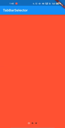
Below is the code which defines the implementation for building the Tabpageselector.
import 'dart:async';
import 'package:flutter/material.dart';
class MyHomePage extends StatefulWidget {
  const MyHomePage({Key? key}) : super(key: key);
  @override
  State createState() => _MyHomePageState();
}
class _MyHomePageState extends State
    with SingleTickerProviderStateMixin {
  late final TabController _controller;
  late final Timer _timer;
  static const _colors = [
    Colors.red,
    Colors.yellow,
    Colors.blueAccent,
  ];
  int _index = 0;
  void _circulate() {
    (_index != _colors.length - 1) ? _index++ : _index = 0;
    _controller.animateTo(_index);
    setState(() {});
  }
  @override
  void initState() {
    super.initState();
    _controller = TabController(
      length: 3,
      initialIndex: _index,
      vsync: this,
    );
    _timer = Timer.periodic(
      const Duration(seconds: 1),
      (_) => _circulate(),
    );
  }
  @override
  void dispose() {
    _controller.dispose();
    _timer.cancel();
    super.dispose();
  }
  @override
  Widget build(BuildContext context) {
    return Scaffold(
      appBar: AppBar(
        title: const Text("TabBarSelector"),
      ),
      body: Stack(
        alignment: Alignment.center,
        children: [
          Container(color: _colors[_controller.index]),
          Positioned(
            bottom: 20,
            child: TabPageSelector(
              controller: _controller,
              color: Colors.black38,
              selectedColor: Colors.white30,
            ),
          ),
        ],
      ),
    );
  }
}
Output
Conclusion:
With the constant technological growth, Flutter app development company have the experienced Flutter engineers to build multi-featured and functional apps with creative and high-tech widgets. It is a detailed guide about the prominent attributes, methods, operation, and building of tabPageSelector in the Flutter apps. It improves the user experience and attracts them to swipe and click more to explore the app. The above article briefly explains the functions and relative aspects of Tabpageselector functioning in TabBar.
Frequently Asked Questions (FAQs)
1. What are Widgets in Flutter development services?
Widgets are the central class hierarchy in the Flutter application. It has a description of the user interface, which is not modified and can be extended into elements, which will manage the underlying render tree. They didn’t have any mutable state.
2. What is TabBar in Flutter?
Usually, TabBar is used to design the tabs, Whereas TabBarView can be used to define the content of each page. However, Flutter knows how to switch between two tabs, which is easier for us. In Flutter, it is possible to customize the behaviour and style of the tab layout.
3. What will Stateless Widget work in Flutter?
It is a widget which does not change its state during the runtime of a Flutter application. It means that it is not redrawn when the app is in action. In that case, the appearance and the properties remain unchanged during the lifetime of the widget.
4. What is DefaultTabController in the Flutter application?
The DefaultTabController is an inherited widget utilized to exchange a TabController with a TabBar or TabBarView. It is preferred when you share a specifically designed TabController, which is not easy as the tab bar widgets are constructed by stateless parent widgets or the other parent widgets.
5. Did you Know how TabPageSelector works?
A TabPageSelector is an easy widget that will view the recently selected index via TabPageSelectorIndicator widgets. It will animate the indicators whenever the index begins to modify.

Contemporary ventures
Recent blog


Join our newsletter
Read and share new topics about all things Tech.
ready to get started?
Fill out the form below and we will be in touch soon!
"*" indicates required fields