")
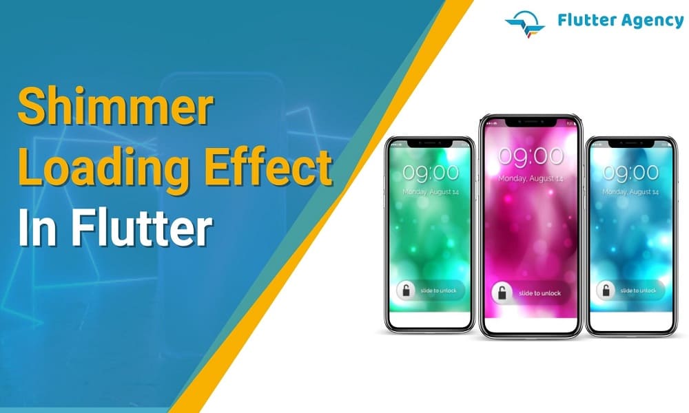
How to Create Shimmer Loading Effect in Flutter?
")
While the apps launch within an operating system, a loading screen appears while the data is transferring from the server or local database. Developers have to take specific steps to enable this in apps. In Flutter, adding the loading view using the ‘ProgressIndicator’ module is relatively easy. However, there are more advanced options now.
As for how to present the loading screen in an optimized manner, the Shimmer loading effect is a better option. This approach is a little more complex to achieve as it is not the same as the single loading widget and requires specialized steps.
If you are wondering what is involved in preparing this type of effect, give this post a full read.
What is the Shimmer Effect?
The Shimmer effect is a loading indicator that comes up while the app technology fetches the commanded data from remote or local data sources. The loading page appears as the page will potentially materialize after rendering the actual data.
Unlike the previously used LinearProgressIndicator or CircularProgressIndicator solutions, shimmer loading effects appear in a more aesthetically pleasing look to users. Given that the loading view looks somewhat hazy, it sometimes increases anticipation in readers about the actual content view that will appear on screen after loading.
How to import the Shimmer effect on Flutter?
It is important to get accurate Shimmer libraries from the Flutter community and add this to the pubspec.yaml file in the package:
dependencies:
shimmer: ^2.0.0
Then, access the command line and install the available package with Flutter
$ flutter pub get
After that, utilize the following command in Dart code
import 'package:shimmer/shimmer.dart';
Integrating the Shimmer effect in Flutter
With different steps, you can wrap the loading widget into the Shimmer effect indicator. There are several steps you can handle for specific implementations. Here are some examples.
1. Drawing the shimmer effect shapes
To note, when you see the shimmer loading effect on Flutter apps, you will see some shapes appear. However, these are not completely incorporated into the final content rendering on the page after the loading process.
For Flutter programmers, adding shapes that will accurately represent the placement of the final content efficiently on screen is important. The developers can run different codes depending on the shape type you want, like rectangle or circle.
At this point, it is important to keep the text in mind that will appear under the shapes as that will affect where the final content text will appear on the site after loading.
The following is an example codework for implementing the circular type of shape implementation in the loading screen. You should access the circular list of items at the screen’s top section. Ensure all of the CircleListItem widgets appear as colored circles in place of the final images during loading.
Example:
import 'package:flutter/material.dart';
import 'package:shimmer/shimmer.dart';
void main() => runApp(const MyApp());
class MyApp extends StatefulWidget
{
  const MyApp({Key? key}) : super(key: key);
  @override
  _MyAppState createState() => _MyAppState();
}
class _MyAppState extends State<MyApp> {
  List<String> products = ["data1", "data2", "data3", "data4", "data5"];
  @override
  Widget build(BuildContext context) {
    return const MaterialApp(
      debugShowCheckedModeBanner: false,
      home: ShimmerLoaderExample(),
    );
  }
}
class ShimmerLoaderExample extends StatelessWidget {
  const ShimmerLoaderExample({
    super.key,
  });
  @override
  Widget build(BuildContext context) {
    return Scaffold(
      appBar: AppBar(
        title: const Text("Shimmer loader"),
      ),
      body: Padding(
        padding: const EdgeInsets.symmetric(horizontal: 24, vertical: 16),
        child: Column(
          crossAxisAlignment: CrossAxisAlignment.start,
          children: [
            SizedBox(
              height: 200,
              width: double.infinity,
              child: ClipRRect(
                borderRadius: BorderRadius.circular(16),
                child: Image.network(
                  'https://picsum.photos/250?image=9',
                  fit: BoxFit.cover,
                  loadingBuilder: (context, child, loadingProgress) =>
                      Shimmer.fromColors(
                    baseColor: Colors.grey[300]!,
                    highlightColor: Colors.white,
                    child: Container(
                      color: Colors.grey,
                    ),
                  ),
                ),
              ),
            ),
          ],
        ),
      ),
    );
  }
}
Output
2. Complete the Shimmer gradience paint
After setting the shapes for the shimmer effect, you should change the shimmer gradient color. Use the ShaderMask widget for this, which applies specific shades to the child codes. However, this relates only to the sections the child had previously painted on/configured. The following steps cover:
- Define the linear gradient in chrome colouring that will appear in the shimmer effect shapes.
- Give a definition to the ShimmerLoading stateful widget that will wrap around the child widget using ShaderMask.
- Configure ShaderMask using ‘srcATop’ and ‘blendMode’ modules.
- Wrap the CircleListItem and then the CardListItem using the ShimmerLoading widget.
- The shimmer gradient that the “shaderCallback” widget returns appears after this while the shapes load.
Also Read: How to set up an Emulator For VSCode?
You can use specific steps to paint a full shimmer effect on the screen as well, with a gradient over the whole screen. After that, refer each ShimmerLoading widget to their Shimmer ancestor, and then request the desired gradient and size to appear.
- Define the new Shimmer stateful widget with LinearGradient, and allow the descendants access to the State object.
- Include methods into the ShimmerState class to allow access to the LinearGradient widget, the ShimmerState’s Renderbox size, and the descendant’s position within it.
- Wrap everything on screen using the Shimmer widget, and utilize the Shimmer widget inside ShimmerLoading widget for painting the shared gradient.
3. Animate on-page shimmer effect
Of course, the effect will not fully occur if the shimmer gradience does not move in a shimmery quality. For this, the ‘transform’ property with LinearGradient is useful for changing the gradient’s appearance and moving it in a specific direction.
- Then, define the SlidingGradientTransform class, which will implement GradientTransform for the horizontal sliding appearance.
- The rate of the gradient slide shifts over time for the motion-like look. Flutter developers can handle AnimationController configuration within the ShimmerState class.
- Next, they apply the available SlidingGradientTransform class within the gradient and utilize the value off the shimmerController as slidePercent. This animates the gradient, but not each ShimmerLoading widget on the screen.
- So, it would help if you exposed shimmerController as a ‘Listenable’ from ShimmerState class.
- Within the ShimmerLoading class, keep note of the ShimmerState ancestor’s shimmerChanges property, and paint the shimmer effect gradient again.
This will activate a full-scale animated shimmer loading effect on the screen of your app.
Conclusion
Implementing the Shimmer effect is a high-quality option to improve the loading screen appearance of apps. In terms of Flutter-based app development, the team can handle these steps if you insist on getting this loading style.
Frequently Asked Questions (FAQs)
1. What is the shimmer effect?
Shimmer is the Android library that gives an easy way to include the shimmer effect to any view in your android application. It is also helpful as an unobtrusive loading indicator originally established for the Facebook Home.
2. State the Shimmer loading?
The shimmer loading widget will perform as the skeleton layout. Usually, the content placeholder has a shimmering animation. It will override the app’s main screen as it requests the server’s data. After the data is loaded, a dummy skeleton screen is replaced by the main screen view.
3. What is the Shimmer in CSS?
The animate class has a custom animation by the name ‘shimmer’, duration of 2 seconds, infinite count., background as the linear gradient. We must utilize a gradient combined with the rest of the colour in its front and back.

Contemporary ventures
Recent blog


Join our newsletter
Read and share new topics about all things Tech.
ready to get started?
Fill out the form below and we will be in touch soon!
"*" indicates required fields