")
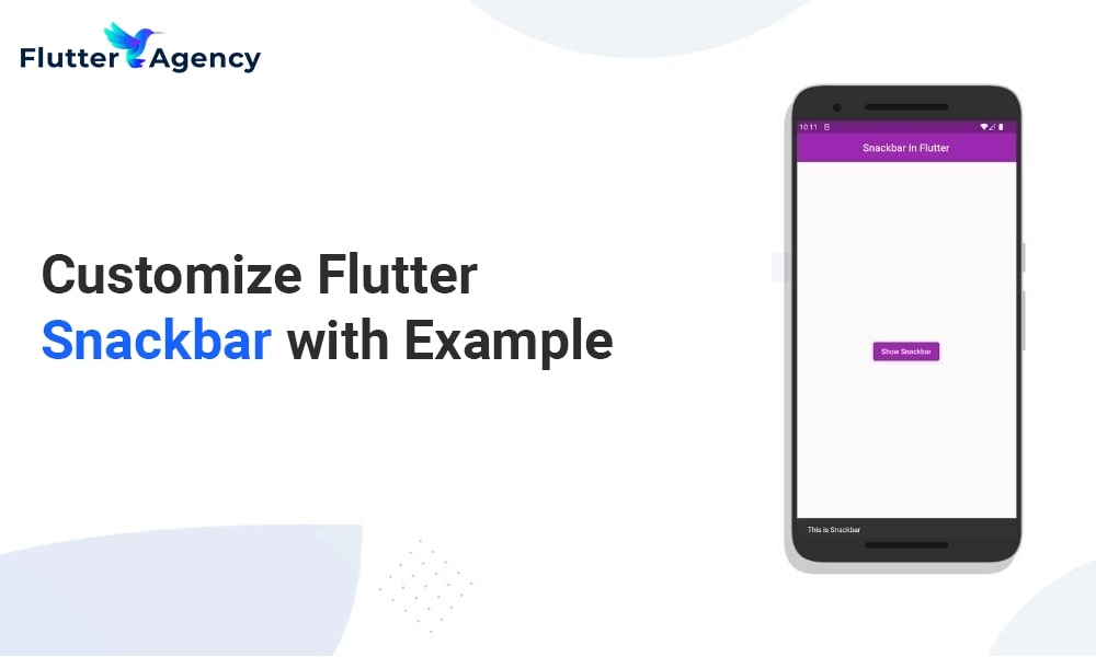
Flutter Snackbar Customization Example
")
A material widget in Flutter is called the snackbar. In Flutter, the snackbar provides users with a short form of notification. To display a message briefly before disappearing, the Flutter snackbar may be used after a specific action, such as deleting a file or when there is no internet connection.
This article will teach you how to use a snackbar widget in Flutter with an example and how to customize its look with various settings. Flutter includes a widget named SnackBar that allows us to add a snackbar to our application.
There is only one property that is needed to create a snackbar, and that is content. We can create a Flutter snackbar in our application by executing its constructor.
When displaying material to the user, we often utilize a Text widget.
If we choose, we can use different widgets.
We may utilize the Text widget for content to display a message in the snackbar.
Constructor
const SnackBar(
{Key? key,
required Widget content,
Color? backgroundColor,
double? elevation,
EdgeInsetsGeometry? margin,
EdgeInsetsGeometry? padding,
double? width,
ShapeBorder? shape,
SnackBarBehavior? behavior,
SnackBarAction? action,
double? actionOverflowThreshold,
bool? showCloseIcon,
Color? closeIconColor,
Duration duration = _snackBarDisplayDuration,
Animation<double>? animation,
VoidCallback? onVisible,
DismissDirection dismissDirection = DismissDirection.down,
Clip clipBehavior = Clip.hardEdge}
)
Viewing Flutter Snackbar
A snackbar cannot be continually shown like other widgets.
Snackbars can be displayed for specific program actions, such as file deletion or no internet connection; therefore, you can show the user a snackbar under these circumstances.
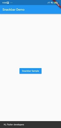
The code for showing a snackbar in Flutter is provided below.
Please add the following code
ScaffoldMessenger.of(context).showSnackBar(
            const SnackBar(
              content: Text(‘Hai, I am a Flutter developer’),
            ),
          );
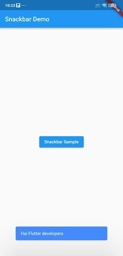
Example of Complete Code for Flutter Snackbar
Let’s look at an example where we form a button in Flutter and show a snackbar when the button is clicked.
Check out the code below to see how we will implement our snackbar for a clean code approach in a different method that we will also create.
import 'package:flutter/material.dart';
void main() {
runApp(const MyApp());
}
class MyApp extends StatelessWidget {
const MyApp({Key? key}) : super(key: key);
@override
Widget build(BuildContext context) {
return MaterialApp(
home: Scaffold(
appBar: AppBar(
title: const Text('Snackbar Demo'),
),
body: const SnackBarPage(),
),
);
}
}
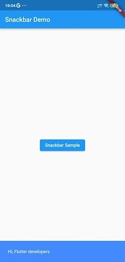
class SnackBarPage extends StatelessWidget {
const SnackBarPage({Key? key}) : super(key: key);
void showCustomSnackBar(BuildContext context) {
const snackBar = SnackBar(
content: Text('Hi, Flutter developers'),
);
ScaffoldMessenger.of(context).showSnackBar(snackBar);
}
@override
Widget build(BuildContext context) {
return Center(
child: ElevatedButton(
onPressed: () {
showCustomSnackBar(context);
},
child: const Text('Snackbar Sample'),
),
);
}
}
Output
Properties of Flutter Snackbar
Below is the list of some properties.
- Width
- Margin
- Padding
- onVisible
- Background color
- Elevation
- Duration
- Action
- Shape
- Behavior
Let’s now examine each snackbar property individually.
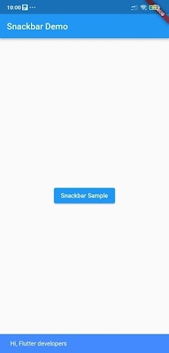
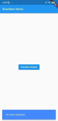
Snackbar Flutter BackgroundColor
Let’s look at the code for changing the background color of the snackbar using the BackgroundColor property.
  void showCustomSnackBar(BuildContext context) {
    const snackBar = SnackBar(
      content: Text('Hi, Flutter developers'),
      backgroundColor: Colors.blueAccent,
    );
    ScaffoldMessenger.of(context).showSnackBar(snackBar);
  }
Output
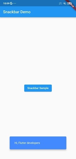
Padding
If you want to give the content of the snackbar with padding, use the Padding property as shown below.
void showCustomSnackBar(BuildContext context) {
    const snackBar = SnackBar(
      content: Text('Hi, Flutter developers'),
      backgroundColor: Colors.blueAccent,
      padding: EdgeInsets.all(25),
    );
    ScaffoldMessenger.of(context).showSnackBar(snackBar);
  }
Output
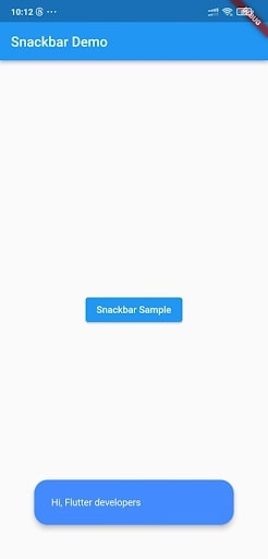
Behavior
The snackbar’s default behavior is fixed. Use the behavior property and set the SnackBarBehavior constant as the value if we wish to update it. There are two constants in the SnackBarBehavior: fixed and floating If the behavior is corrected, the snackbar will display above the bottom navigation if a BottomNavigationBar widget is available.
Add the following code to the snackbar
behavior: SnackBarBehavior.floating,
Duration
Use the Duration parameter to adjust the snackbar display’s duration. You may provide the duration value in microseconds, milliseconds, or minutes.
duration: Duration(seconds: 1),
Margin
We can utilize the margin property to set the snackbar’s margin. The amount of space we desire surrounding the snackbar is what we refer to as the margin.
margin: EdgeInsets.all(50),
Shape
In the example below, I’m only utilizing the stadium border shape to modify the snackbar’s development using the shape property.
 shape: RoundedRectangleBorder(
        borderRadius: BorderRadius.all(Radius.circular(20)),
      ),
Width
We may set or change the snackbar’s width by utilizing the width property.
void showCustomSnackBar(BuildContext context) {
    const snackBar = SnackBar(
      content: Text('Hi, Flutter developers'),
      backgroundColor: Colors.blueAccent,
      behavior: SnackBarBehavior.floating,
      width: 300,
    );
    ScaffoldMessenger.of(context).showSnackBar(snackBar);
  }
Elevation
By utilizing the elevation attribute, we can modify the snackbar’s elevation.
 void showCustomSnackBar(BuildContext context) {
    const snackBar = SnackBar(
      content: Text('Hai Flutter developers'),
      backgroundColor: Colors.blueAccent,
      behavior: SnackBarBehavior.floating,
      margin: EdgeInsets.all(50),
      elevation: 100,
    );
    ScaffoldMessenger.of(context).showSnackBar(snackBar);
  }
Snackbar Flutter onVisible
The onVisible() callback method allows us to execute a command when the snackbar is visible.
onVisible: (){
//Code to be run when the snackbar is visible
},
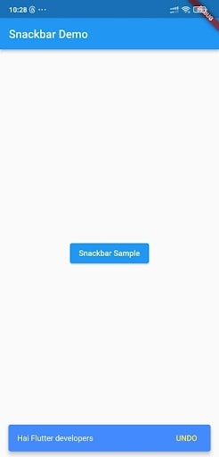
Action
You can add an action button to your snackbar by using the snackbar’s Action attribute.
SnackBarAction() is the value for action and contains four key characteristics.
label: The title that should appear next to the action button.
textColor: To give the actionButton’s text color.
disabledTextColor: This determines the text’s color when the action button is disabled.
onPressed: When we click the action button, a callback method called onPressed is activated.
  void showCustomSnackBar(BuildContext context) {
    final snackBar = SnackBar(
      content: const Text('Hai Flutter developers'),
      backgroundColor: Colors.blueAccent,
      behavior: SnackBarBehavior.floating,
      action: SnackBarAction(
        label: 'UNDO',
        disabledTextColor: Colors.white,
        textColor: Colors.yellow,
        onPressed: () {
          // Few lines of code to undo the change.
        },
      ),
    );
    ScaffoldMessenger.of(context).showSnackBar(snackBar);
  }
Conclusion
I hope this guide was helpful. Flutter makes it incredibly simple for developers to develop apps for both the web and mobile platforms. Widgets are the building blocks of Flutter. To ensure that your users get the most out of your Flutter application, the SnackBar widget makes distributing critical and educational information simple. Also, you can browse our Flutter blogs to learn more about it.
Feel free to contact the Flutter experts to assist you with any questions or doubts. They will demonstrate the best path that meets your demands through their experience and knowledge.
Frequently Asked Questions (FAQs)
1. How can snack bars be customized in Flutter?
There is only one attribute that is needed to create a snackbar, and that is content. We can create a Flutter snackbar in our application by executing its constructor. When displaying material to the user, we often utilize a Text widget. If we choose, we can substitute different widgets.
2. What is meant by snackbar design?
Snackbars are UI components that alert the user to an action an app has already taken or will do. They temporarily appear at the bottom of the screen. Snackbar. Material Design, the source. Snackbars should disrupt no user experience or activity.
3. Define snackbar component.
Snackbars provide short alerts. The element is sometimes referred to as a toast in Flutter. Users are informed of a procedure through snackbars that an app has completed or will complete. They temporarily appear towards the bottom of the screen. They don’t require human action to disappear and shouldn’t interfere with the user’s experience.

Contemporary ventures
Recent blog


Join our newsletter
Read and share new topics about all things Tech.
ready to get started?
Fill out the form below and we will be in touch soon!
"*" indicates required fields