")
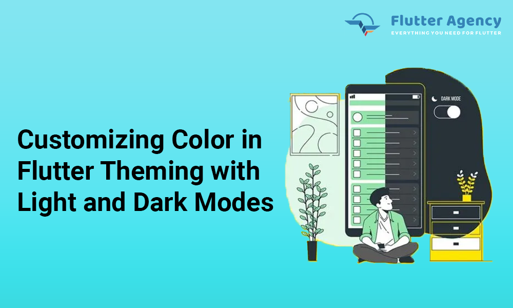
Customizing Color in Flutter Theming with Light and Dark Modes
")
In Flutter theming there is a powerful technique that allows you to customize the visual appearance of your application to provide a consistent and engaging user experience. One common theming approach is implementing light and dark themes, enabling users to switch between color schemes based on their preferences or the surrounding environment.
By incorporating light and dark themes with custom colors in your Flutter web application development, you can create visually appealing interfaces that adapt seamlessly to different lighting conditions. This guide will explore how to implement light and dark themes in Flutter and demonstrate how to customize the color palette to match your app’s branding or design requirements. Let’s dive into the world of Flutter theming and discover how to bring a vibrant and dynamic look to your app quickly.
What is Flutter theming?
The theme is the generic styling element that will represent your application’s entire style, look, and feel. Whenever you want to alter the Flutter app theme, for example, from Flutter dark mode to Flutter light mode or vice-versa, this process is referred to as Flutter theming.
However, by implementing the Flutter theme Dark Light in projects, they will use the default App Theme and their default colors attribute. But in the live project, you are required t include the custom color for app branding.
Flutter theming with custom color: Step-by-Step Guide
For the successful integration with Flutter theming, you need to take care of the following points below:
Create Flutter project
Add the Riverpod package to the yaml file.
Step 1: Make a Light/Dark theme
Use ThemeData class and customize colors and the various properties dependent on needs. We have made one method for getting ThemeData based on the opted light or dark themes.
Based on the selected theme, we provide several values for scaffoldBackgroundColor, thumbColor, appBar Theme, listTile Theme, and bodycolor.
ThemeData getAppTheme(BuildContext context, bool isDarkTheme) {
  return ThemeData(
    scaffoldBackgroundColor: isDarkTheme ? Colors.black : Colors.white,
    textTheme: Theme.of(context)
        .textTheme
        .copyWith(
          titleSmall:
              Theme.of(context).textTheme.titleSmall?.copyWith(fontSize: 11),
        )
        .apply(
          bodyColor: isDarkTheme ? Colors.white : Colors.black,
          displayColor: Colors.grey,
        ),
    switchTheme: SwitchThemeData(
      thumbColor: MaterialStateProperty.all(
          isDarkTheme ? Colors.orange : Colors.purple),
    ),
    listTileTheme: ListTileThemeData(
        iconColor: isDarkTheme ? Colors.orange : Colors.purple),
    appBarTheme: AppBarTheme(
        backgroundColor: isDarkTheme ? Colors.black : Colors.white,
        iconTheme:
            IconThemeData(color: isDarkTheme ? Colors.white : Colors.black54)),
  );
}
Step 2: Make a provider for the theme state with Riverpod
River-pod will be used to control the app theme state. We will use StateProvider to save a bool value to control light or dark themes.
final appThemeProvider = StateProvider<bool>((ref) => false);
Step 3: Utilize theme in the app
Since the river-pod is used in the project, MyApp must be wrapped in ProviderScope in order to access all providers across the app. MyApp implements ConsumerWidget, allowing us to obtain the WidgetRef object in the build method and use the ref variable to access any river-pod. The method getAppTheme(context, ref.watch(appThemeProvider)), which monitors changes to the app theme, updates the application as necessary.
class MyApp extends ConsumerWidget {
  const MyApp({super.key});

  @override
  Widget build(BuildContext context, WidgetRef ref) {
    return MaterialApp(
      title: 'Flutter Light/Dark Theme',
      debugShowCheckedModeBanner: false,
      theme: getAppTheme(context, ref.watch(appThemeProvider)),
      home: const MyHomePage(),
    );
  }
}
ref.read(appThemeProvider.notifier).value = state. When the switch state is changed from light/dark mood, we update the theme state in appThemeProvider.
Switch(
  activeColor: Colors.orange,
  onChanged: (value) {
    ref.read(appThemeProvider.notifier).state = value;
  },
  value: isDarkMode )
Step 4: Add custom color
It functions properly as long as all icons and text use the same color. We must develop an extension for the theme to utilize alternative colors for icons. Make a class, extend it with ThemeExtension, and add the required fields for customization.
class AppColors extends ThemeExtension<AppColors> {
  final Color? color1;
  final Color? color2;
  final Color? color3;

  const AppColors({
    required this.color1,
    required this.color2,
    required this.color3,
  });

  @override
  AppColors copyWith({
    Color? color1,
    Color? color2,
    Color? color3,
  }) {
    return AppColors(
      color1: color1 ?? this.color1,
      color2: color2 ?? this.color2,
      color3: color3 ?? this.color3,
    );
  }

  @override
  AppColors lerp(ThemeExtension<AppColors>? other, double t) {
    if (other is! AppColors) {
      return this;
    }
    return AppColors(
      color1: Color.lerp(color1, other.color1, t),
      color2: Color.lerp(color2, other.color2, t),
      color3: Color.lerp(color3, other.color3, t),
    );
  }
}
The theme may now be defined according to colours by adding this extension attribute to ThemeData in our creation method getAppTheme.
extensions: <ThemeExtension<AppColors>>[
  AppColors(
    color1: isDarkTheme ? Colors.blue : Colors.blueGrey,
    color2: isDarkTheme ? Colors.pink : Colors.pinkAccent,
    color3: isDarkTheme ? Colors.yellow : Colors.limeAccent,
  ),
Create a new extension function that we may utilise for quickly retrieving custom colour.
AppColors colors(context) => Theme.of(context).extension<AppColors>()!;
Simply utilizing colors(context), we may get these colours in the widget.color1. If we don’t specify the icon colour, listTileTheme will determine the colour for us.
ListTile(
    leading: Icon(Icons.chat_outlined, color: colors(context).color3),
    title: Text( "Help Center", style: Theme.of(context).textTheme.titleSmall),
 ),
ListTile(
    leading: const Icon(Icons.notifications),
    title: Text("Notification", style: Theme.of(context).textTheme.titleSmall),
),
Step 5 : Full Soure code
import 'package:flutter/material.dart';

AppColors colors(context) => Theme.of(context).extension<AppColors>()!;

ThemeData getAppTheme(BuildContext context, bool isDarkTheme) {
  return ThemeData(
    extensions: <ThemeExtension<AppColors>>[
      AppColors(
        color1: isDarkTheme ? Colors.blue : Colors.green,
        color2: isDarkTheme ? Colors.pink : Colors.blue,
        color3: isDarkTheme ? Colors.yellow : Colors.red,
      ),
    ],
    scaffoldBackgroundColor: isDarkTheme ? Colors.black : Colors.white,
    textTheme: Theme.of(context)
        .textTheme
        .copyWith(
          titleSmall:
              Theme.of(context).textTheme.titleSmall?.copyWith(fontSize: 12),
        )
        .apply(
          bodyColor: isDarkTheme ? Colors.white : Colors.black,
          displayColor: Colors.grey,
        ),
    switchTheme: SwitchThemeData(
      thumbColor: MaterialStateProperty.all(
          isDarkTheme ? Colors.orange : Colors.purple),
    ),
    listTileTheme: ListTileThemeData(
        iconColor: isDarkTheme ? Colors.orange : Colors.purple),
    appBarTheme: AppBarTheme(
        backgroundColor: isDarkTheme ? Colors.black : Colors.white,
        iconTheme:
            IconThemeData(color: isDarkTheme ? Colors.white : Colors.black54)),
  );
}

@immutable
class AppColors extends ThemeExtension<AppColors> {
  final Color? color1;
  final Color? color2;
  final Color? color3;

  const AppColors({
    required this.color1,
    required this.color2,
    required this.color3,
  });

  @override
  AppColors copyWith({
    Color? color1,
    Color? color2,
    Color? color3,
  }) {
    return AppColors(
      color1: color1 ?? this.color1,
      color2: color2 ?? this.color2,
      color3: color3 ?? this.color3,
    );
  }

  @override
  AppColors lerp(ThemeExtension<AppColors>? other, double t) {
    if (other is! AppColors) {
      return this;
    }
    return AppColors(
      color1: Color.lerp(color1, other.color1, t),
      color2: Color.lerp(color2, other.color2, t),
      color3: Color.lerp(color3, other.color3, t),
    );
  }
}
Code of our main screen:
import 'package:flutter/material.dart';
import 'package:flutter_riverpod/flutter_riverpod.dart';
import 'package:light_dark_mode/provider%20/app_theme_provider.dart';
import 'package:light_dark_mode/utils/app_theme.dart';

void main() {
  runApp(const ProviderScope(child: MyApp()));
}

class MyApp extends ConsumerWidget {
  const MyApp({super.key});

  @override
  Widget build(BuildContext context, WidgetRef ref) {
    return MaterialApp(
      title: 'Flutter Light/Dark Theme',
      debugShowCheckedModeBanner: false,
      theme: getAppTheme(context, ref.watch(appThemeProvider)),
      home: const MyHomePage(),
    );
  }
}

class MyHomePage extends ConsumerWidget {
  const MyHomePage({Key? key}) : super(key: key);

  @override
  Widget build(BuildContext context, WidgetRef ref) {
    var isDarkMode = ref.watch(appThemeProvider);
    return Scaffold(
      appBar: AppBar(
        elevation: 0,
        leading: const Icon(Icons.arrow_back_ios_sharp),
        actions: const [
          Padding(
            padding: EdgeInsets.symmetric(horizontal: 15.0),
            child: Icon(Icons.add_circle_outline),
          )
        ],
      ),
      body: Padding(
        padding: const EdgeInsets.symmetric(horizontal: 8.0),
        child: ListView(
          children: [
            CircleAvatar(
              radius: 60,
              backgroundColor: Colors.grey,
              child: Padding(
                padding: const EdgeInsets.all(1), // Border radius
                child: ClipRRect(
                    borderRadius: BorderRadius.circular(60),
                    child: Image.asset(
                      "assets/ic_profile.jpeg",
                      fit: BoxFit.fill,
                      width: 120,
                      height: 120,
                    )),
              ),
            ),
            Container(
              margin: const EdgeInsets.only(top: 10, bottom: 60),
              alignment: Alignment.center,
              child: Text(
                "Testing User",
                style: Theme.of(context).textTheme.titleLarge,
              ),
            ),
            ListTile(
              leading: Icon(isDarkMode ? Icons.brightness_3 : Icons.sunny),
              title: Text(
                isDarkMode ? "Dark mode" : "Light mode",
                style: Theme.of(context).textTheme.titleSmall,
              ),
              trailing: Consumer(builder: (context, ref, child) {
                return Transform.scale(
                  scale: 0.7,
                  child: Switch(
                    activeColor: Colors.orange,
                    onChanged: (value) {
                      ref.read(appThemeProvider.notifier).state = value;
                    },
                    value: isDarkMode,
                  ),
                );
              }),
            ),
            ListTile(
              leading: Icon(Icons.grid_on_sharp, color: colors(context).color1,),
              title: Text(
                "Story",
                style: Theme.of(context).textTheme.titleSmall,
              ),
            ),
            ListTile(
              leading: Icon(Icons.settings, color: colors(context).color2),
              title: Text("Settings and Privacy",
                  style: Theme.of(context).textTheme.titleSmall),
            ),
            ListTile(
              leading: Icon(Icons.chat_outlined, color: colors(context).color3),
              title: Text(
                "Help Center",
                style: Theme.of(context).textTheme.titleSmall,
              ),
            ),
            ListTile(
              leading: const Icon(Icons.notifications),
              title: Text(
                "Notification",
                style: Theme.of(context).textTheme.titleSmall,
              ),
            ),
          ],
        ),
      ),
    );
  }
}
Conclusion
In conclusion, this blog aims to assist you in personalizing the Flutter app theme. Although we customized Colours in ThemeExtension for this blog, we may customize the value in any field. So that, Flutter theming is just one aspect; you can find several blogs on the Flutter framework.
Flutter Agency, a leading and best mobile app development agencies, provides valuable insights on theming in Flutter. With their help of development expertise, you can explore various techniques to implement light and dark themes and create visually stunning applications. Hence, Embrace the power of theming and deliver delightful experiences to your users with Flutter.
Frequently Asked Questions (FAQs)
1. Why is a light theme preferable to a dark theme?
On the other hand, Light mode is uncomplicated and transparent. It is readable, clear, natural, and visually appealing. Information can be presented in the Light mode in a more precise visual design than in the Dark mode. Therefore, Apple’s marketing is the clearest example of how it efficiently uses Light mode to give the display an impression of pure clarity.
2. How do you use custom hex colors in Flutter Theming?
To use a custom hex color in Flutter, you can utilize the Color class and specify the hex color value preceded by 0xFF. So, for example, to use the hex color “#FFAABB,” you can define it as Color(0xFFAABB). This allows you to easily integrate custom hex colors into your Flutter application’s theme, widgets, or styles, providing precise control over the visual appearance.
3. What is color blend mode in Flutter Theming?
BlendMode blendMode. Then when drawing a shape or combining layers, use this mixed mode. The colors used as sources come from the shape being drawn, like Canvas – graphics drawn between the Canvas and a composite layer (drawPath) or layer.

Contemporary ventures
Recent blog


Join our newsletter
Read and share new topics about all things Tech.
ready to get started?
Fill out the form below and we will be in touch soon!
"*" indicates required fields