")
CupertinoTabBar Widget – Flutter Widget Guide By Flutter Agency
")
In this article, we will walk through what is CupertinoTabBar Widget.
What is CupertinoTabBar Widget?
CupertinoTabBar Widget is an iOS-styled bottom navigation tab bar. It displays multiple tabs using BottomNavigationBarItem with one tab being active, the first tab by default.
This StatelessWidget doesn’t store the active tab itself. Users must listen to the onTap callbacks and call setState with a new currentIndex for the new selection to reflect. This can also be done automatically by wrapping this with a CupertinoTabScaffold.
Tab changes typically trigger a switch between Navigators, each with its own navigation stack, per standard iOS design. This can be done by using CupertinoTabViews inside each tab builder in CupertinoTabScaffold.
If the given backgroundColor’s opacity is not 1.0 (which is the case by default), it will produce a blurring effect to the content behind it.
When used as CupertinoTabScaffold.tabBar, by default CupertinoTabBar Widget has its text scale factor set to 1.0 and does not respond to text scale factor changes from the operating system, to match the native iOS behavior. To override this behavior, wrap each of the navigationBar’s components inside a MediaQuery with the desired MediaQueryData.textScaleFactor value. The text scale factor value from the operating system can be retrieved in many ways, such as querying MediaQuery.textScaleFactor Of against CupertinoApp’s BuildContext.
Default Constructor for it will look like below:
const CupertinoTabBar(
{Key? key,
required List items,
ValueChanged? onTap,
int currentIndex = 0,
Color? backgroundColor,
Color? activeColor,
Color inactiveColor = _kDefaultTabBarInactiveColor,
double iconSize = 30.0,
double height = _kTabBarHeight,
Border? border = const Border(top: BorderSide(color: _kDefaultTabBarBorderColor, width: 0.0))}
)
In the Above constructor, all fields marked with required must not be empty.
Properties:
- Key key: Controls how one widget replaces another widget in the tree.
- List<BottomNavigationBarItem> items: The interactive items laid out within the bottom navigation bar.
- ValueChanged<int> onTap(): Signature callback that reports an underlying change has been occur.
- int currentIndex: The index into items of current active item. Must not be null and must inclusively be between 0 and the number of tabs minus 1.
- Color backgroundColor: The background color of the tab bar. If it contains transparency, the tab bar will automatically produce a blurring effect to the content behind it. Defaults to CupertinoTheme’s barBackgroundColor when null.
- Color activeColor: The foreground color of the icon and title for the BottomNavigationBarItem of the selected tab. Defaults to CupertinoTheme’s primaryColor if null.
- Color inactiveColor: The foreground color of the icon and title for the BottomNavigationBarItems in the unselected state.Defaults to CupertinoColors.inactiveGray and cannot be null.
- double iconSize: The size of all of the BottomNavigationBarItem icons. This value is used to configure the IconTheme for the navigation bar. When a BottomNavigationBarItem.icon Widget is not an Icon the widget should configure itself to match the icon theme’s size and color.
- Size preferredSize: The size this widget would prefer if it were otherwise unconstrained. In many cases, it’s only necessary to define one preferred dimension.
- List<BottomNavigationBarItem> items: The interactive items laid out within the bottom navigation bar.Must not be null.
How to use CupertinoTabBar Widget in Flutter?
The following code snippet tells us how to implement CupertinoTabBar Widget in Flutter.
CupertinoTabBar(
      items: const [
        BottomNavigationBarItem(
          icon: Icon(
            CupertinoIcons.circle,
          ),
          label : 'Tab 1',
        ),
        BottomNavigationBarItem(
          icon: Icon(
            CupertinoIcons.add,
          ),
          label: 'Tab 2',
        ),
      ],
      currentIndex: 1,
    ),
We will get output like below:
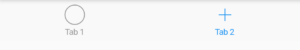
CupertinoTab Bar Widget
Conclusion:
In this article, we have been through What is CupertinoTabBar Widget in Flutter along with how to implement it in a Flutter.
Still, need support for Flutter?
We are happy to assist you.

Contemporary ventures
Recent blog


Join our newsletter
Read and share new topics about all things Tech.
ready to get started?
Fill out the form below and we will be in touch soon!
"*" indicates required fields