")
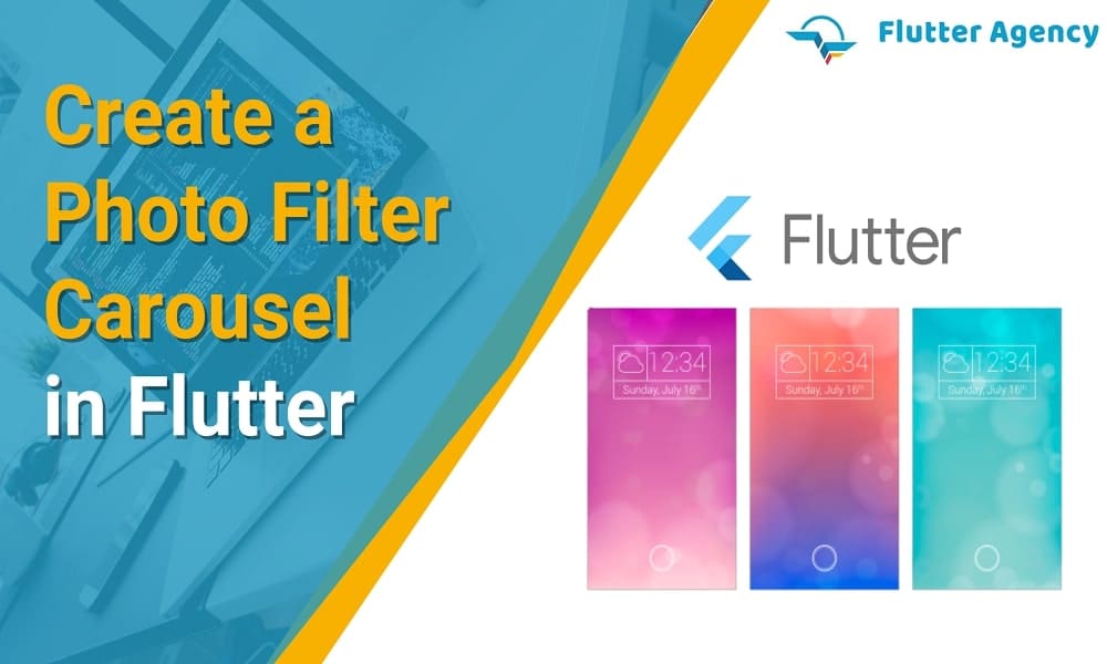
How to Create a Photo Filter Carousel in Flutter?
")
Flutter is one of the best frameworks for creating an intuitive user interface with interactive features, innovative styles, and excellent performance. It is based on Dart programming language, HTML, and CSS styling. Flutter comes with a built-in library of UI components that can be customized to meet business needs and take the user experience to the next level. Whether animation or parallax, Flutter makes all these variations easier and makes the UI look more appealing and innovative.
See Also:
How to Add the Parallax Effect in Flutter?
One such function of Flutter is to allow developers to include a filter carousel for pictures. When you want to develop any photo and video editing app or any other application with an embedded picture editor.
After all, no one likes to upload pictures in unedited form. For example, out of every 100 Insta users, 90 will edit the photo, apply filter effects, and then use the edited image to upload the post on social media platforms.
Therefore, knowing more about developing a carousel for photo filters will benefit you. In the following article, we have discussed the step-by-step guide to complete the Flutter web app development of this particular UI component and explained some other relatable facts.
What widget is used to create the filter carousel?
We would first learn the widget used to create the entire filter carousel. Since here, the main subject is a picture; you need to use the Image widget in Flutter. It is a widget to display the UI image once the codes are deployed to the live environment or server.
This image comes with multiple constructors based on the way the image needs to be extracted and the source. For instance, image.network constructor extracts and displays the image from a specified URL. Similarly, the load image.file in Flutter is used to display an image stored in a particular file. No matter what, you need to define the source from where the widget will extract and display the picture.
Also, Check This Article:
How to Create Gradient Chat Bubbles in Flutter?
What are the general structure of the carousel and its functioning?
Before delving deep into the technical details of developing a codebase to include the filter carousel for the pictures, let us understand the functionality. A carousel is a slideshow with new slides or options displayed as the user slides the list horizontally. The carousel has a central ring with a bold border in most image editing apps. The colour filter within the circle is the one currently in use.
As the user slides the filter bar from left to right or vice versa, a new colour will be positioned inside the central circle. The colour positioned within the carousel circle will be the filter applied to the picture.
Flutter coders must synchronize these elements’ properties to develop the entire filter carousel. Also, you need to ensure the filter colours have a darker background to understand the difference between the filter options and the original picture to be edited.
How to implement the carousel selector ring?
Your first task is to create the selector ring for the filter carousel. For this, you need to create a FilterSelector stateful widget. A function needs to be added that will calculate and return the value of the box size. Once done, you need to define a function named Positioned. This will help you to establish the location of the filter selector widget on the image.

Within the Positioned function, initialize left, right, and bottom position variables with 0.0 values. Here, the filter selector widget will act as a child function for the main function. The filter selector widget should also define a child widget Stack to set the ring’s position, shape, and contrast, followed by a buildShadowGradient widget to define the darker background gradient of the filter colours.
There are two more widgets that you need to include in the codebase for further use. These are:
1. IgnorePointer:
IgnorePointer widget will prevent any change in the image colour once the carousel is in the inactive stage, even if any action is taken on the carousel filter.
2. LayoutBuilder:
It will assess the available space and then calculate the overall size of each item in the carousel, including the darker gradient background and the selector ring.
How to Create the carousel item for the image filter?
When you build the carousel, a single filter item will display a circular image. The colour applied to this image must be the same as that of the filter colour within the selector ring. Therefore, to create the item, you need to define a new widget named FilterItem. It is a stateless widget and should include a constructor.
You have to define the filter item and its colour. For this, define the structure or shape as circular with padding around the main shape. Also, you have to define the opacity so that the users can easily distinguish the colour of the filter carousel and the image.
How to Implement the filter carousel through Flutter?
Since the filter items will be scrolled from left to right and vice versa along a horizontal line, you must use another widget to define this gesture. For this, you need to create the Scrollable widget. This will help you place the beginning of the item list right at the center, unlike the ListView widget, which will position the selected item at the extreme side of the screen. To enhance the positioning of the selector ring and the selected filter colour during the scrolling action, you can use the PageView widget.
It will ensure that the filter item will snap back to the central ring detector, regardless of whether the user drags the item to any other screen point. All the FilterItem widgets will be included within the PageView widget. Now, to establish a gesture where a filter item will start shrinking in size and gain more opacity as it is moved to the side of the screen, farther away from the selector ring. You can use the viewport action property in the PageViewController widget.
Example:
import 'package:flutter/material.dart';
import 'package:flutter/rendering.dart' show ViewportOffset;
import 'dart:math' as math;

void main() {
  runApp(MyApp());
}

class MyApp extends StatelessWidget {
  const MyApp({Key? key}) : super(key: key);

  @override
  Widget build(BuildContext context) {
    return MaterialApp(
      title: "Face Pile Example",
      theme: ThemeData(primarySwatch: Colors.blue),
      home: ExampleInstagramFilterSelection(),
    );
  }
}

class ExampleInstagramFilterSelection extends StatefulWidget {
  const ExampleInstagramFilterSelection({super.key});

  @override
  State createState() =>
      _ExampleInstagramFilterSelectionState();
}

class _ExampleInstagramFilterSelectionState
    extends State {
  final _filters = [
    Colors.white,
    ...List.generate(
      Colors.primaries.length,
      (index) => Colors.primaries[(index * 4) % Colors.primaries.length],
    )
  ];

  final _filterColor = ValueNotifier(Colors.white);

  void _onFilterChanged(Color value) {
    _filterColor.value = value;
  }

  @override
  Widget build(BuildContext context) {
    return Material(
      color: Colors.black,
      child: Stack(
        children: [
          Positioned.fill(
            child: _buildPhotoWithFilter(),
          ),
          Positioned(
            left: 0.0,
            right: 0.0,
            bottom: 0.0,
            child: _buildFilterSelector(),
          ),
        ],
      ),
    );
  }

  Widget _buildPhotoWithFilter() {
    return ValueListenableBuilder(
      valueListenable: _filterColor,
      builder: (context, value, child) {
        final color = value as Color;
        return Image.network(
          'https://images.pexels.com/photos/213780/pexels-photo-213780.jpeg?auto=compress&cs=tinysrgb&dpr=1&w=500',
          color: color.withOpacity(0.5),
          colorBlendMode: BlendMode.color,
          fit: BoxFit.cover,
        );
      },
    );
  }

  Widget _buildFilterSelector() {
    return FilterSelector(
      onFilterChanged: _onFilterChanged,
      filters: _filters,
    );
  }
}

@immutable
class FilterSelector extends StatefulWidget {
  const FilterSelector({
    super.key,
    required this.filters,
    required this.onFilterChanged,
    this.padding = const EdgeInsets.symmetric(vertical: 24.0),
  });

  final List filters;
  final void Function(Color selectedColor) onFilterChanged;
  final EdgeInsets padding;

  @override
  State createState() => _FilterSelectorState();
}

class _FilterSelectorState extends State {
  static const _filtersPerScreen = 5;
  static const _viewportFractionPerItem = 1.0 / _filtersPerScreen;

  late final PageController _controller;
  late int _page;

  int get filterCount => widget.filters.length;

  Color itemColor(int index) => widget.filters[index % filterCount];

  @override
  void initState() {
    super.initState();
    _page = 0;
    _controller = PageController(
      initialPage: _page,
      viewportFraction: _viewportFractionPerItem,
    );
    _controller.addListener(_onPageChanged);
  }

  void _onPageChanged() {
    final page = (_controller.page ?? 0).round();
    if (page != _page) {
      _page = page;
      widget.onFilterChanged(widget.filters[page]);
    }
  }

  void _onFilterTapped(int index) {
    _controller.animateToPage(
      index,
      duration: const Duration(milliseconds: 450),
      curve: Curves.ease,
    );
  }

  @override
  void dispose() {
    _controller.dispose();
    super.dispose();
  }

  @override
  Widget build(BuildContext context) {
    return Scrollable(
      controller: _controller,
      axisDirection: AxisDirection.right,
      physics: const PageScrollPhysics(),
      viewportBuilder: (context, viewportOffset) {
        return LayoutBuilder(
          builder: (context, constraints) {
            final itemSize = constraints.maxWidth * _viewportFractionPerItem;
            viewportOffset
              ..applyViewportDimension(constraints.maxWidth)
              ..applyContentDimensions(0.0, itemSize * (filterCount - 1));

            return Stack(
              alignment: Alignment.bottomCenter,
              children: [
                _buildShadowGradient(itemSize),
                _buildCarousel(
                  viewportOffset: viewportOffset,
                  itemSize: itemSize,
                ),
                _buildSelectionRing(itemSize),
              ],
            );
          },
        );
      },
    );
  }

  Widget _buildShadowGradient(double itemSize) {
    return SizedBox(
      height: itemSize * 2 + widget.padding.vertical,
      child: const DecoratedBox(
        decoration: BoxDecoration(
          gradient: LinearGradient(
            begin: Alignment.topCenter,
            end: Alignment.bottomCenter,
            colors: [
              Colors.transparent,
              Colors.black,
            ],
          ),
        ),
        child: SizedBox.expand(),
      ),
    );
  }

  Widget _buildCarousel({
    required ViewportOffset viewportOffset,
    required double itemSize,
  }) {
    return Container(
      height: itemSize,
      margin: widget.padding,
      child: Flow(
        delegate: CarouselFlowDelegate(
          viewportOffset: viewportOffset,
          filtersPerScreen: _filtersPerScreen,
        ),
        children: [
          for (int i = 0; i < filterCount; i++)
            FilterItem(
              onFilterSelected: () => _onFilterTapped(i),
              color: itemColor(i),
            ),
        ],
      ),
    );
  }

  Widget _buildSelectionRing(double itemSize) {
    return IgnorePointer(
      child: Padding(
        padding: widget.padding,
        child: SizedBox(
          width: itemSize,
          height: itemSize,
          child: const DecoratedBox(
            decoration: BoxDecoration(
              shape: BoxShape.circle,
              border: Border.fromBorderSide(
                BorderSide(width: 6.0, color: Colors.white),
              ),
            ),
          ),
        ),
      ),
    );
  }
}

class CarouselFlowDelegate extends FlowDelegate {
  CarouselFlowDelegate({
    required this.viewportOffset,
    required this.filtersPerScreen,
  }) : super(repaint: viewportOffset);

  final ViewportOffset viewportOffset;
  final int filtersPerScreen;

  @override
  void paintChildren(FlowPaintingContext context) {
    final count = context.childCount;

    // All available painting width
    final size = context.size.width;

    // The distance that a single item "page" takes up from the perspective
    // of the scroll paging system. We also use this size for the width and
    // height of a single item.
    final itemExtent = size / filtersPerScreen;

    // The current scroll position expressed as an item fraction, e.g., 0.0,
    // or 1.0, or 1.3, or 2.9, etc. A value of 1.3 indicates that item at
    // index 1 is active, and the user has scrolled 30% towards the item at
    // index 2.
    final active = viewportOffset.pixels / itemExtent;

    // Index of the first item we need to paint at this moment.
    // At most, we paint 3 items to the left of the active item.
    final min = math.max(0, active.floor() - 3).toInt();

    // Index of the last item we need to paint at this moment.
    // At most, we paint 3 items to the right of the active item.
    final max = math.min(count - 1, active.ceil() + 3).toInt();

    // Generate transforms for the visible items and sort by distance.
    for (var index = min; index <= max; index++) {
      final itemXFromCenter = itemExtent * index - viewportOffset.pixels;
      final percentFromCenter = 1.0 - (itemXFromCenter / (size / 2)).abs();
      final itemScale = 0.5 + (percentFromCenter * 0.5);
      final opacity = 0.25 + (percentFromCenter * 0.75);

      final itemTransform = Matrix4.identity()
        ..translate((size - itemExtent) / 2)
        ..translate(itemXFromCenter)
        ..translate(itemExtent / 2, itemExtent / 2)
        ..multiply(Matrix4.diagonal3Values(itemScale, itemScale, 1.0))
        ..translate(-itemExtent / 2, -itemExtent / 2);

      context.paintChild(
        index,
        transform: itemTransform,
        opacity: opacity,
      );
    }
  }

  @override
  bool shouldRepaint(covariant CarouselFlowDelegate oldDelegate) {
    return oldDelegate.viewportOffset != viewportOffset;
  }
}

@immutable
class FilterItem extends StatelessWidget {
  const FilterItem({
    super.key,
    required this.color,
    this.onFilterSelected,
  });

  final Color color;
  final VoidCallback? onFilterSelected;

  @override
  Widget build(BuildContext context) {
    return GestureDetector(
      onTap: onFilterSelected,
      child: AspectRatio(
        aspectRatio: 1.0,
        child: Padding(
          padding: const EdgeInsets.all(8.0),
          child: ClipOval(
            child: Image.network(
              'https://docs.flutter.dev/cookbook/img-files/effects/instagram-buttons/millenial-texture.jpg',
              color: color.withOpacity(0.5),
              colorBlendMode: BlendMode.hardLight,
            ),
          ),
        ),
      ),
    );
  }
}
Output:
Conclusion
This article discusses some of the most important things to be added to the codebase to establish and define every element of the filter carousel and its gesture and movement. Ensure the more complex carousel you want, the lengthier the code will be.
Connect with Flutter Agency if you have a unique app idea and want to develop your own app.
If you want to know more about the Flutter app development then connect with the Flutter Agency.
Frequently Asked Questions (FAQs)
1. How will filters work on photos?
The software routine modifies a view of the image or a portion of the image by altering its shades and colours of pixels in any way. It is also utilized to raise the brightness and contrast and can include a wide variety of textures, tones and particular effects to the picture.
2. How can I add the filter to the carousel?
On the bottom, you will see the search icon known as the filter carousel. With the help of a filter carousel, you can see different types of filters and its name if you remember its name. You can apply a filter to the video.
3. What are the components of the filter?
A filter circuit has passive circuit elements like inductors, capacitors, resistors and their combination. This filter action is based on the electrical properties of the passive circuit elements.

Contemporary ventures
Recent blog


Join our newsletter
Read and share new topics about all things Tech.
ready to get started?
Fill out the form below and we will be in touch soon!
"*" indicates required fields