How to Customize the Switch Button In a Flutter ?
When the user wants to display data based on Button Widget visibility which could be true or false. So in this article, we are going to How to Customize the Switch Button in a Flutter?
How to Customize the Switch Button In a Flutter?
Depending on the end-user requirement we can make a plugin like custom_switch code snippet will below:
import 'package:custom_switch/custom_switch.dart';
import 'package:flutter/material.dart';

void main() => runApp(MyApp());

class MyApp extends StatelessWidget {
  @override
  Widget build(BuildContext context) {
    return MaterialApp(
      debugShowCheckedModeBanner: false,
      theme: ThemeData(
        primarySwatch: Colors.deepOrange
      ),
      home: HomeScreen(),
    );
  }
}


class HomeScreen extends StatefulWidget {
  @override
  _HomeScreenState createState() => _HomeScreenState();
}

class _HomeScreenState extends State<HomeScreen> {

  bool status = false;

  @override
  Widget build(BuildContext context) {
    return Scaffold(
      appBar: AppBar(
        title: Text('Custom Switch Example'),
      ),
      body: Center(
        child: Column(
          mainAxisAlignment: MainAxisAlignment.center,
          children: <Widget>[
            CustomSwitch(
              activeColor: Colors.pinkAccent,
              value: status,
              onChanged: (value) {
                print("VALUE : $value");
                setState(() {
                  status = value;
                });
              },
            ),
            SizedBox(height: 12.0,),
            Text('Value : $status', style: TextStyle(
              color: Colors.black,
              fontSize: 20.0
            ),)
          ],
        ),
      ),
    );
  }
}
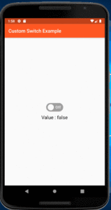
The above code will give us output like the below:

User can also give try with CupertinoSwitch Widget First user need to set bool value like a below:
bool _switchValue=true;
CupertinoSwitch(
             value: _switchValue,
             onChanged: (value) {
               setState(() {
                 _switchValue = value;
               });
             },
           ),
User Create Custom Switch Class like a below:
class CustomSwitch extends StatefulWidget {
    final bool value;
    final ValueChanged<bool> onChanged;

    CustomSwitch({
      Key key,
      this.value,
      this.onChanged})
      : super(key: key);

    @override
   _CustomSwitchState createState() => _CustomSwitchState();
}

class _CustomSwitchState extends State<CustomSwitch>
     with SingleTickerProviderStateMixin {
    Animation _circleAnimation;
    AnimationController _animationController;

    @override
    void initState() {
       super.initState();
      _animationController = AnimationController(vsync: this, duration: Duration(milliseconds: 60));
      _circleAnimation = AlignmentTween(
          begin: widget.value ? Alignment.centerRight : Alignment.centerLeft,
          end: widget.value ? Alignment.centerLeft :Alignment.centerRight).animate(CurvedAnimation(
          parent: _animationController, curve: Curves.linear));
    }

  @override
  Widget build(BuildContext context) {
      return AnimatedBuilder(
               animation: _animationController,
               builder: (context, child) {
                      return GestureDetector(
                             onTap: () {
                                 if (_animationController.isCompleted) {
                                     _animationController.reverse();
                                 } else {
                                     _animationController.forward();
                                 }
                                widget.value == false
                                     ? widget.onChanged(true)
                                     : widget.onChanged(false);
                              },
                             child: Container(
                                     width: 45.0,
                                     height: 28.0,
                                     decoration: BoxDecoration(
                                     borderRadius: BorderRadius.circular(24.0),
                                     color: _circleAnimation.value ==
                                             Alignment.centerLeft
                                           ? Colors.grey
                                           : Colors.blue,),
                                   child: Padding(
                                          padding: const EdgeInsets.only(
                                              top: 2.0, bottom: 2.0, right: 2.0, left: 2.0),
                                       child:  Container(
                                                 alignment: widget.value
                                                    ? Alignment.centerRight
                                                    : Alignment.centerLeft,
                                  child: Container(
                                          width: 20.0,
                                          height: 20.0,
                                          decoration: BoxDecoration(
                                                  shape: BoxShape.circle,
                                                  color: Colors.white),
                                          ),
                                   ),
                                ),
                            ),
                          );
                     },
               );
         }
       }
Call this class as a widget and use the value parameter to set the state of the switch.
_enable = false;

CustomSwitch(
   value: _enable,
   onChanged: (bool val){
      setState(() {
         _enabled = val;
      });
   },
),
There is also a custom switch button plugin available for the same.
Import a package like the below:
import 'package:custom_switch_button/custom_switch_button.dart';

bool isChecked = false;
The code snippet will look like the below:
return MaterialApp(
      home: Scaffold(
        appBar: AppBar(
          title: const Text('Custom Switch Button example app'),
        ),
        body: GestureDetector(
          onTap: () {
            setState(() {
              isChecked = !isChecked;
            });
          },
          child: Center(
            child: CustomSwitchButton(
              backgroundColor: Colors.blueGrey,
              unCheckedColor: Colors.white,
              animationDuration: Duration(milliseconds: 400),
              checkedColor: Colors.lightGreen,
              checked: isChecked,
            ),
          ),
        ),
      ),
    );
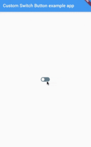
The above code will generate output like the below:

One more available for the plugin flutter_switch
Install these dependencies in pubspec.yaml
dependencies:
     flutter_switch: ^0.3.2
Import a package like the below:
import 'package:flutter_switch/flutter_switch.dart';
A simple code snippet will look like the below:
FlutterSwitch(
     height: 20.0,
     width: 40.0,
     padding: 4.0,
     toggleSize: 15.0,
     borderRadius: 10.0,
     activeColor: lets_cyan,
     value: isToggled,
     onToggle: (value) {
          setState(() {
                isToggled = value;
          });
     },
),
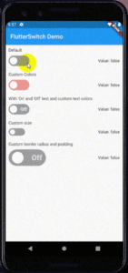
The above code will give us output like the below:

Conclusion:
In this article, We have been through How to Customize the Switch Button in a Flutter?
Drop us your valuable feedback to serve you better.
Thanks for Reading !!! Keep Fluttering !!!
FlutterAgency.com is our portal Platform dedicated to Flutter Technology and Flutter Developers. The portal is full of cool resources from Flutter like Flutter Widget Guide, Flutter Projects, Code libs and etc.
FlutterAgency.com is one of the most popular online portal dedicated to Flutter Technology and daily thousands of unique visitors come to this portal to enhance their knowledge on Flutter.
Contemporary ventures
Recent blog
ready to get started?
Fill out the form below and we will be in touch soon!
"*" indicates required fields


