")
Buttons Widgets- Flutter Widget Guide By Flutter Agency
")
What is the Button in Flutter?
Buttons Widget is a user interface control that is used to perform an action whenever the user clicks or tap on it.
There are certain types of different Buttons Widget used in a flutter. In this article, we will explore how to use Buttons Widget in a flutter. Basically there are three types of buttons in a flutter.
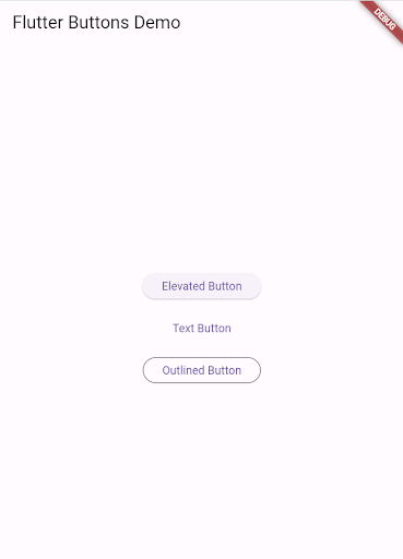
1. Elevated Button
2. Text Button
3. Outlined Button
1. Elevated Button
Elevated buttons add dimension to mostly flat layouts. They emphasize functions on busy or wide spaces. The elevation indicates that the button will prompt an action when pressed. In Flutter, the ElevatedButton widget is used for this purpose.
Example Code:
ElevatedButton(
 onPressed: () {
 // Your action code here
 print('Elevated Button Pressed');
 },
 child: Text('Elevated Button'),
)
2. Text Button
Text buttons are typically used for less-pronounced actions, including those located in dialogs and cards. In a layout, they are often used to represent the less important actions, blending into the content to appear as links.
Example Code:
TextButton(
 onPressed: () {
 // Your action code here
 print('Text Button Pressed');
 },
 child: Text('Text Button'),
)
3. Outlined Button
Outlined buttons are used for more emphasis than text buttons due to the stroke that surrounds the text or icon inside. They are often used for secondary actions, complementing a primary action represented by an Elevated Button.
Example Code:
OutlinedButton(
 onPressed: () {
 // Your action code here
 print('Outlined Button Pressed');
 },
 child: Text('Outlined Button'),
)
The complete source code for above all buttons can be found from below :
import 'package:flutter/material.dart';

void main() {
  runApp(MyApp());
}

class MyApp extends StatelessWidget {
  @override
  Widget build(BuildContext context) {
    return MaterialApp(
      home: Scaffold(
        appBar: AppBar(
          title: Text('Flutter Buttons Demo'),
        ),
        body: Center(
          child: Column(
            mainAxisSize: MainAxisSize.min,
            children: <Widget>[
              ElevatedButton(
                onPressed: () {
                  // Your action code for Elevated Button
                  print('Elevated Button Pressed');
                },
                child: Text('Elevated Button'),
              ),
              SizedBox(height: 20), // Adds space between the buttons
              TextButton(
                onPressed: () {
                  // Your action code for Text Button
                  print('Text Button Pressed');
                },
                child: Text('Text Button'),
              ),
              SizedBox(height: 20), // Adds space between the buttons
              OutlinedButton(
                onPressed: () {
                  // Your action code for Outlined Button
                  print('Outlined Button Pressed');
                },
                child: Text('Outlined Button'),
              ),
            ],
          ),
        ),
      ),
    );
  }
}
Output:
Conclusion:
In this article, we have learned about What is Button in Flutter along with How to use it in a Flutter?
Do let us know your suggestion/Feedback for this article.
We would love to assist you.
Keep Flirting Flutter !!!
Do let us know if you need any assistance with Flutter.
FlutterAgency.com is our portal Platform dedicated to Flutter Technology and Flutter Developers. The portal is full of cool resources from Flutter like Flutter Widget Guide, Flutter Projects, Code libs and etc.
FlutterAgency.com is one of the most popular online portal dedicated to Flutter Technology and daily thousands of unique visitors come to this portal to enhance their knowledge on Flutter.

Contemporary ventures
Recent blog


Join our newsletter
Read and share new topics about all things Tech.
ready to get started?
Fill out the form below and we will be in touch soon!
"*" indicates required fields