")

TextField Widget – Flutter Widget Guide By Flutter Agency
")
In this tutorial, we will implement TextField Widget in flutter and will learn about how to get data from TextField Widget in flutter.
What is TextField Widget in Flutter?
TextField Widget is used to get data from users and perform the desired operation.
Properties:
- controller: The controller will specify the name of the controller to handle the TextField Widget.
- hintText: To set hint text.
- hintStyle: To set style for hint.
- input type: To set the type of input keyboard whether it’s numeric or character.default input type is TextInputType.text but if the max line is one then TextInputType.multiline.
- inputAction: inputAction will specify what kind of action to request when a TextField is focused.
- helperText: helperText is a text that shows how the value will be used.
- labelText: labelText is a text that defines the purpose of the input type.
- autofocus: autofocus will have the boolean value true or false. If the user sets it true then that particular Textfield widget will get focus.
- maxlength: To fix the maximum number of characters in TextField.
- maxLines: maxLines will specify the maximum number of lines. The default value for maxLine is 1 but there is no limit to the number of lines text container will start with vertical available space for default one line.
How to use TextField Widget in a Flutter?
import 'package:flutter/material.dart';

void main() => runApp(MyApp());

class MyApp extends StatelessWidget {
  final TextEditingController nameController = TextEditingController();
  MyApp({Key? key}) : super(key: key);

  @override
  Widget build(BuildContext context) {
    return MaterialApp(
      title: 'Material App',
      home: Scaffold(
        appBar: AppBar(
          title: const Text('Material App Bar'),
        ),
        body: Center(
          child: TextField(
            controller: nameController,
            decoration: const InputDecoration(
              hintText: "Firstname",
              enabledBorder: OutlineInputBorder(
                borderSide: BorderSide(color: Colors.red),
              ),
              focusedBorder: OutlineInputBorder(
                borderSide: BorderSide(color: Colors.red),
              ),
              labelText: 'FirstName',
            ),
          ),
        ),
      ),
    );
  }
}
We will get output like below:
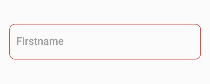
Simple TextField Widget
How to apply decoration to Textfield Widget in Flutter?
This is simple just Textfield users can customize it as per requirement by wrapping it into Container Widget. e.g. If we would like to add a prefix icon and suffix icon in it?
Don’t get tensed about it that’s pretty simple like below :
import 'package:flutter/material.dart';

void main() => runApp(MyApp());

class MyApp extends StatelessWidget {
  final TextEditingController nameController = TextEditingController();
  MyApp({Key? key}) : super(key: key);

  @override
  Widget build(BuildContext context) {
    return MaterialApp(
      title: 'Material App',
      home: Scaffold(
        appBar: AppBar(
          title: const Text('Material App Bar'),
        ),
        body: Center(
          child: TextField(
            controller: nameController,
            maxLength: 10,
            decoration: InputDecoration(
              hintText: "Firstname",
              enabledBorder: const OutlineInputBorder(
                borderSide: BorderSide(color: Colors.red),
              ),
              focusedBorder: const OutlineInputBorder(
                borderSide: BorderSide(color: Colors.red),
              ),
              labelText: 'FirstName',
              prefixIcon: const Icon(Icons.person),
              suffixIcon: IconButton(
                icon: const Icon(Icons.search),
                onPressed: () {},
              ),
            ),
          ),
        ),
      ),
    );
  }
}
So we will get output like below:
TextField with suffix icon and prefix icon
-
TextField Widget with Border Property
If you want to apply different types of border to Textfield then you have applied InputDecoration property in TextField.
Below is an example for enabledBorder in TextField.
TextField(
            controller: nameController,
            maxLength: 10,
            decoration: InputDecoration(
              hintText: "Firstname",
              enabledBorder: const OutlineInputBorder(
                borderSide: BorderSide(color: Colors.red),
              ),

              labelText: 'FirstName',
              prefixIcon: const Icon(Icons.person),
              suffixIcon: IconButton(
                icon: const Icon(Icons.search),
                onPressed: () {},
              ),
            ),
          ),
Below is an example for focusedBorder in TextField.
TextField(
            controller: nameController,
            maxLength: 10,
            decoration: InputDecoration(
              hintText: "Firstname",

              focusedBorder: const OutlineInputBorder(
                borderSide: BorderSide(color: Colors.green),
              ),
              labelText: 'FirstName',
              prefixIcon: const Icon(Icons.person),
              suffixIcon: IconButton(
                icon: const Icon(Icons.search),
                onPressed: () {},
              ),
            ),
          ),
With all these now our TextField will look like below :
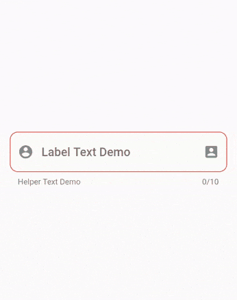
TextField Widget with enableBorder and focusedBorder
Here note that TextField is an underlying TextField without form integration. so, if you want to use Textfield with a form then TextFormField is required. because TextFormField is handy in Form validation, save, and reset the field. we will now take a look at it.
Below is an example for focusedBorder in it.
TextField(
            controller: nameController,
            maxLength: 10,
            decoration: InputDecoration(
              hintText: "Firstname",
              enabledBorder: const OutlineInputBorder(
                borderSide: BorderSide(color: Colors.red),
              ),
              focusedBorder: const OutlineInputBorder(
                borderSide: BorderSide(color: Colors.green),
              ),
              labelText: 'FirstName',
              prefixIcon: const Icon(Icons.person),
              suffixIcon: IconButton(
                icon: const Icon(Icons.search),
                onPressed: () {},
              ),
            ),
          ),
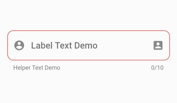
We will get output like below:

TextFormField with suffix and prefix icon
The complete source code for above all TextField is as follows :
First, define three controllers like this :
TextEditingController nameController = TextEditingController();
Now TextEditingController cityController = TextEditingController();
And TextEditingController accountController = TextEditingController();
Column(
          mainAxisAlignment: MainAxisAlignment.spaceBetween,
          children: <Widget>[
            Column(
              mainAxisAlignment: MainAxisAlignment.center,
              children: <Widget>[
                Padding(
                  padding: const EdgeInsets.all(6.0),
                  child: TextField(
	       controller : nameController,
                    keyboardType: TextInputType.text,
                    textInputAction: TextInputAction.next,
                    decoration: const InputDecoration(
                      focusColor: Colors.green,
                      enabledBorder: OutlineInputBorder(
                        borderRadius: BorderRadius.all(
                          Radius.circular(10.0),
                        ),
                        borderSide: BorderSide(
                          color: Colors.red,
                          width: 1,
                        ),
                      ),
                      focusedBorder: OutlineInputBorder(
                        borderRadius: BorderRadius.all(
                          Radius.circular(10.0),
                        ),
                        borderSide: BorderSide(
                          color: Colors.green,
                        ),
                      ),
                      hintText: "Firstname",
                      fillColor: Colors.red,
                    ),
                    onChanged: (str) {
                      // To Do
                    },
                    onSubmitted: (str) {
                      // To Do
                    },
                  ),
                ),
                // Textfield with Suffix and Prefix
                Padding(
                  padding: const EdgeInsets.all(5.0),
                  child: TextField(
	        controller : cityController,
                    keyboardType: TextInputType.text,
                    textInputAction: TextInputAction.next,
                    maxLength: 10,
                    decoration: const InputDecoration(
                      focusColor: Colors.green,
                      enabledBorder: OutlineInputBorder(
                        borderRadius: BorderRadius.all(
                          Radius.circular(10.0),
                        ),
                        borderSide: BorderSide(
                          color: Colors.red,
                          width: 1,
                        ),
                      ),
                      helperText: "Helper Text Demo",
                      labelText: "Label Text Demo",
                      focusedBorder: OutlineInputBorder(
                        borderRadius: BorderRadius.all(
                          Radius.circular(10.0),
                        ),
                        borderSide: BorderSide(
                          color: Colors.green,
                        ),
                      ),
                      prefixIcon: Icon(
                        Icons.account_circle,
                        color: Colors.black45,
                      ),
                      suffixIcon: Icon(
                        Icons.account_box,
                        color: Colors.black45,
                      ),
                      hintText: "Firstname",
                      fillColor: Colors.red,
                    ),
                    onChanged: (str) {
                      // To do
                    },
                    onSubmitted: (str) {
                      // To do
                    },
                  ),
                ),
                // Textform Field
                Padding(
                  padding: const EdgeInsets.all(6.0),
                  child: TextFormField(
                    maxLength: 12,
                    autofocus: false,
                    textAlign: TextAlign.start,
	        controller : accountController,
                    keyboardType: TextInputType.text,
                    textInputAction: TextInputAction.next,
                    decoration: InputDecoration(
                      labelText: "labelTxt",
                      helperText: "helperTxt",
                      contentPadding: const EdgeInsets.all(15.0),
                      prefixIcon: const Icon(
                        Icons.account_circle,
                        color: Colors.black45,
                      ),
                      suffixIcon: const Icon(
                        Icons.account_box,
                        color: Colors.black45,
                      ),
                      disabledBorder: OutlineInputBorder(
                        borderRadius: BorderRadius.circular(28.0),
                        borderSide: const BorderSide(
                          color: Color(0xFF26b78b),
                        ),
                      ),
                      enabledBorder: OutlineInputBorder(
                        borderRadius: BorderRadius.circular(28.0),
                        borderSide: const BorderSide(
                          color: Color(0xFF26b78b),
                        ),
                      ),
                      focusedErrorBorder: OutlineInputBorder(
                        borderRadius: BorderRadius.circular(28.0),
                        borderSide: const BorderSide(
                          color: Color(0xFF26b78b),
                        ),
                      ),
                      errorBorder: OutlineInputBorder(
                        borderRadius: BorderRadius.circular(28.0),
                        borderSide: const BorderSide(
                          color: Color(0xFF26b78b),
                        ),
                      ),
                      hintText: "Firstname",
                      focusedBorder: OutlineInputBorder(
                        borderRadius: BorderRadius.circular(28.0),
                        borderSide: const BorderSide(
                          color: Color(0xFF26b78b),
                        ),
                      ),
                      focusColor: Colors.green,
                    ),
                    onChanged: (str) {
                      // To do
                    },
                    onSaved: (str) {
                      //  To do
                    },
                  ),
                ),
              ],
            ),
          ],
        ),
So the Screenshot for all TextField will look like below :
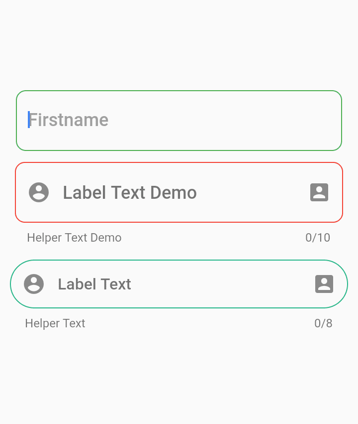
All TextField in a screen
Conclusion:
So in this article, we have been through What is TextField in Flutter along with how to use it in a Flutter Mobile Application.
Do let us know if you need any assistance regarding flutter.
Keep Reading !!!

Contemporary ventures
Recent blog


Join our newsletter
Read and share new topics about all things Tech.
ready to get started?
Fill out the form below and we will be in touch soon!
"*" indicates required fields
1 comment