")
How to Display a Circular Timer in Flutter?
")
You can make stunning, native-looking apps for Android and iOS using the popular cross-platform Flutter mobile app programming framework. Circular timer creation is just one of the numerous things you can accomplish with Flutter. A countdown clock or a stopwatch are two examples of circular timers that are excellent for displaying the amount of time left on a job.
In Flutter, there are some different methods to build a circular timer. This article will teach you how to design a circular clock in Flutter. In addition, you will know how to change the timer’s look. You can learn more about displaying a circular timer in Flutter by reading the tutorial below.
Developing a Custom Circular Timer in Flutter
There are several methods in Flutter for displaying a circular timer outside the circular_countdown_timer package. As an illustration, you might make a circular progress bar using the RadialGauge widget. The circular_countdown_timer box, on the other hand, is a more specialized widget made just for showing countdown timers. You may make a customized circular timer by following the instructions in this article after installing Flutter:
import 'package:flutter/material.dart';
import 'package:circular_countdown_timer/circular_countdown_timer.dart';
void main() {
runApp(const MyApp());
}
class MyApp extends StatelessWidget {
const MyApp({super.key});
@override
Widget build(BuildContext context) {
return MaterialApp(
title: 'Flutter Demo',
theme: ThemeData(
primarySwatch: Colors.blue,
),
home: const HomePage(),
debugShowCheckedModeBanner: false,
);
}
}
class HomePage extends StatefulWidget {
const HomePage({super.key});
@override
State<HomePage> createState() => _HomePageState();
}
class _HomePageState extends State<HomePage> {
final int _duration = 10;
final CountDownController _controller = CountDownController();
@override
Widget build(BuildContext context) {
return Scaffold(
appBar: AppBar(
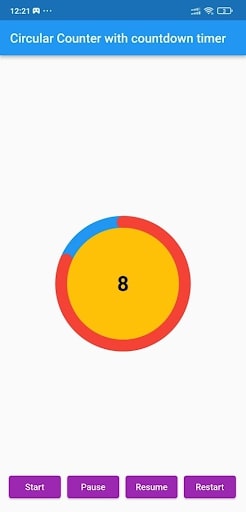
title: const Text("Circular Counter with countdown timer"),
),
body: Center(
child: CircularCountDownTimer(
// Countdown duration in Seconds.
duration: _duration,
// Countdown initial elapsed Duration in Seconds.
initialDuration: 0,
// Controls (i.e., Start, Pause, Resume, Restart) the Countdown Timer.
controller: _controller,
// Width of the Countdown Widget.
width: MediaQuery.of(context).size.width / 2,
// Height of the Countdown Widget.
height: MediaQuery.of(context).size.height / 2,
// Ring Color for Countdown Widget.
ringColor: Colors.blue,
// Ring Gradient for Countdown Widget.
ringGradient: null,
// Filling Color for Countdown Widget.
fillColor: Colors.red,
// Filling Gradient for Countdown Widget.
fillGradient: null,
// Background Color for Countdown Widget.
backgroundColor: Colors.amber,
// Background Gradient for Countdown Widget.
backgroundGradient: null,
// Border Thickness of the Countdown Ring.
strokeWidth: 20.0,
// Begin and end contours with a flat edge and no extension.
strokeCap: StrokeCap.round,
// Text Style for Countdown Text.
textStyle: const TextStyle(
fontSize: 33.0,
color: Colors.black,
fontWeight: FontWeight.bold,
),
// Format for the Countdown Text.
textFormat: CountdownTextFormat.S,
// Handles Countdown Timer (true for Reverse Countdown (max to 0), false for Forward Countdown (0 to max)).
isReverse: true,
// Handles Animation Direction (true for Reverse Animation, false for Forward Animation).
isReverseAnimation: true,
// Handles visibility of the Countdown Text.
isTimerTextShown: true,
// Handles the timer start.
autoStart: true,
// This Callback will execute when the Countdown Starts.
onStart: () {
// Here, do whatever you want
debugPrint('Started Countdown');
},
// This Callback will execute when the Countdown Ends.
onComplete: () {
// Here, do whatever you want
debugPrint('Ended Countdown');
},
// This Callback will execute when the Countdown Changes.
onChange: (String timeStamp) {
// Here, do whatever you want
debugPrint('Changed Countdown $timeStamp');
},
),
),
);
}
}
- Function to format the text.
- Allows you to format the current duration to any String.
- It also provides the default function in case you want to format specific moments as in reverse when reaching ‘0’ show ‘GO,’ and for the rest of the instances, follow the default behavior.
Inside the CircularCountDownTimer we have to add these below lines:
 timeFormatterFunction: (defaultFormatterFunction, duration) {
            if (duration.inSeconds == 0) {
              // only format for '0'
              return "Start";
            } else {
              // other durations by it's default format
              return Function.apply(defaultFormatterFunction, [duration]);
            }
          },
Add inside the scaffold widget to control the counter
floatingActionButton: Row(
        mainAxisAlignment: MainAxisAlignment.center,
        children: [
          const SizedBox(
            width: 30,
          ),
          _button(
            title: "Start",
            onPressed: () => _controller.start(),
          ),
          const SizedBox(
            width: 10,
          ),
          _button(
            title: "Pause",
            onPressed: () => _controller.pause(),
          ),
          const SizedBox(
            width: 10,
          ),
          _button(
            title: "Resume",
            onPressed: () => _controller.resume(),
          ),
          const SizedBox(
            width: 10,
          ),
          _button(
            title: "Restart",
            onPressed: () => _controller.restart(duration: _duration),
          ),
        ],
      ),
Function return button
Widget _button({required String title, VoidCallback? onPressed}) {
    return Expanded(
      child: ElevatedButton(
        style: ButtonStyle(
          backgroundColor: MaterialStateProperty.all(Colors.purple),
        ),
        onPressed: onPressed,
        child: Text(
          title,
          style: const TextStyle(color: Colors.white),
        ),
      ),
    );
  }
Example
import 'package:flutter/material.dart';
import 'package:circular_countdown_timer/circular_countdown_timer.dart';


void main() {
  runApp(const MyApp());
}


class MyApp extends StatelessWidget {
  const MyApp({super.key});


  @override
  Widget build(BuildContext context) {
    return MaterialApp(
      title: 'Flutter Demo',
      theme: ThemeData(
        primarySwatch: Colors.blue,
      ),
      home: const HomePage(),
      debugShowCheckedModeBanner: false,
    );
  }
}


class HomePage extends StatefulWidget {
  const HomePage({super.key});


  @override
  State<HomePage> createState() => _HomePageState();
}


class _HomePageState extends State<HomePage> {
  final int _duration = 10;
  final CountDownController _controller = CountDownController();


  @override
  Widget build(BuildContext context) {
    return Scaffold(
      appBar: AppBar(
        title: const Text("Circular Counter with countdown timer"),
      ),
      body: Center(
        child: CircularCountDownTimer(
          timeFormatterFunction: (defaultFormatterFunction, duration) {
            if (duration.inSeconds == 0) {
              // only format for '0'
              return "Start";
            } else {
              // other durations by it's default format
              return Function.apply(defaultFormatterFunction, [duration]);
            }
          },


          // Countdown duration in Seconds.
          duration: _duration,


          // Countdown initial elapsed Duration in Seconds.
          initialDuration: 0,


          // Controls (i.e., Start, Pause, Resume, Restart) the Countdown Timer.
          controller: _controller,


          // Width of the Countdown Widget.
          width: MediaQuery.of(context).size.width / 2,


          // Height of the Countdown Widget.
          height: MediaQuery.of(context).size.height / 2,


          // Ring Color for Countdown Widget.
          ringColor: Colors.blue,


          // Ring Gradient for Countdown Widget.
          ringGradient: null,


          // Filling Color for Countdown Widget.
          fillColor: Colors.red,
          // Filling Gradient for Countdown Widget.
          fillGradient: null,


          // Background Color for Countdown Widget.
          backgroundColor: Colors.amber,


          // Background Gradient for Countdown Widget.
          backgroundGradient: null,


          // Border Thickness of the Countdown Ring.
          strokeWidth: 20.0,


          // Begin and end contours with a flat edge and no extension.
          strokeCap: StrokeCap.round,


          // Text Style for Countdown Text.
          textStyle: const TextStyle(
            fontSize: 33.0,
            color: Colors.black,
            fontWeight: FontWeight.bold,
          ),


          // Format for the Countdown Text.
          textFormat: CountdownTextFormat.S,


          // Handles Countdown Timer (true for Reverse Countdown (max to 0), false for Forward Countdown (0 to max)).
          isReverse: true,


          // Handles Animation Direction (true for Reverse Animation, false for Forward Animation).
          isReverseAnimation: true,


          // Handles visibility of the Countdown Text.
          isTimerTextShown: true,


          // Handles the timer start.
          autoStart: true,


          // This Callback will execute when the Countdown Starts.
          onStart: () {
            // Here, do whatever you want
            debugPrint('Started Countdown');
          },


          // This Callback will execute when the Countdown Ends.
          onComplete: () {
            // Here, do whatever you want
            debugPrint('Ended Countdown');
          },


          // This Callback will execute when the Countdown Changes.
          onChange: (String timeStamp) {
            // Here, do whatever you want
            debugPrint('Changed Countdown $timeStamp');
          },
        ),
      ),
      floatingActionButton: Row(
        mainAxisAlignment: MainAxisAlignment.center,
        children: [
          const SizedBox(
            width: 30,
          ),
          _button(
            title: "Start",
            onPressed: () => _controller.start(),
          ),
          const SizedBox(
            width: 10,
          ),
          _button(
            title: "Pause",
            onPressed: () => _controller.pause(),
          ),
          const SizedBox(
            width: 10,
          ),
          _button(
            title: "Resume",
            onPressed: () => _controller.resume(),
          ),
          const SizedBox(
            width: 10,
          ),
          _button(
            title: "Restart",
            onPressed: () => _controller.restart(duration: _duration),
          ),
        ],
      ),
    );
  }


  Widget _button({required String title, VoidCallback? onPressed}) {
    return Expanded(
      child: ElevatedButton(
        style: ButtonStyle(
          backgroundColor: MaterialStateProperty.all(Colors.purple),
        ),
        onPressed: onPressed,
        child: Text(
          title,
          style: const TextStyle(color: Colors.white),
        ),
      ),
    );
  }
}
Output
Why Should You Display a Circular Timer in Flutter?
You can choose to show a circular timer in Flutter for various reasons. Here are some of the most typical causes:
1. To start the countdown to an upcoming event. The most typical application for circular timers is this. They help count down to the beginning of a presentation, the end of a timer, or any other event you wish to keep track of.
2. To provide user feedback. The user can receive feedback about the passing of time through circular timers. This is advantageous when performing duties like preparing meals or watching for a bus.
2. For a visual component for your app. Circular timers may provide an optical element to your app that will increase its aesthetic appeal and make it more engaging.
Hire Flutter developer to create a circular timer. It is an excellent alternative if you are searching for a way to show the passing of time in your Flutter project. They are versatile, easy to use, and serve several functions.
Conclusion
The article has shown how to display a circular timer in Flutter. First, you will set up the widget to show a circular countdown timer from the circular_countdown_timer package. It can also utilize the widget to exhibit a ten-second countdown timer by creating a simple example. By defining the colors, border width, and text style, the article also provided information on how to alter the timer’s visual look.
Connect with the top Flutter app development company for your project if you want to create mobile apps with the circular timer for your business. But if you’re still unclear and want more information about the Flutter framework, browse our blogs!
Frequently Asked Questions (FAQs)
1. How is a dart timer used?
The timer starts at the given duration and counts down to 0. The given callback function is called when the timer approaches zero. To repeatedly count down the same interval, use a periodic timer. The same rules apply to negative durations as to durations of 0.
2. How can I create a widget with a countdown timer?
Press the addition (+) sign in the top left corner to add a widget. A Countdown widget can be selected. Click Add Widget. Please tap on the widget once it shows on your Home Screen.
3. What does Flutter’s circle indicator mean?
The CircularProgressIndicator widget uses a circle to represent progress. It can be used as a progress indicator for determined and indeterminate work. The value attribute must be left empty or unspecified to create an indeterminate progress indicator in Flutter.

Contemporary ventures
Recent blog


Join our newsletter
Read and share new topics about all things Tech.
ready to get started?
Fill out the form below and we will be in touch soon!
"*" indicates required fields