")
Enhance User Experience with the SwitchListTile Widget in Flutter
")
Discover how the SwitchListTile widget in Flutter can enhance your app’s user experience. Learn how to effectively implement this powerful widget, customize its functionality, and hire skilled Flutter developers from flutteragency.com to take your app to the next level.
The SwitchListTile widget in Flutter is a valuable tool that allows developers to create interactive and visually appealing toggles within their apps. This article, brought to you by FlutterAgency.com, will guide you through the usage and implementation of the SwitchListTile widget, providing insights into its properties and features.
Understanding the SwitchListTile Widget
The SwitchListTile widget in Flutter is essential for conveying user choices and representing the current setup and state of an app. It consists of various components such as text widgets, rows, columns, and containers, all of which play specific roles in creating a well-designed user interface.
Why Use the SwitchListTile Widget in Flutter?
The SwitchListTile widget is crucial in ensuring that app components are updated according to the screen perspective. By leveraging the SwitchListTile widget, developers can effectively manage code execution and make informed decisions based on user interactions. The structure of the widget encompasses widgets such as columns, text, and more, allowing for seamless integration into the app’s user interface.
Key Properties of the SwitchListTile Widget
Let’s explore the essential properties of the SwitchListTile widget in Flutter:
1. Value: This property determines whether the switch is checked or unchecked.
2. onChanged: By utilizing the onChanged property, developers can define callback functions that handle state changes and control the opening and closing of options.
3. Active Color: This property enables the customization of the background color when the switch is in the “ON” state.
4. Active Track Color: This property allows for changing the color of the sliding track when the switch is selected.
5. Active Thumb Image: With this property, developers can choose a custom image to represent the thumb of the slider when it is in the “ON” state.
6. Inactive Thumb Image: This property defines the image displayed when the slider is unchecked.
7. Title: The title property represents the main text associated with the SwitchListTile.
8. Subtitle: The subtitle property displays additional text below the title, typically in a smaller font.
9. Secondary: This property positions a widget on the left side, providing additional information or functionality.
Improving Clarity and Coherence
To enhance the clarity and coherence of the article, it is important to eliminate redundant information and provide concise explanations. Additionally, the article should focus solely on the SwitchListTile widget and avoid mentioning irrelevant topics.
Including Practical Examples
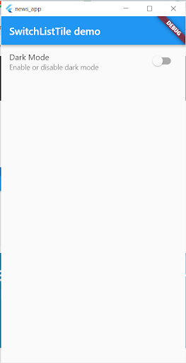
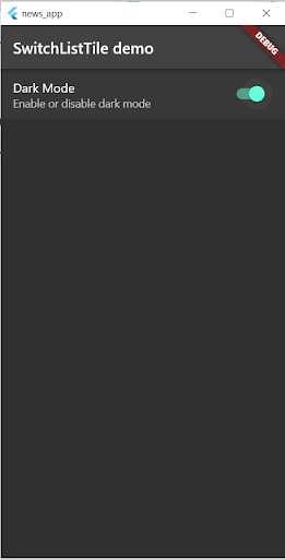
To facilitate understanding, let’s examine a practical example of utilizing the SwitchListTile widget. Suppose we want to create a settings page where users can toggle a dark mode switch. Here’s how we can achieve this:
SwitchListTile(
  title: Text('Dark Mode'),
  subtitle: const Text('Enable or disable dark mode'),
  value: isDarkMode,
  onChanged: (value) {
    setState(() {
      isDarkMode = value;
    });
  },
)
This example demonstrates the basic implementation of the SwitchListTile widget for a dark mode toggle switch. The isDarkMode variable tracks the state of the switch, and the onChanged callback function updates the state when the switch is toggled.
Full Example
import 'package:flutter/material.dart';

void main() {
  runApp(const MyApp());
}

class MyApp extends StatefulWidget {
  const MyApp({super.key});

  @override
  State createState() => _MyAppState();
}

class _MyAppState extends State {
  // This boolean will be used to toggle between themes
  bool isDarkMode = false;

  // Method to toggle the theme
  void toggleTheme(bool isOn) {
    setState(() {
      isDarkMode = isOn;
    });
  }

  @override
  Widget build(BuildContext context) {
    return MaterialApp(
      title: 'SwitchListTile Example',
      theme: isDarkMode ? ThemeData.dark() : ThemeData.light(),
      home: SettingsScreen(toggleTheme: toggleTheme, isDarkMode: isDarkMode),
    );
  }
}

class SettingsScreen extends StatelessWidget {
  final Function(bool) toggleTheme;
  final bool isDarkMode;

  const SettingsScreen(
      {super.key, required this.toggleTheme, required this.isDarkMode});

  @override
  Widget build(BuildContext context) {
    return Scaffold(
      appBar: AppBar(
        title: const Text("SwitchListTile demo"),
      ),
      body: ListView(
        children: [
          SwitchListTile(
            value: isDarkMode,
            title: const Text('Dark Mode'),
            subtitle: const Text('Enable or disable dark mode'),
            onChanged: (value) {
              toggleTheme(value);
            },
          ),
        ],
      ),
    );
  }
}
Output
Conclusion
The SwitchListTile widget in Flutter provides a powerful tool for enhancing user experience by incorporating interactive and visually appealing toggles into your app. By understanding the widget’s properties and implementing it effectively, you can create a seamless and intuitive user interface. To hire skilled Flutter developers who can assist you in implementing advanced features and taking your app to the next level, visit FlutterAgency.com. Remember to focus on the user experience and make the most of the SwitchListTile widget’s capabilities.
Thus, in that scenario, you can also connect with award-winning Flutter app development company who will make your app run smoothly with their skills and efforts.
Frequently Asked Questions (FAQs)
1. Why is the ListTile in Flutter used?
It is usually used to populate scrollable views like Column, Row, and ListView. For instance, you can also use ListTile to view the loss of to-do items, emails, etc. Hence, you can also receive the click event by clicking the ListTile.
2. What is the use of Switch in Flutter development?
Since it does not keep track of the State, Flutter’s Switch widget is used to change between two alternatives, either On or Off. However, to maintain the states, it would call an onChanged functionality. Hence, if the value being returned by this property is true, then the Switch is ON, and if call the value false, it is OFF.
3. What is the hot reload in the Flutter app?
This feature allows you to edit the CSS files while the application is running, and the changes are immediately implemented as you type. Hot reload is also supported while using Visual Studio to begin your web application without any debugger.

Contemporary ventures
Recent blog


Join our newsletter
Read and share new topics about all things Tech.
ready to get started?
Fill out the form below and we will be in touch soon!
"*" indicates required fields