")
How to use the ElevatedButton widget in Flutter?
")
This article will give examples of using the ElevatedButton widget in Flutter, starting with the most fundamental usage. It is the perfect example written by our Flutter experts, who have vast experience developing Flutter apps.
One of the buttons in Material Design in Flutter web is called Elevated Button has the feature of rising in elevation as the user presses it. Use the ElevatedButton widget in Flutter if you need to construct a Material Design elevated button.
When tapped by the user, these buttons’ primary feature is a small elevation of their surface toward the screen. Simply put, elevated buttons are raised, non-deprecated buttons without a clearly defined button style.
There are two parameters. It goes without saying that you must transmit a Widget as a child, usually a Text or an Icon widget. Additionally, you must pass the onPressed callback, which is triggered when a button is pressed by the user.
A static factory function ElevatedButton.icon makes it simpler for you to create an elevated button that has both Icon and Text widgets. For each icon and label, you must pass a Widget rather than a child.
This constructor can be used to create an ElevatedButton.
ElevatedButton(
{Key? key,
required VoidCallback? onPressed,
VoidCallback? onLongPress,
ValueChanged<bool>? onHover,
ValueChanged<bool>? onFocusChange,
ButtonStyle? style,
FocusNode? focusNode,
bool autofocus = false,
Clip clipBehavior = Clip.none,
MaterialStatesController? statesController,
required Widget? child}
)
What are the properties of an ElevatedButton?
1. autofocus:
It delivers a boolean value that corresponds to the button’s initial focus of Flutter.
2. clipBehaviour :
Whether or not the content is clipped is determined by clipBehavior.
3. focusNode:
Depicts the widget’s focus node.
4. ButtonStyle style:
Determines how the button will be styled
5. onLongPress :
When the button is long-pressed by the user, an action is to be taken called onLongPress.
6. enabled :
Gives a boolean value for the button’s activity called “enabled”
7. hashcode :
The button’s hashcode is determined by the hashcode.
8. onFocusChanged :
When a button’s focus changes, a method called onFocusChanged is called.
9. onHover :
The action that will be carried out when the user hovers over the button.
Also, Read This Post:
Best Flutter Application Development Tools in 2022
Example:
import 'package:flutter/material.dart';
void main() {
  runApp(const MyApp());
}
class MyApp extends StatelessWidget {
  const MyApp({super.key});
  @override
  Widget build(BuildContext context) {
    return const MaterialApp(
      home: MyHomePage(),
    );
  }
}
class MyHomePage extends StatefulWidget {
  const MyHomePage({
    super.key,
  });
  @override
  State<MyHomePage> createState() => _MyHomePageState();
}
class _MyHomePageState extends State<MyHomePage> {
  @override
  Widget build(BuildContext context) {
    return Scaffold(
        body: Column(
      mainAxisAlignment: MainAxisAlignment.center,
      crossAxisAlignment: CrossAxisAlignment.center,
      children: [
        ElevatedButton(
          style: ElevatedButton.styleFrom(
            minimumSize: const Size(88, 36),
            padding: const EdgeInsets.symmetric(horizontal: 16),
            shape: const RoundedRectangleBorder(
             borderRadius: BorderRadius.all(Radius.circular(2)),
            ),
          ),
          onPressed: () {},
          child: const Text('Looks like a RaisedButton'),
        ),
        ElevatedButton(
          style: ElevatedButton.styleFrom(),
          onPressed: () {},
          child: const Text('ElevatedButton with custom foreground/background'),
        ),
        ElevatedButton(
          style: ElevatedButton.styleFrom(backgroundColor: Colors.red),
          onPressed: null,
          child: const Text('ElevatedButton with custom disabled colors'),
        ),
        ElevatedButton(
          style: ButtonStyle(
      backgroundColor: MaterialStateProperty.resolveWith<Color>(
                (Set<MaterialState> states) {
          if (states.contains(MaterialState.disabled)) return Colors.red;
              return Colors.blue; // Defer to the widget's default.
            }),
     foregroundColor: MaterialStateProperty.resolveWith<Color>(
                (Set<MaterialState> states) {
              if (states.contains(MaterialState.disabled)) return Colors.blue;
              return Colors.blue; // Defer to the widget's default.
            }),
          ),
          onPressed: null,
          child: const Text('ElevatedButton with custom disabled colors'),
        ),
        ElevatedButton(
          style: ButtonStyle(
          elevation: MaterialStateProperty.resolveWith<double>(
                (Set<MaterialState> states) {
              if (states.contains(MaterialState.pressed)) return 16;
              return 10;
            }),
          ),
          onPressed: () {},
          child: const Text('ElevatedButton with a custom elevation'),
        )
      ],
    ));
  }
}
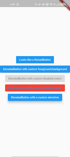
Output:
Conclusion :
So, in this article, we learned how to use the ElevatedButton widget. You can change and update this Flutter code according to your requirement. I hope you liked reading this.
Flutter is the best choice to develop your business apps. Adopt a Flutter app development company to build your dream Flutter mobile application.
Frequently Asked Questions (FAQs)
1. Which is the essential argument for an ElevatedButton in Flutter?
You can make the ElevatedButton in the Flutter by calling the constructor. Usually, there are two kinds of parameters. First, you must pass the widget as a child and the text or icon. You also have to give the onPressed Callback that is called when the user presses the button.
2. How do you increase the size of a widget in Flutter app development?
You can utilize the LayoutBuilder, which will fetch a parent widget’s dimension and will adjust the children’s widget dimension according to the parent.
3. How do you give the style to an ElevatedButton in a Flutter project?
You can not provide the style to ElevatedButtons in Flutter. You cannot modify the button’s color, font size, etc. Explicitly like raised buttons. You can pass the text or icons as a child widget to them.

Contemporary ventures
Recent blog


Join our newsletter
Read and share new topics about all things Tech.
ready to get started?
Fill out the form below and we will be in touch soon!
"*" indicates required fields