")
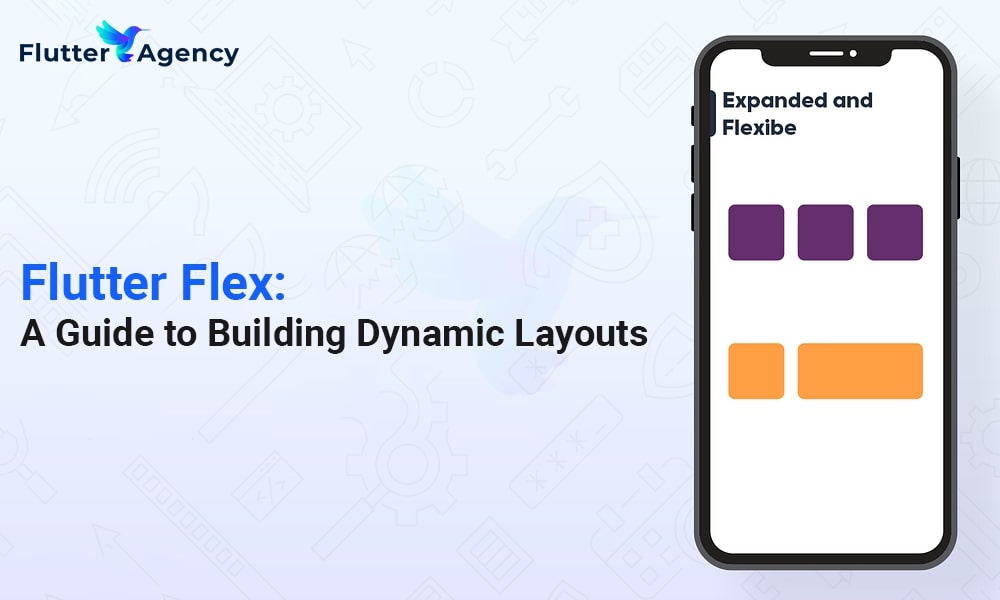
Building Dynamic Layouts with Flutter Flex
")
With the Flutter framework’s contaFlutter Flex widget, programmers can easily create adaptive and responsive user interfaces. Flutter Flex helps Flutter app developers quickly and easily create visually appealing and adaptive user interfaces because of its simple features and functionalities.
With the help of the powerful tool known as Flutter Flex, you can build responsive layouts that modify themselves to fit various screen sizes and orientations.
Dive into the depths of Flutter Flex to learn how to use the flexible widget in a flutter.
Overview of Flutter Flex
Flutter’s Flexible widget is a powerful tool for developing mobile applications with dynamic and changeable user interfaces.The Flexible widget allows you to specify in the layout exactly how much space a widget can take up. It allocates the accessible space among the widgets in the layout equally.
Alternatively, you can utilize flex factors to define how much space each widget should use if you have many widgets wrapped in Flexible. Widgets will occupy more screen space with more considerable flex factors than those with smaller flex factors.
It implies that you won’t need to bother about manually changing dynamic user interfaces any longer.
Flutter Flex Widget properties
Through several available parameters, Flutter’s Flexible widget gives users excellent control over the look and behavior of flexible layouts. The following are some of the most advantageous traits:
1. Flex:
The flex property of each Flexible widget in a container border flutter determines how the available space should be proportionally distributed among the Flexible widgets. Flex settings determine how widgets compete for screen space, with higher values encouraging more aggressive behavior than lower values.
2. Fit:
Specifies how the widget should be positioned with the available space. FlexFit is a setting to FlexFit.tight to force the widget to occupy all available at FlexFit .loose so the widget can choose its size depending on its inherent dimensions.
3. Child:
Defines the widget’s child inside the Flexible widget. As a result, you may create complex, flexible layouts by overlaying more widgets.
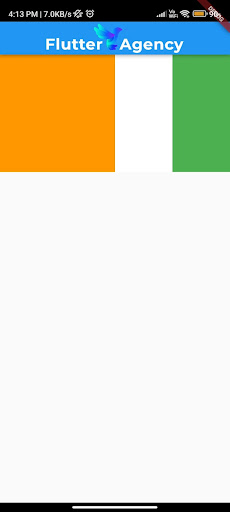
Using Flex in a Flutter
Let’s go through a short example to further understand how to use the Flex widget in Flutter.
Consider making a row of three widgets, with the middle widget occupying twice as much space as the other two. Here’s how you can do that with Flex:
Example:
Column(
 crossAxisAlignment: CrossAxisAlignment.stretch, // Ensures children stretch along the cross-axis
 children: [
   Flexible(
     child: Container(
       color: Colors.orange,
       width: 200,
       height: 100,
     ),
   ),
   Flexible(
     fit: FlexFit.loose, // This child will take only its intrinsic height
     child: Container(
       color: Colors.white,
       width: 200,
       height: 200,
     ),
   ),
   Flexible(
     child: Container(
       color: Colors.green,
       width: 200,
       height: 100,
     ),
   ),
 ],
)
Output:
The child widgets are arranged horizontally using the Row widget in the above example. We surround each child widget with Flexible inside the Row.
The relative sizes of the child widgets are managed by setting the flex attribute of the Flexible widget. In this case, the middle widget’s flex value is 2, while the values for the other two widgets are 1 and 2. This will result in the middle widget taking up twice as much area as the other two, giving the intended arrangement a visual representation.
The Container widgets inside each Flexible determine the appearance and height of the widgets. You can alter their sizes, colors, or other characteristics depending on your needs.
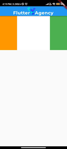
Example of FlexFit.tight in a Row
Consider creating a dynamic user interface with a core widget that grows to fill the available space. However, two-sided widgets maintain their fixed widths.
Let’s create a unique layout for a music player app:
To start, we’ll build one with FlexFit.tight. The Row widget places the album cover on the left, the playback controls in the middle, and the audio visualization on the right, all three containers arranged horizontally.
The container for the playback controls is equipped with the Flexible widget with FlexFit.tight. As a result, it can dynamically expand and take up all of the available horizontal space, becoming the focal point of the layout.
The following example demonstrates how FlexFit.tight in Flutter flex enables the creation of dynamic and aesthetically beautiful layouts in Flutter, where some widgets can change and expand to fill available while preserving a fixed width for additional widgets.
Example
Row(
  children: [
    Flexible(
      child: Container(
        color: Colors.orange,
        height: 200,
        width: 100, // Set a fixed width to demonstrate the effect
      ),
    ),
    Flexible(
      fit: FlexFit.tight, // This child will occupy all available space
      child: Container(
        color: Colors.white,
        height: 200,
      ),
    ),
    Flexible(
      child: Container(
        color: Colors.green,
        height: 200,
        width: 100, // Set a fixed width to demonstrate the effect
      ),
    ),
  ],
)
Output
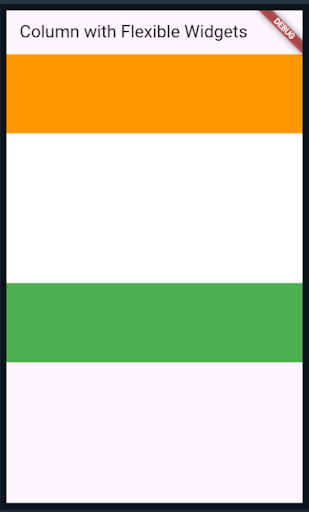
Example of FlexFit.loose in a Column
Define the flexible layout using Flexible and FlexFit.loose after importing the necessary package and creating the appropriate widget.
Each container maintains its original dimensions using FlexFit.loose based on width and height parameters. On the Column, the containers are positioned evenly.
Three containers are arranged vertically using Columns. FlexFit is used to wrap each container in Flexible.loose.
Each container keeps its original sizes using FlexFit.loose based on width and height parameters. The containers are set to be vertically aligned in the Column’s centre using the MainAxisAlignment. centre property.
When the application is running, you will see a column layout with three equal-sized containers and a different backdrop color (blue, green, or red).
This illustration shows how FlexFit.loose enables containers to maintain their original size within a flexible column layout, generating a UI design that is visually appealing and perfectly aligned.
Example
Column(
  crossAxisAlignment: CrossAxisAlignment.stretch, // Ensures children stretch along the cross-axis
  children: [
    Flexible(
      child: Container(
        color: Colors.orange,
        width: 200,
        height: 100,
      ),
    ),
    Flexible(
      fit: FlexFit.loose, // This child will take only its intrinsic height
      child: Container(
        color: Colors.white,
        width: 200,
        height: 200,
      ),
    ),
    Flexible(
      child: Container(
        color: Colors.green,
        width: 200,
        height: 100,
      ),
    ),
  ],
)
Output

Expanded vs. Flexible Flutter
Flexible
Objective: Flexibility in space sharing is provided.
Parent: It applies to a variety of layout widgets.
Flexibility: Flexibility can be altered
Flex Fit: Customizable fit (tight or loose)
Height and Width: It can be adjusted for flexibility in either direction.
Minimum Size: Can be made that occupies up the least amount of room using fit: FlexFit.loose
Maximum Size: Other widgets or constraints may impose a size restriction.
Use Case: It offers greater flexibility when distributing space among widgets.
Flexibility: Greater adaptability in space sharing and adjusting widget sizes
Expanded
Objective: Expands to take up all available area as its goal
Parent: Must be a direct descendant of a Flex
Flex Fit: Always be a tight fit (FlexFit.tight)
Flex Factor: Obtain a flex factor of 1 automatically
Height or Width: Expands both horizontally and vertically in width and height
Minimum Size: Takes up a minimal amount of space if the content is more minor.
Maximum Size: It will expand if the content is larger than the available space.
Use Case: Ideal for making equal-sized widgets in a Flex application.
Flexibility: Space sharing is less versatile.
Tips for Creating the Best Use of Flex Flutter
- Nested flexible widgets can be used to build more complex and flexible layouts. This makes it possible to precisely manage how much space is distributed across child widgets. Creating sophisticated layout designs that adapt effectively to multiple screen sizes is possible by stacking Flexible widgets with varied flex factors.
- Flex Flutter can be used in combination with layout widgets like Row, Column, and Stack to meet particular layout needs. Developers may produce more complex and responsive user interface designs by comprehending how Flexible interacts with other widgets.
Conclusion
The Flexible widget is crucial for creating aesthetically pleasing and adaptive UI designs in Flutter because of its flexibility and versatility.
Developers can utilize the full potential of this widget by being aware of the flex factor, flex fit options, and possibilities for nesting Flexible widgets. Developers may acquire exact control over space distribution, design complicated and flexible layouts, and enhance user experience by utilizing adaptable hidden features.
Collaborating with a reliable partner is essential when looking for expert help with Flutter app development. You can rely on skilled professionals to bring your app ideas to life and provide great user experiences if you search for the best Flutter app development company in the USA.
Frequently Asked Questions (FAQs)
1. What does Flutter’s flexible layout mean?
Flutter’s flexible widgets are effective in building responsive and adaptable layouts. They enable us to allocate the available space between the widgets of the parent and the child based on particular ratios or proportions. This facilitates the development of adaptive user interfaces (UIs) that adapt to various screen sizes and orientations.
2. What distinguishes flexible layout from Flex?
Flex models can adjust their components’ height and width to fit the container’s available space best. To prevent overflow, it can enlarge or shrink. The inline layout is horizontally biased, while the current block is vertically skewed. However, flex layout is direction-agnostic or free from any directional constraints.
3. What are the benefits of a flexible layout?
CSS. The space between elements in a grid container can be allocated and aligned with the help of Flexbox. It supports a variety of screen sizes and display types. Flex layout simplifies responsive web page design and development by reducing the float and position properties needed in the CSS code.

Contemporary ventures
Recent blog


Join our newsletter
Read and share new topics about all things Tech.
ready to get started?
Fill out the form below and we will be in touch soon!
"*" indicates required fields