")

Divider Widget – Flutter Widget Guide By Flutter Agency
")
Flutter has given us an inbuilt widget named Divider Widget which is used to create a horizontal divider line between views. Sometimes we have seen a Login form where the SignIn form present first then the OR text in the middle of a horizontal line and just the below the OR text we have seen a Sign in with Google or Sign in with Facebook button.
What is the Divider Widget?
If you have a list of widgets, you may need to add a separator between the widgets. In Flutter, there are two widgets suitable for that purpose: Divider widget and VerticalDivider. A Divider is used to create a horizontal line divider, while VerticalDivider is used to create a vertical line divider. The constructor of the Divider Widget will look like below :
Divider({
  Key? key,
  double? height,
  double? thickness,
  double? indent,
  double? endIndent,
  Color? color,
})
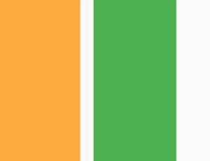
Divider Widget Example
Consider code snippet like below :
Column(
        children: <Widget>[
          Container(
            height: 100,
            width: 100,
            color: Colors.orangeAccent,
          ),
          Divider(),
          Container(
            height: 100,
            width: 100,
            color: Colors.green,
          ),
        ],
      ),
We will get output like below :
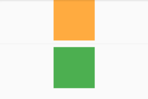
Divider Widget
Divider widget Height and Thickness
For adjusting the height of the area that will be occupied by the divider, use height property. It doesn’t affect the thickness of the line which can be set using thickness property.
The code snippet for it will look like below :
Column(
        children: <Widget>[
          Container(
            height: 100,
            width: 100,
            color: Colors.orangeAccent,
          ),
          Divider(
            height: 50,
            thickness: 5,
          ),
          Container(
            height: 100,
            width: 100,
            color: Colors.green,
          ),
        ],
      ),
We will get output like below :
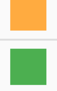
Divider height & thickness
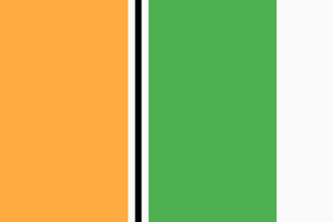
Color Property
Column(
       children: <Widget>[
         Container(
           height: 100,
           width: 100,
           color: Colors.orangeAccent,
         ),
         Divider(
           thickness: 5,
           color: Colors.black,
         ),
         Container(
           height: 100,
           width: 100,
           color: Colors.green,
         ),
       ],
     ),
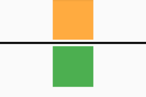
Divider Color Property
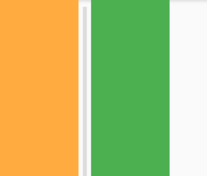
Indent :
In case users want to change the indent of the line, use the indent property to adjust the indent on the leading edge and endIndent property for the indent on the trailing edge. Code Snippet will look like below :
Column(
        children: <Widget>[
          Container(
            height: 100,
            width: 100,
            color: Colors.orangeAccent,
          ),
          Divider(
            thickness: 5,
            indent: 10,
            endIndent: 10,
          ),
          Container(
            height: 100,
            width: 100,
            color: Colors.green,
          ),
        ],
      ),
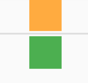
Divider indent Property
Divider as Separator of ListView
ListView Widget generates dynamic content from external sources.
ListView.separated(
      separatorBuilder: (context, index) => Divider(
        thickness: 3,
      ),
      itemCount: 5,
      itemBuilder: (context, index) => Padding(
        padding: EdgeInsets.all(5),
        child: Container(
          color: Colors.orangeAccent,
          height: 100,
        ),
      ),
    )
We will get output like below :
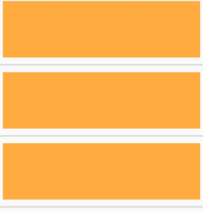
Divider in a ListView widget
Divider Properties :
- Key key: The widget key, used to control if it should be replaced.
- double height: Height of the divider.
- double thickness: Thickness of the line.
- double indent: Empty space to the leading edge of the divider.
- double endIndent: Empty space to the trailing edge of the divider.
- Color color: Color of the line.
VerticalDivider
VerticalDivider is the same as Divider Widget only difference is VerticalDivider has width property instead of height.
The constructor of VerticalDivider widget will look like below :
VerticalDivider({
  Key? key,
  double? width,
  double? thickness,
  double? indent,
  double? endIndent,
  Color? color,
})
VerticalDivider Example :
Row(
  children: <Widget>[
    Container(
      width: 100,
      color: Colors.red,
    ),
    VerticalDivider(),
    Container(
      width: 100,
      color: Colors.blue,
    ),
  ],
)
We will get output like below :
VerticalDivider
VerticalDivider’s Color :
The code snippet will look like below :
Row(
      children: <Widget>[
        Container(
          width: 100,
          color: Colors.orangeAccent,
        ),
        VerticalDivider(
          thickness: 5,
          color: Colors.black,
        ),
        Container(
          width: 100,
          color: Colors.green,
        ),
      ],
    )
We will get output like below :
VerticalDivider Color
VerticalDivider’s Indent
The code snippet will look like below :
Row(
      children: <Widget>[
        Container(
          width: 100,
          color: Colors.orangeAccent,
        ),
        VerticalDivider(
          thickness: 5,
          endIndent: 10,
          indent: 10,
          // color: Colors.black,
        ),
        Container(
          width: 100,
          color: Colors.green,
        ),
      ],
    )
We will get output like below :
VerticalDivider Indent
VerticalDivider Properties :
- Key: The widget key, used to control if it should be replaced.
- double width: Width of the divider.
- double thickness: Thickness of the line.
- double indent: Empty space to the leading edge of the divider.
- double endIndent: Empty space to the trailing edge of the divider.
- Color: Color of the line.
Thanks for reading !!!
FlutterAgency.com is our portal Platform dedicated to Flutter Technology and Flutter Developers. The portal is full of cool resources from Flutter like Flutter Widget Guide, Flutter Projects, Code libs and etc.
FlutterAgency.com is one of the most popular online portal dedicated to Flutter Technology and daily thousands of unique visitors come to this portal to enhance their knowledge on Flutter.

Contemporary ventures
Recent blog


Join our newsletter
Read and share new topics about all things Tech.
ready to get started?
Fill out the form below and we will be in touch soon!
"*" indicates required fields