CupertinoSlidingSegmentedControl Widget – Flutter Widget Guide By Flutter Agency
Earlier We have gone through a different Cupertino widgets article like CupertinoSlider Widget, CupertinoPageTransition Widget, CupertinoSegmentedControl Widget, CupertinoScrollbar Widget so now in this article we will go through CupertinoSlidingSegmentedControl Widget.
What is CupertinoSlidingSegmentedControl Widget?
CupertinoSlidingSegmentedControl Widget is an iOS 13 style segmented control. It will display the widgets provided in the Map of children in a horizontal list. Used to select between a number of mutually exclusive options. When one option in the segmented control is selected, the other options in the segmented control cease to be selected.
Default Constructor for it will look like below:
CupertinoSlidingSegmentedControl({
  Key? key,
  required Map children,
  required void Function(dynamic) onValueChanged,
  dynamic groupValue,
  Color thumbColor = _kThumbColor,
  EdgeInsetsGeometry padding = _kHorizontalItemPadding,
  Color backgroundColor = CupertinoColors.tertiarySystemFill,
})
In the Above constructor, all fields marked with @required must not be empty.
Properties:
- Key key: The widget key, used to control if it’s should be replaced.
- children: The children will be displayed in the order of the keys in the Map. The height of the segmented control is determined by the height of the tallest widget provided as a value in the Map of children. The width of each child in the segmented control will be equal to the width of the widest child unless the combined width of the children is wider than the available horizontal space. In this case, the available horizontal space is divided by the number of provided children to determine the width of each widget. The selection area for each of the widgets in the Map of children will then be expanded to fill the calculated space, so each widget will appear to have the same dimensions.
- ValueChanged<T> onValueChanged(): The callback that is called when a new option is tapped. The segmented control passes the newly selected widget’s associated key to the callback but does not actually change state until the parent widget rebuilds the segmented control with the new groupValue.The callback provided to onValueChanged should update the state of the parent StatefulWidget using the State.setState method, so that the parent gets rebuilt.
- T groupValue: The identifier of the widget that is currently selected. This must be one of the keys in the Map of children. If this attribute is null, no widget will be initially selected.
- Color thumbColor: The color used to paint the interior of the thumb that appears behind the currently selected item. The default value is a CupertinoDynamicColor that appears white in light mode and becomes a gray color in dark mode.
- EdgeInsetsGeometry padding: The amount of space by which to inset the children. Defaults to EdgeInsets.symmetric(vertical: 2, horizontal: 3).
- Color backgroundColor: backgroundColor Specify the color used to paint the rounded rect behind the children and the separators.
Example
First define a sliding variable like below:
int _sliding = 0;
Consider a Code Snippet as below:
CupertinoSlidingSegmentedControl(
            children: {
              0: Text('Segment 0'),
              1: Text('Segment 1'),
              2: Text('Segment 2'),
            },
            groupValue: _sliding,
            onValueChanged: (newValue) {
              setState(() {
                _sliding = newValue!;
              });
            }),
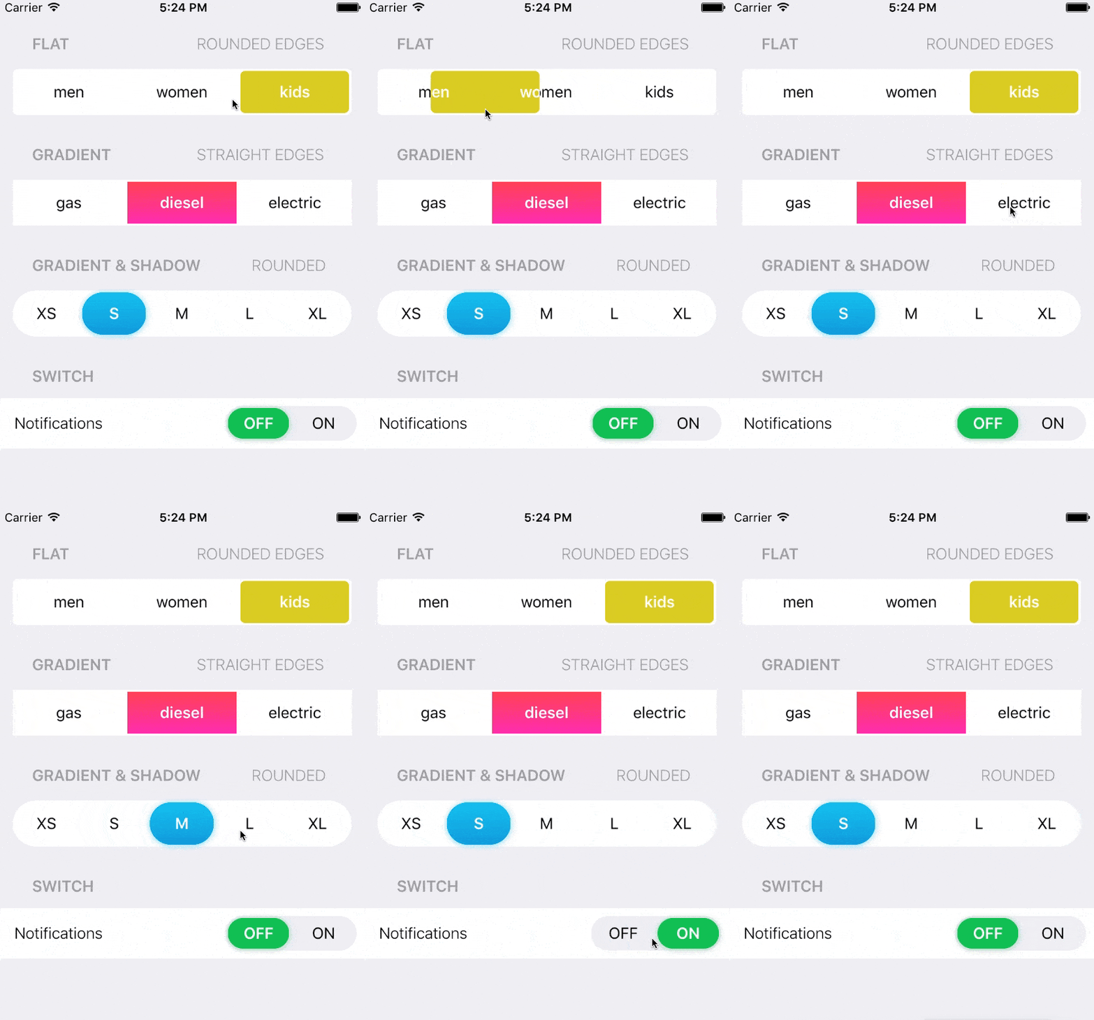
The above code will generate output like below:

CupertinoSlidingSegmentedControl Widget
General Queries
How to Create a Segmented Control Widget with a slider button like below:

To Implement similar to the Above image consider a code snippet as below:
class _ViewState extends State<View> {
  int segmentedControlGroupValue = 0;
  final Map<int, Widget> myTabs = const <int, Widget>{
    0: Text("Item 1"),
    1: Text("Item 2")
  };

  @override
  Widget build(BuildContext context) {
    return Scaffold(
      body: CupertinoSlidingSegmentedControl(
          groupValue: segmentedControlGroupValue,
          children: myTabs,
          onValueChanged: (i) {
            setState(() {
              segmentedControlGroupValue = i!;
            });
          }),
    );
  }
}
Thanks for being with us on a Flutter Journey !!!
Contemporary ventures
Recent blog
ready to get started?
Fill out the form below and we will be in touch soon!
"*" indicates required fields


