")
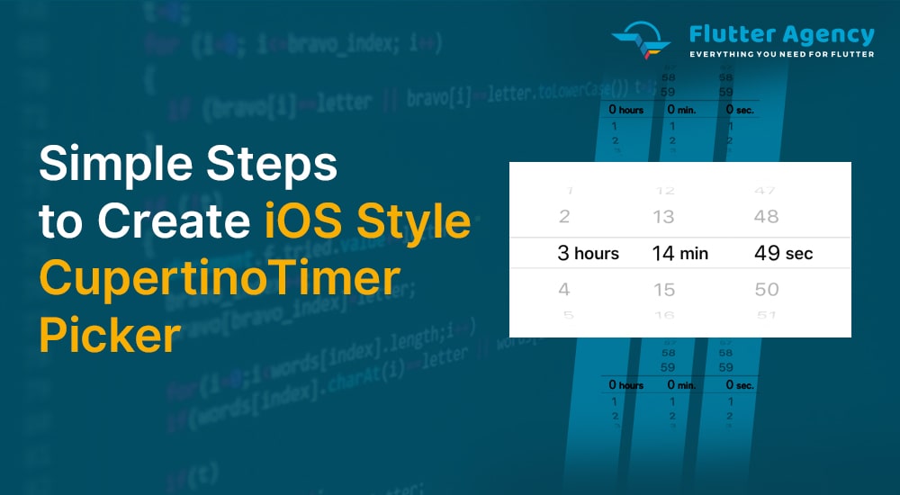
How to Create iOS Style CupertinoTimerPicker in Flutter?
")
The Cupertino timer picker in Flutter is a countdown timer picker in the iOS style. We can add an iOS-style countdown timer picker to our application by using the CupertinoTimerPicker widget.
We can set the time for a countdown timer using a timer picker. Instead of utilizing it as a picker for a countdown timer, we can alternatively use it as a time picker.
So, in this article, we will learn how to use the Cupertino timer picker in Flutter. A reputed Flutter mobile app development company will also discover other properties that may be used to alter the CupertinoTimerPicker widget’s appearance.
Flutter requires the CupertinoTimerPicker class in order to generate a cupertino timer picker. The task can be completed by calling the constructor and passing it the necessary properties. It only has to have the onTimerDurationChanged attribute. A callback function is the value it accepts.
Unlike other widgets, we are not required to display a timing picker continuously. When an event happens, we have to show it. On a button click, for instance, or with any other widget. Typically, we’ll use showCupertinoModalPopup or showModalBottomSheet to present a timer picker.
CupertinoDatePicker(
{Key? key,
CupertinoDatePickerMode mode = CupertinoDatePickerMode.dateAndTime,
required ValueChanged onDateTimeChanged,
DateTime? initialDateTime,
DateTime? minimumDate,
DateTime? maximumDate,
int minimumYear = 1,
int? maximumYear,
int minuteInterval = 1,
bool use24hFormat = false,
DatePickerDateOrder? dateOrder,
Color? backgroundColor,
bool showDayOfWeek = false,
double itemExtent = _kItemExtent}
)
2. initialTimeDuration Property: InitialTimerDuration has a default value of 0 and a maximum value of 23 hours 59 minutes 59 seconds.
3. minuteInterval Property: The minute spinner’s granularity is minuteInterval. There must be a 60 positive integer multiple.
4. secondInterval Property: The second spinner’s granularity is secondInterval. There must be a 60 positive integer multiple.
5. alignment Property: Classes generated with Alignment and its variations are acceptable in a property or argument of this kind.
6. backgroundColor Property: We will use this parameter to modify the picker’s background colour. CupertinoColors or the colors class constant are accepted as values.
7. onTimerDurationChanged Property: A callback function is the value it accepts. Every time the user modifies the time in the picker, this function is called. The most recent time will be obtained inside of this method. We will use the setState() function to update the UI with this value.
Let’s create an example where we use the CupertinoTimerPicker widget in Flutter to make a cupertino timer picker. We’ll show a button that, when clicked, will show the picker. We will show the time in a Text widget when the user selects a time.
import 'package:flutter/cupertino.dart';
import 'package:flutter/material.dart';

void main() {
  runApp(MyApp());
}

class MyApp extends StatelessWidget {
  @override
  Widget build(BuildContext context) {
    return MaterialApp(
      home: MyHomePage(),
    );
  }
}

class MyHomePage extends StatefulWidget {
  @override
  _MyHomePageState createState() {
    return _MyHomePageState();
  }
}

class _MyHomePageState extends State {
  TextEditingController controller = TextEditingController();
  Duration? selectedValue;
  @override
  Widget build(BuildContext context) {
    return Scaffold(
      appBar: AppBar(
        title: const Text("Time Picker"),
      ),
      body: Padding(
        padding: const EdgeInsets.all(15.0),
        child:
            Column(mainAxisAlignment: MainAxisAlignment.spaceEvenly, children: [
          TextFormField(
            controller: controller,
            onTap: () {
              showTimerPicker();
            },
          ),
        ]),
      ),
    );
  }

  void showTimerPicker() {
    showModalBottomSheet(
        context: context,
        builder: (BuildContext builder) {
          return Container(
              height: MediaQuery.of(context).copyWith().size.height * 0.25,
              width: double.infinity,
              color: Colors.white,
              child: CupertinoTimerPicker(
                onTimerDurationChanged: (value) {
                  selectedValue = value;
                  controller.text = selectedValue.toString();
                  setState(() {});
                },
              ));
        });
  }
}
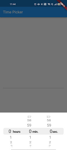
Output:
Conclusion:
So concludes the lesson on how to create a Cupertino Timer Picker in Flutter and use it. Also demonstrated was how to use the CupertinoTimerPicker widget and alter its appearance. I hope you guys enjoy and understand this article. With this, you can get an idea that we are experts in mobile application development and can hire Flutter engineers from us.
1. What is Cupertino’s design in Flutter?
The application that utilizes Cupertino design has a convenient widget that wraps the widgets mainly used for iOS design-based applications. It is created upon a WidgetsApp by iOS, with particular defaults like scrolling physics and fonts.
2. What does the Flutter date range picker permits?
It allows the users to choose a single date easily or multiple dates. It has four built-in views that grant faster navigation to the desired date.
3. Is it possible to hide the day from the Cupertino date picker?
Yes, Of Course! You have to pick only the month and the year from the date picker.
4. How to view Time Picker on a Textfield tap and get the time formatted in Flutter?
Let’s create the TextField or TextFormField, and when the user clicks on that particular field, a time picker dialogue will appear. In this, we will get the formatted time from the picker and set the resulting value to TextFormField and TextField.


Contemporary ventures
Recent blog


Join our newsletter
Read and share new topics about all things Tech.
ready to get started?
Fill out the form below and we will be in touch soon!
"*" indicates required fields