Row Widget – Flutter Widget Guide By Flutter Agency
In this article, we will explore how to place the widget in Row Widget.
Within the Row Widget, we can place multiple widgets in a row align horizontally. Similarly, we have Column Widget where the elements or child are arranged vertically like a column.
Pretty Simple isn’t it?
Let implement it step by step. first, create a new project name using flutter create –projectName(here ours is RowWidgetExample).
create a new file in the lib folder and name it as “RowExample “. row example will extend a Stateless Widget. You will learn about StatelessWidget and StatefulWidget later in our blog. Now in a Build Method of our RowExample class should return our Row Widget. Within this Row Widget Array, we can place multiple children horizontally.
Define all widgets within it like below.
Row(
children: [
Widget1,
Widget2,
Widget3
],)
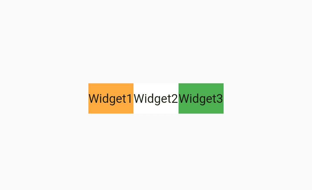
Here we have placed three widgets in our Row so all of them will align horizontally in like a Row. Let Place three Container of a different color so that we will see screen three colors.
Code snippet for it will look like below :
Row(
          mainAxisAlignment: MainAxisAlignment.center,
          children: <Widget>[
            Container(
              color: Colors.orangeAccent,
                child: Center(
              child: Text("Widget1"),
            )),
            Container(
               color: Colors.white,
                child: Center(
              child: Text("Widget2"),
            )),
            Container(
              color: Colors.green,
                child: Center(
              child: Text("Widget3"),
            ))
We will get output like below:
Elements in a Row
In the above example, we have placed three different Container Widget having Orange, White, Green.
What if these all three overflow out of the screen and we receive Pixel error? We have already published a separate article for resolving overflow error using Expanded Widget and Flexible Widget.
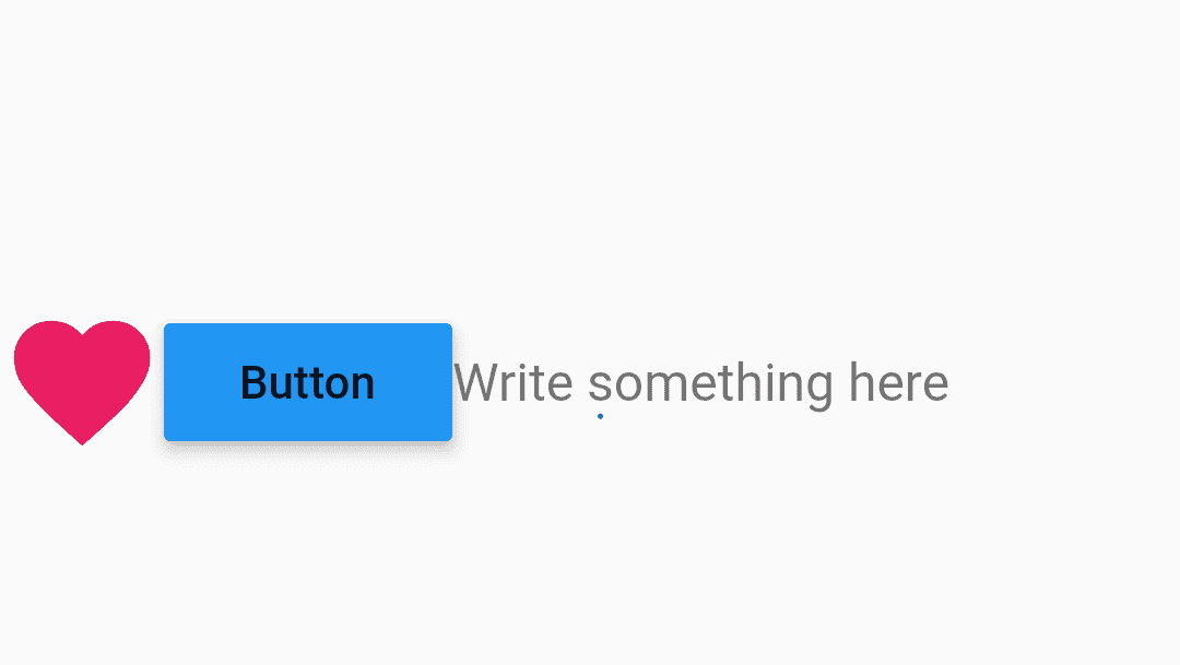
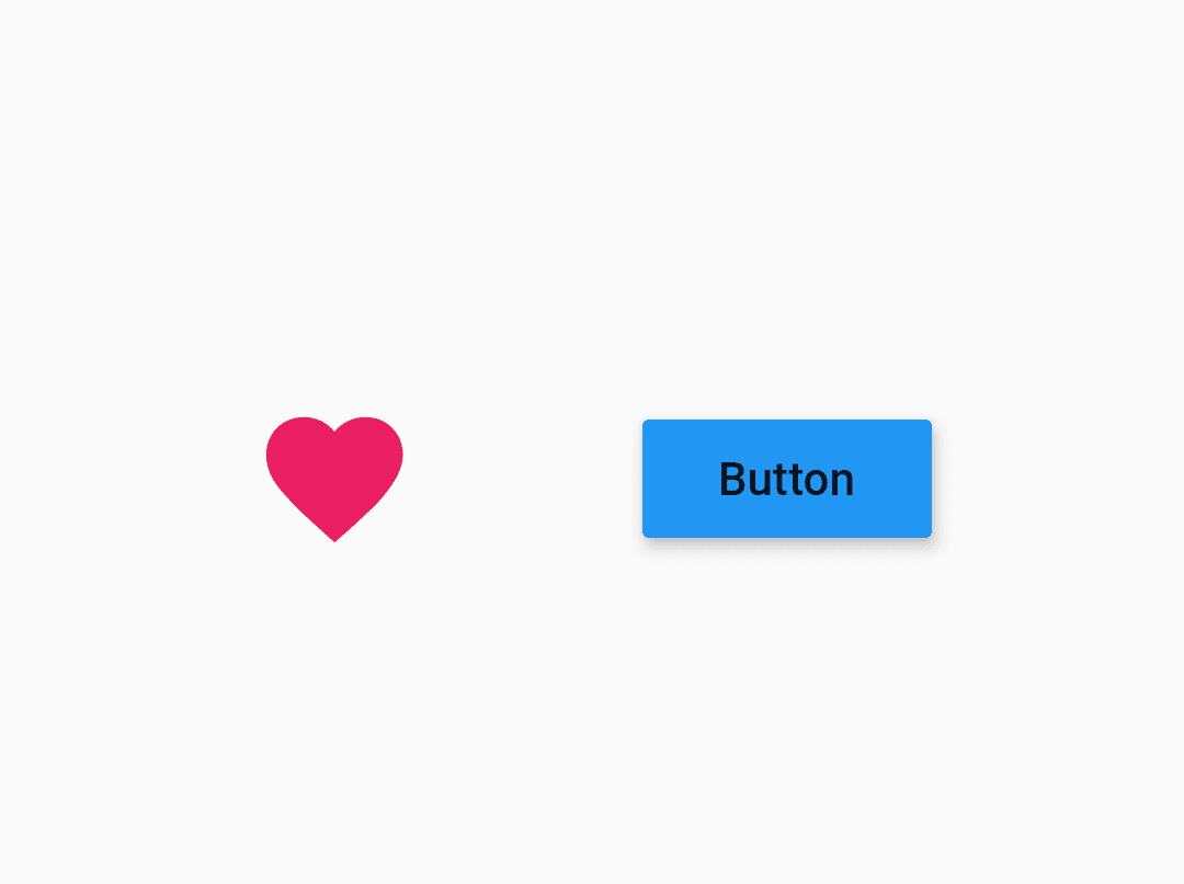
Let make changes in our widgets. We have placed the first widget as an Icon using the below code snippet.
 Icon(
  Icons.favorite,
  color: Colors.pink,
  size: 50.0,
),
Second Widget as RaisedButton Widget.
     RaisedButton(
            child: const Text('Button'),
            color: Colors.blue,
            elevation: 4.0,
            splashColor: Colors.yellow,
            onPressed: () {
              // do something
            },
          ),
Third widget as a
Expanded(
            child: TextField(
              decoration: InputDecoration(
                border: InputBorder.none,
                hintText: 'Write something here',
              ),
            ),
          )
We will get output like below:
Element in a Row Widget
As Row arranges all its widget horizontal dimension so it has Main Axis as X-Axis and Cross Axis as Y-Axis.
A row has a property called ” mainAxisAlignment “.
- Center: Arrange the children as near to the middle of the main axis as possible.
- Start: Put children as near to the start of the main axis as possible.
- End: Put children as near to the end of the main axis as possible.
- space-between: Put a free space evenly between the children.
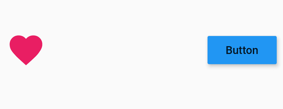
To understand better I have to remove one widget. Now our output will look like below :
mainAxisAlignment : MainAxisAlignment.spaceBetween,
- SpaceAround: Put a free space evenly between the children as well as half of that space before and after the first and last child.
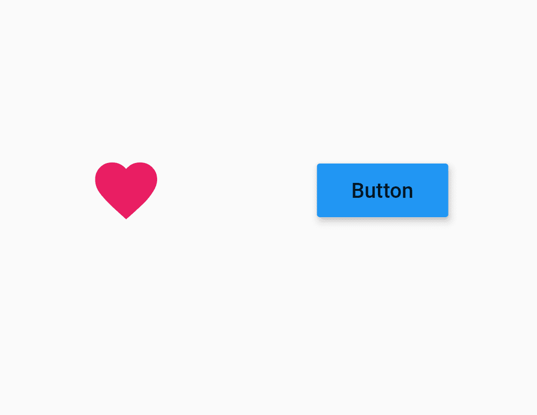
In our case we will have output as below :
mainAxisAlignment : MainAxisAlignment.spaceAround,
- SpaceEvenly: Put a free space evenly between the children as well as before and after the first and last child.
mainaxisAlignment: MainAxisAlignment.spaceEvenly
Thanks for reading !!!
Contemporary ventures
Recent blog
ready to get started?
Fill out the form below and we will be in touch soon!
"*" indicates required fields

