")
ListTile Widget – Flutter Widget Guide By Flutter Agency
")
ListTile Widget in Flutter is similar to the concept of Cards in Android. These widgets are much more flexible and often used along with a List in Flutter. Users can create a ListWidget and make use of ListTile Widget as its children.
What is ListTile Widget?
ListTile Widget contains one to three lines of text optionally flanked by icons or other widgets, such as checkboxes. The icons for the tile are defined with the leading and trailing parameters. The first line of text is not optional and is specified with the title. The value of subtitle, which is optional, will occupy the space allocated for an additional line of text, or two lines if isThreeLine is true.
The ListView often times needs a list of items and it is important to use a good looking list. ListTile can be very helpful for this purpose in particular.
It will create a simple looking card like a list of items without the need for specifying the boundary etc.
How to use ListTile Widget?
The following code, snippet demonstrates the use of ListTile Widget.
ListView(
        children: <Widget>[
          ListTile()
        ],
      ),
ListTile Widget – Properties
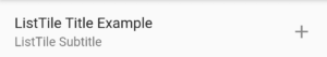
- title: Title is the first line of the ListTile Widget. It occupies the top part and takes in a Text widget as its value. Users can create a simple ListTile Widget with the Title attribute as given below. the code snippet will look like below :
ListView(
        children: <Widget>[
          ListTile(
            title: Text("ListTile Title Example"),
          )
        ],
      ),
We will get output like below :
ListTile Widget
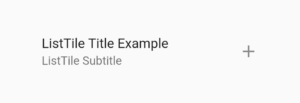
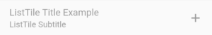
- subtitle: Subtitle occupies the second line of the ListTile Widget. It also takes in the value of Text Widget. The code snippet will look like below :
ListTile(
           title: Text("ListTile Title Example"),
           subtitle: Text("ListTile Subtitle"),
         )
We will get output like below :

ListTileSubtitle
-
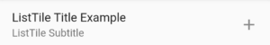
trailing:
Trailing is an attribute that takes in an Image/Icon as its value. The trailing attribute occupies the sides of the ListTile Widget and creates a simple List like effect with Images. The code snippet will look like below :
ListTile(
     title: Text("ListTile Title Example"),
     subtitle: Text("ListTile Subtitle"),
     trailing: Icon(Icons.add),
     )
we will get output like below :
ListTile with trailing
-
contentPadding :
contentPadding attribute gives padding to the content inside the ListTile. The title/subtitle is padded on all sides by the ListTile Widget. The code snippet will look like below :
ListTile(
         title: Text("ListTile Title Example"),
         subtitle: Text("ListTile Subtitle"),
         trailing: Icon(Icons.add),
         contentPadding: EdgeInsets.all(50.0),
         )
We will get output like below :
ListTile ContentPadding
-
dense:
dense attribute lets the flutter engine decide if the items should be vertically arranged or not. The difference is the Title and subtitle differentiation is removed and all of the Text looks the same if the dense is set to false.
Code Snippet will look like below :
ListTile(
         title: Text("ListTile Title Example"),
         subtitle: Text("ListTile Subtitle"),
         trailing: Icon(Icons.add),
         dense: false,
         )
We will get output like below :
ListTile Widget dense
-
enabled:
enabled whether the user can interact with the ListTile or not. The list tile can be clicked by the user. If there is a need to not allow the user to create a click action on that Title, the enabled attribute can be set to false like shown below.
ListTile(
        title: Text("ListTile Title Example"),
        subtitle: Text("ListTile Subtitle"),
        trailing: Icon(Icons.add),
        enabled: false,
         )
We will get output like below :
ListTile Enable
-
isThreeLine :
By default, the ListTile in flutter can display only 2 lines. The Title and the SubTitle. In case there is a third line of text to be displayed, the isThreeLine is set to true and can allow another line to be present. The subtitle will be taking care of giving the 3rd line of text. Code Snippet will look like below :
ListTile(
   title: Text("ListTile Title Example"),
   subtitle: Text("Sample Subtitle. \nSubtitle line 3"),
   trailing: Icon(Icons.add),
   isThreeLine: true,
   )
We will get output like below :
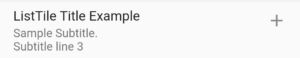
ListTile widget isThreeLine
-
leading:
Leading is another attribute that lets any widget be present to the left of the Title, Subtitle widget. This portion is given to the Leading Attribute. Just like the trailing widget which occupies the space to the right of the Title/Subtitle, the leading occupies the left.
ListTile(
      title: Text("ListTile Title Example"),
      subtitle: Text("Sample Subtitle. \nSubtitle line 3"),
      trailing: Icon(Icons.add),
      leading: Icon(Icons.add_box),
      isThreeLine: true,
      )
We will get output like below :
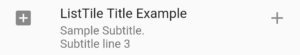
ListTile leading
- onLongPress():
To create the control for the LongPress on the ListTile Widget, the onLongPress callback is used. It gets fired whenever the user clicks long on the ListTile.
ListTile(
     title: Text("ListTile Title Example"),
     subtitle: Text("Sample Subtitle. \nSubtitle line 3"),
     trailing: Icon(Icons.add),
     leading: Icon(Icons.add_box),
     isThreeLine: true,
     onLongPress: () {
      print("User Long Press Tile");
     },
     )
Here the user will get ” User Long Press Tile ” in the terminal.
-
onTap() :
If there are actions to be performed when the user taps on the Title this callback can be used. Just like onLongPress, onTap is fired as soon as the user clicks on any item of the ListTile. code snippet will look like below :
ListTile(
       title: Text("ListTile Title Example"),
       subtitle: Text("Sample Subtitle. \nSubtitle line 3"),
       trailing: Icon(Icons.add),
       leading: Icon(Icons.add_box),
       isThreeLine: true,
       onTap: () {
        print("On Tap is Clicked");
        },
       )
The above code will give us output message as ” On Tap is Clicked ” in the terminal.
Thanks for reading !!!
Keep Fluttering !!!
FlutterAgency.com is our portal Platform dedicated to Flutter Technology and Flutter Developers. The portal is full of cool resources from Flutter like Flutter Widget Guide, Flutter Projects, Code libs and etc.
FlutterAgency.com is one of the most popular online portal dedicated to Flutter Technology and daily thousands of unique visitors come to this portal to enhance their knowledge on Flutter.

Contemporary ventures
Recent blog


Join our newsletter
Read and share new topics about all things Tech.
ready to get started?
Fill out the form below and we will be in touch soon!
"*" indicates required fields