Adaptive UI for Android and iOS using Material and Cupertino
Since its debut in May of 2017, Flutter has come a long way. It has, in reality, grown into a framework for developing apps for multiple platforms. Flutter now used to build desktop, online, and even embedded devices and cross-platform apps.
Design and usability best practices are supported by Material Design, allowing for the creation of visually appealing user interfaces on multiple platforms.
When is it time to make a change?
Material Design is based on user experience, cognitive science research, and traditional and web design best practices. Based on research findings, design principles have been produced that may be used on any platform.
Platforms have different design conventions. These disparities can hamper the user’s ability to grasp the UI or execute particular tasks. In these situations, it’s a good idea to follow platform conventions. Adapting to the platform is optional in areas where design differences are less disruptive.
When should you conform to the conventions of the native platform? The following recommendations explain when this is a need and when it is not. We are constantly changing our design patterns to keep up with platform conventions. You can also consult or hire a skilled Flutter developer to make these changes smoothly in your business application. An experienced app developer helps you improve your app UI and optimize your app to work seamlessly on all devices.
Platform-independent best practices

Adaptive User Interface
1. Toolbars
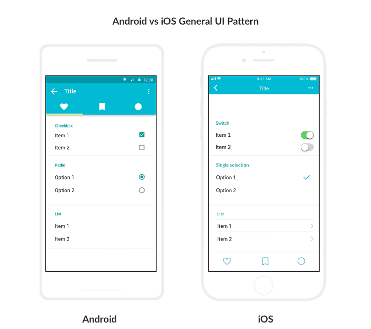
Toolbars are frequently employed to set the tone of a display. Navigator bars are called toolbars on iOS, and their height is less than on Android, which has a more extensive toolbar. This term refers to the toolbars on Android, which are termed top app bars.
Toolbar titles should be aligned using the platform’s default text alignment unless there are several action buttons.
Android: The default alignment of app bar titles is left-aligned. The top app bar names are always left-aligned when several or no actions are on the right side.
iOS: The default position of navigation bar titles is center-aligned. Titles can be aligned to the left when many action buttons are on the right side of the home screen of an application.
2. Translucency
Shadows are used in Material Design app bars to convey elevation. Translucency can be used to distinguish app bars from content in iOS.
Android: Express elevation with shadow.
iOS: Translucency can be used to show an elevation in iOS products. To distinguish the top app bar from scrolling content, add a hairline to the bottom border of the app bar.
3. Iconography
Icons employed by the platform’s system symbolize a wide range of actions.
Android: The up button has a stemmed arrow with a thin arrow in the middle. In the “More…” sign, the action overflow menu icon (which comprises three vertical dots)
iOS: The back arrow is more significant and lacks a stem on iOS. Using the return arrow on iOS, you may also see a label for the location of your choice. Using the “More…” sign, the action overflow menu icon displays three horizontal dots.
4. Controls
Users should be able to understand how to interact with controls readily.
Android: Incorporated Material switches, checkboxes, and radio buttons into the design.
iOS: Native platform switches are preferable to Material switches because they have the same functionality and presentation.
Instead of checkboxes and radio buttons, use switches and checkmark lists, which iOS users are used to seeing.
Communication
1. Dialogs
Dialogs can contain numerous actions and alert users when a vital decision is needed. Alerts and action sheets on iOS are comparable to dialogues on Android, although they aren’t quite the same.
When porting a dialogue component to iOS, consider the number of actions and the length of the text in each step to determine which part (Alert or Action Sheet) to use. Use Alerts when two actions have short text labels and can be shown horizontally.
Android: When presenting two different activities, use a simple dialogue box. When a lengthy text label, it is best to stack actions.
iOS: When displaying two actions, you can use an alert. iOS action sheets or bottom sheets may be used when three or more actions with long labels in a Material dialogue.
Gestures
1. Edge swipe
Off-screen material can be accessed by swiping from the outer edge of the screen.
For example, horizontal swipes through pages or table rows can conflict with edge swipes. To avoid conflicts, an edge swipe should behave the same way as any other swipe over a content region.
Android: Using an edge swipe from the left exposes off-screen material like a menu drawer when there are no conflicting gestures.
iOS: When there are no conflicting gestures, the user can return to the app’s hierarchy by performing an edge swipe from the left.
2. Transitions
User interface elements are linked together through transitions, shown by animations. Using the platform’s default motion for changes is an excellent place to start.
Android: Android’s built-in transition leverages scale to show forward and backward movement in a navigation flow.
iOS: iOS employs horizontal translation to represent moving forward and backward in a navigation flow by default.
3. Typography
Branding and text content are both communicated through typefaces. The text must be readable and resizable in both circumstances.
Using a brand-specific typeface sparingly is a good idea if your software is already identifying itself with it.
Android: Roboto is Android’s default typeface. The text size on Android should be given in scalable pixels to allow the type to be resized using accessibility options.
iOS: San Francisco is the typeface that comes pre-installed on iOS devices. Accessibility features like Dynamic Type can be easily implemented by using this typeface. Other typefaces may necessitate specific alterations to maintain the same level of accessibility.
Conclusion
Business owners are concerned about how we can assure that the UI/UX design is consistent across devices because Flutter allows developers to produce multi-platform applications using the same code base. You can choose an experienced Flutter app development company like Flutter Agency if you need help.
Get a Free Consultation Now
Contemporary ventures
Recent blog
ready to get started?
Fill out the form below and we will be in touch soon!
"*" indicates required fields


