How to Add Interactivity to Your Flutter App?
Your app’s responsiveness depends on how you adjust it. An app with solely non-interactive widgets will be made interactive in this tutorial. By developing a custom stateful widget, you’ll be able to create an icon tappable by adding two stateless widgets.
Creating a stateful widget
The construct() function and the widget’s mutable state are both located in the state class.
The widget’s state object uses setState() to instruct the framework to redraw the widget whenever the object’s value changes.
Custom stateful widgets may be created in this area. An IconButton Widget and Text will be the two children of a single custom stateful widget that replaces two stateless widgets the solid red star and the numeric count next to it. If the above solutions are difficult for you to implement, get expert advice and solution support from our skilled Flutter engineers. You can also get business application consultation from our experienced development team.
Two classes must be created in order to implement a custom stateful widget
A subclass of State that includes the widget’s state and specifies the construct() function for the widget.
The FavoriteWidget widget for the lakes app is shown in this section. After setting up, the first step is to decide how FavoriteWidget’s state is handled.
Step #1: Prepare for the task at hand
- Make sure your surroundings are set up before you begin.
- Use Flutter to create a simple “Hello World” app.
- Main.dart should replace the lib/main.dart file
- It is recommended that you use pubspec.yaml instead of pubspec.yaml.
- After connecting a device, or launching an iOS or Android emulator, you’re ready to start!
Step #2: Determine which object is responsible for managing the state of the widget.
There are many other approaches to managing the state of a widget; however, in this example, the widget itself, FavoriteWidget, will handle managing its own state.
Toggling the star is a standalone operation in this demonstration that has no impact on the parent widget or the rest of the user interface; hence, the widget may manage its state on its own internally during Flutter custom app creation.
Step #3: Subclass the StatefulWidget
Because the FavoriteWidget class is responsible for its own state management, it must override the createState() method in order to generate a State object. When the framework needs to construct the widget, it makes a call to the createState() method.
In this demonstration, the createState() function provides a return value that is an instance of the _FavoriteWidgetState class. You will build this class in the subsequent step.
class FavoriteWidget extends StatefulWidget {
  const FavoriteWidget({super.key});
  @override
  _FavoriteWidgetState createState() => _FavoriteWidgetState();
}
Step #4: Specifying the Subclass State
The data that is mutable and subject to change over the lifetime of the widget is stored in the _FavoriteWidgetState class. When the program is initially started up, the user interface shows a solid red star, which indicates that the lake has “favorite” status, coupled with the number 41, which represents the number of likes. The following information is kept in the _isFavorited and _favoriteCount fields:
class _FavoriteWidgetState extends State{ bool _isFavorited = true; int _favoriteCount = 41; // ··· }
In addition, the class specifies a construct() function, which, when called, produces a row with a text box and a button with a red icon. You use IconButton rather than Icon because it contains a onPressed property that specifies the callback method (_toggleFavorite) for handling a tap. This is why you use IconButton rather than Icon.
Following this, you will be tasked with defining the callback function.
class _FavoriteWidgetState extends State{ // ··· @override Widget build(BuildContext context) { return Row( mainAxisSize: MainAxisSize.min, children: [ Container( padding: const EdgeInsets.all(0), child: IconButton( padding: const EdgeInsets.all(0), alignment: Alignment.centerRight, icon: (_isFavorited ? const Icon(Icons.star) : const Icon(Icons.star_border)), color: Colors.red[500], onPressed: _toggleFavorite, ), ), SizedBox( width: 18, child: SizedBox( child: Text('$_favoriteCount'), ), ), ], ); } }
When the IconButton is pushed, the function _toggleFavorite() is called, and inside that method is a call to setState (). It is essential to use setState() because doing so notifies the framework that the state of the widget has changed and that the widget has to be repainted as a result. The following are the states that may be toggled on and off using the function parameter to setState():
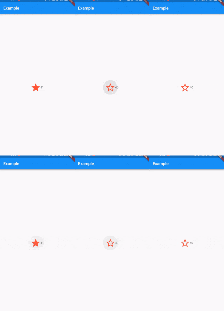
- A symbol of a star together with the number 41
- An symbol with a star border and the number 40
void _toggleFavorite() {
  setState(() {
    if (_isFavorited) {
      _favoriteCount -= 1;
      _isFavorited = false;
    } else {
      _favoriteCount += 1;
      _isFavorited = true;
    }
  });
}
Step #5: Insert the stateful widget into the tree of widgets
In the build() function of your program, add your own unique stateful widget to the tree of other widgets. First, the code that generates the icon and the text has to be located and then deleted.
Example
class FavoriteWidget extends StatefulWidget {
  const FavoriteWidget({Key? key}) : super(key: key);
  @override
  _FavoriteWidgetState createState() => _FavoriteWidgetState();
}
class _FavoriteWidgetState extends State {
  bool _isFavorited = true;
  int _favoriteCount = 41;
  @override
  Widget build(BuildContext context) {
    return Scaffold(
      appBar: AppBar(
        title: const Text("Example"),
      ),
      body: Row(
        mainAxisAlignment: MainAxisAlignment.center,
        crossAxisAlignment: CrossAxisAlignment.center,
        children: [
          Center(
            child: Container(
              // color: Colors.green,
              padding: const EdgeInsets.all(0),
              child: IconButton(
                padding: const EdgeInsets.all(0),
                alignment: Alignment.centerRight,
                icon: (_isFavorited
                    ? const Icon(
                        Icons.star,
                        size: 50,
                      )
                    : const Icon(
                        Icons.star_border,
                        size: 50,
                      )),
                color: Colors.red[500],
                onPressed: _toggleFavorite,
              ),
            ),
          ),
          SizedBox(
            width: 18,
            child: SizedBox(
              child: Text('$_favoriteCount'),
            ),
          ),
        ],
      ),
    );
  }
  void _toggleFavorite() {
    setState(() {
      if (_isFavorited) {
        _favoriteCount -= 1;
        _isFavorited = false;
      } else {
        _favoriteCount += 1;
        _isFavorited = true;
      }
    });
  }
}
Output


Conclusion
So, we have been through the complete step-by-step guide to add interactivity to the Flutter application. However, adding interactivity to the app is imperative as it is integral to Flutter application development. We have learned to create a custom stateful widget and how we can utilize that to add interactivity to the flutter application.
Frequently Asked Questions (FAQs)
1. What is iconButton widget in Flutter?
The icon button is image which is printed on the material widget that act to touch by stuffing with color (ink). Icon button is generally utilized in AppBar.actons field, but it could be uses in oher places also. If the onPressed callback is null, then the button is disabled and will not reach to touch.
2. Define the createState() in app development
For developing the stateful widget in Flutter, make the use of createState() method. This stateful widget is described as a part of user interface by building the constellation of another widgets which will represents the user interface more concretely. A stateful widget is refer to as mutable state.
3. How will construct() class will work?
Constructors is the particular method which is used to initialize the object when it is designed in the project. In the object-oriented programming, an object is created, which will automatically calls the constructor.
Contemporary ventures
Recent blog
ready to get started?
Fill out the form below and we will be in touch soon!
"*" indicates required fields


