Tooltip Widget – Flutter Widget Guide By Flutter Agency
In Flutter, Tooltip is a material design tooltip used to let user know about the functionality of a button or UI action.
What is Tooltip Widget in Flutter?
Tooltip Widget is usually used to increase the accessibility of your application, providing text-based clues for visual-based widgets.
When a widget is equipped with it, if the user long presses the widget or some appropriate action on the widget, Tooltip appears as a floating label.
Constructor of it will look like below :
Tooltip({
  Key? key,
  String? message,
  InlineSpan? richMessage,
  double? height,
  EdgeInsetsGeometry? padding,
  EdgeInsetsGeometry? margin,
  double? verticalOffset,
  bool? preferBelow,
  bool? excludeFromSemantics,
  Decoration? decoration,
  TextStyle? textStyle,
  TextAlign? textAlign,
  Duration? waitDuration,
  Duration? showDuration,
  Duration? exitDuration,
  bool enableTapToDismiss = true,
  TooltipTriggerMode? triggerMode,
  bool? enableFeedback,
  void Function()? onTriggered,
  Widget? child,
})
Properties:
- Decoration decoration: Specifies the tooltip’s shape and background color.The tooltip shape defaults to a rounded rectangle with a border-radius of 4.0. Tooltips will also default to an opacity of 90% and with the color [Colors.grey700] if ThemeData.brightness is Brightness.dark, and Colors.white if it is Brightness.light.
- double height: The height of the tooltip’s child.
- EdgeInsetsGeometry margin: The empty space that surrounds the tooltip.
- String message: The text to display in the tooltip.
- EdgeInsetsGeometry padding: The amount of space by which to inset the tooltip’s child.Defaults to 16.0 logical pixels in each direction.
- Duration showDuration: The length of time that the tooltip will be shown after a long press is released.Defaults to 1.5 seconds.
- TextStyle textStyle: The style to use for the message of the tooltip.
- double verticalOffset: The vertical gap between the widget and the displayed tooltip.
- Duration waitDuration: The length of time that a pointer must hover over a tooltip’s widget before the tooltip will be shown.Once the pointer leaves the widget, the tooltip will immediately disappear.
How to use Tooltip Widget in Flutter?
Tooltip(

        child: IconButton(
        icon: Icon(Icons.high_quality),
        onPressed: () {
        /** */
        },
        ),
      ),
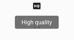
In the above code snippet, we have used an IconButton Widget. Now we will add a message to Tooltip will look like below :
Tooltip(
        message: 'High quality',
        child: IconButton(
        icon: Icon(Icons.high_quality),
        onPressed: () {
        /** */
        },
       ),
      ),
We will get output like below:
Tooltip
The complete source code will look like below :
class TooltipWidget extends StatelessWidget {
  @override
  Widget build(BuildContext context) {
    return Scaffold(
      body: Center(
        child: Container(
          margin: EdgeInsets.all(10),
          child: Tooltip(
            message: 'My Account',
            textStyle: TextStyle(
              fontSize: 16,
              color: Colors.amber, // Text color
            ),
            decoration: BoxDecoration(
              color: Colors.blue, // Background color
              borderRadius: BorderRadius.circular(8),
            ),
            waitDuration: Duration(milliseconds: 500),
            showDuration: Duration(seconds: 2),
            child: ElevatedButton(
              onPressed: () {},
              child: const Icon(
                Icons.account_box,
                size: 50,
              ),
            ),
          ),
        ),
      ),
    );
  }
}
The above code will generate output like below :
Tooltip
Conclusion
In this article, we have been through What is AnimatedBuilder Widget in Flutter along with how to implement it in a Flutter.
Thanks for reading !!!
Don’t hesitate to contact us !!!
FlutterAgency.com is our portal Platform dedicated to Flutter Technology and Flutter Developers. The portal is full of cool resources from Flutter like Flutter Widget Guide, Flutter Projects, Code libs and etc.
FlutterAgency.com is one of the most popular online portal dedicated to Flutter Technology and daily thousands of unique visitors come to this portal to enhance their knowledge on Flutter.
Contemporary ventures
Recent blog
ready to get started?
Fill out the form below and we will be in touch soon!
"*" indicates required fields


