SliverAppBar Widget – Flutter Widget Guide By Flutter Agency
AppBar Widget is the main widget in any Flutter app. It sits at the top of the application and mostly controls major action items. In today’s article, we will learn about how to design a SliverAppBar Widget in a flutter app.
What is SliverAppBar Widget?
SliverAppBar Widget is a kind of app bar in Flutter that’s compatible with CustomScrollView. SliverAppBar Widget is usually used as the first child of CustomScrollView’s slivers. This widget allows you to easily create an app bar with various scrolling effects.
The constructor of SliverAppBar will look like below :
SliverAppBar({
  Key? key,
  Widget? leading,
  bool automaticallyImplyLeading = true,
  Widget? title,
  List? actions,
  Widget? flexibleSpace,
  PreferredSizeWidget? bottom,
  double? elevation,
  double? scrolledUnderElevation,
  Color? shadowColor,
  Color? surfaceTintColor,
  bool forceElevated = false,
  Color? backgroundColor,
  Color? foregroundColor,
  IconThemeData? iconTheme,
  IconThemeData? actionsIconTheme,
  bool primary = true,
  bool? centerTitle,
  bool excludeHeaderSemantics = false,
  double? titleSpacing,
  double? collapsedHeight,
  double? expandedHeight,
  bool floating = false,
  bool pinned = false,
  bool snap = false,
  bool stretch = false,
  double stretchTriggerOffset = 100.0,
  AsyncCallback? onStretchTrigger,
  ShapeBorder? shape,
  double toolbarHeight = kToolbarHeight,
  double? leadingWidth,
  TextStyle? toolbarTextStyle,
  TextStyle? titleTextStyle,
  SystemUiOverlayStyle? systemOverlayStyle,
  bool forceMaterialTransparency = false,
  Clip? clipBehavior,
})
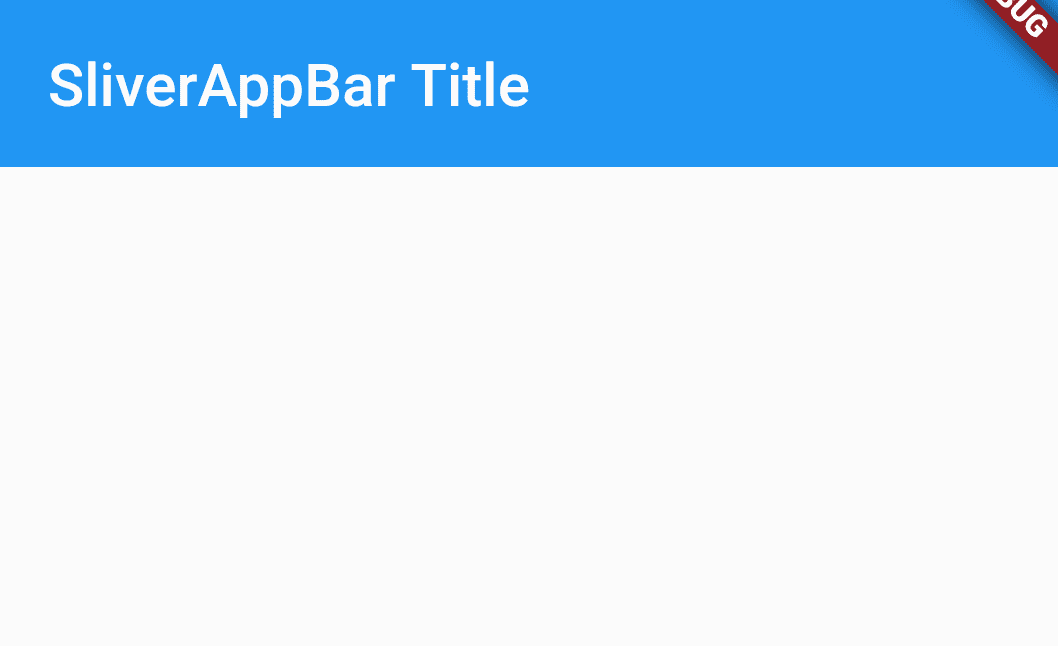
Code Snippet :
 slivers: <Widget>[
    SliverAppBar(
      title: Text("SliverAppBar Title"),
    )
  ],
It will give us output like below :
Sliver App Bar
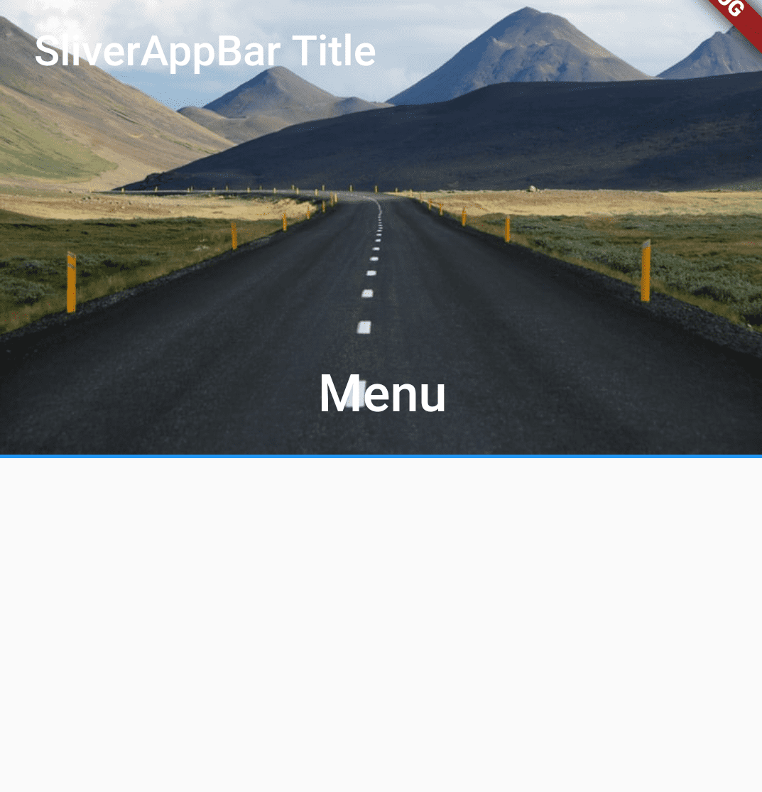
  SliverAppBar(
            title: const Text("SliverAppBar Title"),
            expandedHeight: 220.0,
            flexibleSpace: FlexibleSpaceBar(
              centerTitle: true,
              title: const Text('Menu',
                  style: TextStyle(
                    color: Colors.white,
                    fontSize: 16.0,
                  )),
              background: Image.asset(
                "assets/road.jpg",
              ),
            ),
          ),
Above code will generate output like below :
Sliver App Bar
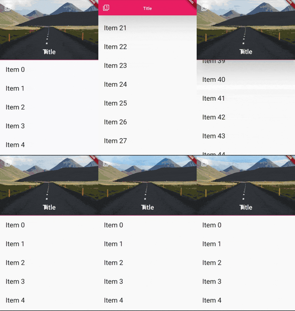
Let’s create Drawer using this Sliver App Bar like below :
Create a _buildList() like below :
List_buildList(int count) { List listItems = []; for (int i = 0; i < count; i++) { listItems.add( Padding( padding: const EdgeInsets.all(20.0), child: Text( 'Item ${i.toString()}', style: const TextStyle(fontSize: 25.0), ), ), ); } return listItems; }
The sliver will have code Snippet like below :
slivers:[ SliverAppBar( leading: IconButton( icon: Icon(Icons.filter_1), onPressed: () { // Do something }), expandedHeight: 220.0, floating: true, pinned: true, snap: true, elevation: 50, backgroundColor: Colors.pink, flexibleSpace: FlexibleSpaceBar( centerTitle: true, title: const Text( 'Title', style: TextStyle( color: Colors.white, fontSize: 16.0, ), ), background: Image.asset( "assets/road.jpg", ), ), ), SliverList(delegate: SliverChildListDelegate(_buildList(50))), ],
We will get output like below:
Sliver
Properties :
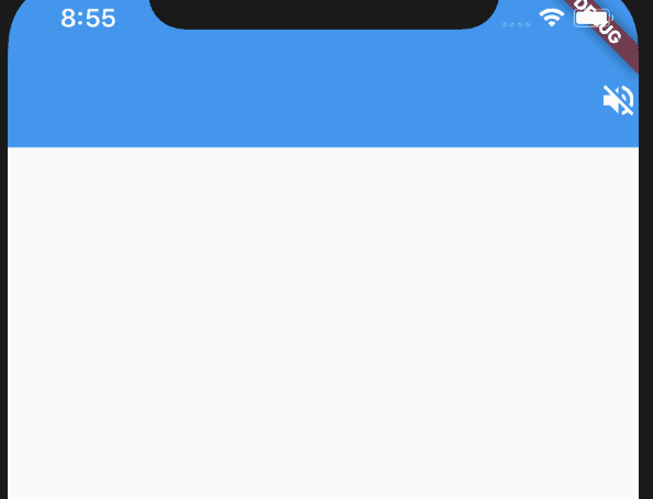
- actions: Just like an attribute in Appbar this lets you create any widget to the right of the AppBar Title. It can take in any number of widgets and it is important to have it minimal and not clutter the AppBar too much.
Code Snippet will look like below :
const SliverAppBar(
            actions: [
              Icon(Icons.volume_off),
            ],
          ),
We will get output like below.
action in SliverAppBar
- title: The title attribute lets you define a Text() widget that holds a Title to the SliverAppBar. This is the attribute similar to the AppBar where the Title holds the name of the Application or the name of the screen for example.
  const SliverAppBar(
            title: Text("SliverAppBar Example"),
          ),
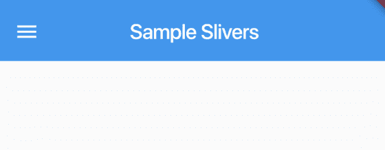
- leading: The leading attribute lets you define any widget to the left of the attribute. This is the place where mostly the Menu Drawers are placed. You can define any widget in this place.
const SliverAppBar(
            title: Text("Sample Slivers"),
            leading: Icon(Icons.menu),
          )
It will give us output like below :
Leading properties
- backgroundColor: The backgroundColor attribute as the name suggests lets you define a Background Color to the SliverAppBar. Takes in the Color class as its value.
  const  SliverAppBar(
            title: Text("Sample Slivers"),
            leading: Icon(Icons.menu),
            backgroundColor: Colors.orangeAccent,
          )
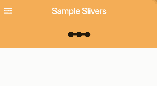
- bottom: The bottom attribute is pretty important as it creates a space to the Bottom of the Title and lets you define any widget as required in that position. It takes in the value of the PreferredSizeWidget. Code Snippet will look like below :
 const SliverAppBar(
            title: Text("Sample Slivers"),
            leading: Icon(Icons.menu),
            backgroundColor: Colors.orangeAccent,
            bottom: PreferredSize(
              preferredSize: Size.fromHeight(50.0),
              child: Icon(
                Icons.linear_scale,
                size: 60.0,
              ),
            ),
          ),
We will get output like below.
The bottom in Sliver App
- System Overlays: As the name suggests, it is going to take in the value of the System Overlays that the AppBar is going to be in.
const SliverAppBar(
            title: Text("Sample Slivers"),
            leading: Icon(Icons.menu),
            backgroundColor: Colors.orangeAccent,
            systemOverlayStyle: SystemUiOverlayStyle.light,
          ),
We will get output like below.
brightness in Sliver App Bar
- expandedHeight: expandedHeight attribute lets you define the maximum height that the AppBar can expand to when the scroll is done. The height has to be defined in double value.
 const SliverAppBar(
            title: Text("Sample Slivers"),
            leading: Icon(Icons.menu),
            backgroundColor: Colors.orangeAccent,
            expandedHeight: 90.0,
          )
- flexibleSpace: Flexible Space is used to create a widget that is stacked behind the toolbar and the tab bar. Its height will be the same as the app bar’s overall height.
  SliverAppBar(
            title: const Text("Sample Slivers"),
            leading: const Icon(Icons.menu),
            backgroundColor: Colors.orangeAccent,
            flexibleSpace: ListView(
              children: const [
                Text("Sample 1"),
                Text("Sample 2"),
                Text("Sample 3")
              ],
            ),
          ),
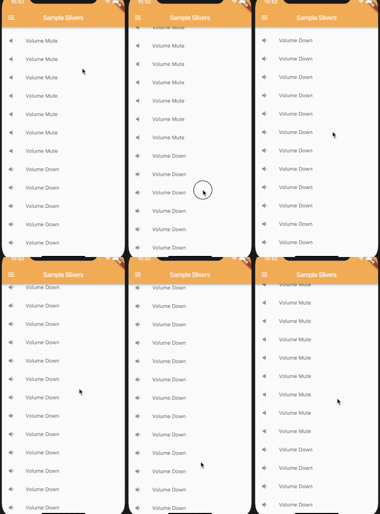
- floating: A very important attribute, which lets you create a Floating AppBar on top of the ListView which can be scrolled. The floating attribute takes in a boolean value. If true, the AppBar floats as soon as the list is scrolled down, If False the AppBar doesn’t appear unless the top of the List appears.
- pinned: Pinned attribute lets the AppBar either be pinned at the start and only lets the Scroll take place. If set to false, the Scroll will take place but the AppBar acts according to the Scroll Direction.
  const SliverAppBar(
            title: Text("Sample Slivers"),
            leading: Icon(Icons.menu),
            backgroundColor: Colors.orangeAccent,
            pinned: true,
          ),
We will get output like below.
pinned Property in Sliver App Bar
- snap: snap is similar to the Floating attribute, except if this attribute is set to true, the AppBar snaps into view, instead of scrolling! A very small change can provide a better animation on the Application. The snap requires that the Floating attribute is set only then the animation can be seen clearly. Code Snippet will look like below :
  const SliverAppBar(
            title: Text("Sample Slivers"),
            leading: Icon(Icons.menu),
            backgroundColor: Colors.orangeAccent,
            floating: true,
            snap: true,
          ),
- primary: If there are multiple AppBars present, you can set the Primary attribute to True to let the Engine decide that, this AppBar occupies the Top Place and will act as the primary AppBar.
- automaticallyImplyLeading: automaticallyImplyLeading attribute takes in a Boolean value and denotes if the Leading widget can be implied or instead it can be left empty if the Leading widget is not defined.
Thanks for reading !!!
Need more assistance for Flutter?
Do not hesitate to Contact Us !!!
FlutterAgency.com is our portal Platform dedicated to Flutter Technology and Flutter Developers. The portal is full of cool resources from Flutter like Flutter Widget Guide, Flutter Projects, Code libs and etc.
FlutterAgency.com is one of the most popular online portal dedicated to Flutter Technology and daily thousands of unique visitors come to this portal to enhance their knowledge on Flutter.
Contemporary ventures
Recent blog
ready to get started?
Fill out the form below and we will be in touch soon!
"*" indicates required fields

