How to set the size to Circular Progress Indicator?
If you want to build a progress bar indicator that is either circular or linear different than the default progress bar, we have used the flutter package which helps to make this very easy. With this, we can easily apply the percentage on it and the progress text. so let’s learn how to set the size to a circular progress Indicator.
How to set the size to Circular Progress Indicator?
Ensure that you have added the router as a dependency in your flutter project.
dependencies:
 percent_indicator: "^2.1.7+2"
Now run flutter packages upgrade or update your packages in IntelliJ.
So now, you need to include the import the package to the dart file where it will be used, use the below command,
import 'package:percent_indicator/percent_indicator.dart';
This is the basic widget given right below:
new CircularPercentIndicator(
                  radius: 60.0,
                  lineWidth: 5.0,
                  percent: 1.0,
                  center: new Text("100%"),
                  progressColor: Colors.green,
                )
The complete example is shown below:
@override
  Widget build(BuildContext context) {
    return Scaffold(
      appBar: AppBar(
        title: const Text("Circular Percent Indicators"),
      ),
      body: Center(
        child: ListView(children: [
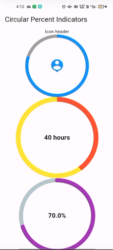
          CircularPercentIndicator(
            radius: 100.0,
            lineWidth: 10.0,
            percent: 0.8,
            header: const Text("Icon header"),
            center: const Icon(
              Icons.person_pin,
              size: 50.0,
              color: Colors.blue,
            ),
            backgroundColor: Colors.grey,
            progressColor: Colors.blue,
          ),
          CircularPercentIndicator(
            radius: 130.0,
            animation: true,
            animationDuration: 1200,
            lineWidth: 15.0,
            percent: 0.4,
            center: const Text(
              "40 hours",
              style: TextStyle(fontWeight: FontWeight.bold, fontSize: 20.0),
            ),
            circularStrokeCap: CircularStrokeCap.butt,
            backgroundColor: Colors.yellow,
            progressColor: Colors.red,
          ),
          CircularPercentIndicator(
            radius: 120.0,
            lineWidth: 13.0,
            animation: true,
            percent: 0.7,
            center: const Text(
              "70.0%",
              style: TextStyle(fontWeight: FontWeight.bold, fontSize: 20.0),
            ),
            footer: const Text(
              "Sales this week",
              style: TextStyle(fontWeight: FontWeight.bold, fontSize: 17.0),
            ),
            circularStrokeCap: CircularStrokeCap.round,
            progressColor: Colors.purple,
          ),
          Padding(
            padding: const EdgeInsets.all(15.0),
            child: CircularPercentIndicator(
              radius: 60.0,
              lineWidth: 5.0,
              percent: 1.0,
              center: const Text("100%"),
              progressColor: Colors.green,
            ),
          ),
          Container(
            padding: const EdgeInsets.all(15.0),
            child: Row(
              mainAxisAlignment: MainAxisAlignment.center,
              children: [
                CircularPercentIndicator(
                  radius: 45.0,
                  lineWidth: 4.0,
                  percent: 0.10,
                  center: const Text("10%"),
                  progressColor: Colors.red,
                ),
                const Padding(
                  padding: EdgeInsets.symmetric(horizontal: 10.0),
                ),
                CircularPercentIndicator(
                  radius: 45.0,
                  lineWidth: 4.0,
                  percent: 0.30,
                  center: const Text("30%"),
                  progressColor: Colors.orange,
                ),
                const Padding(
                  padding: EdgeInsets.symmetric(horizontal: 10.0),
                ),
                CircularPercentIndicator(
                  radius: 45.0,
                  lineWidth: 4.0,
                  percent: 0.60,
                  center: const Text("60%"),
                  progressColor: Colors.yellow,
                ),
                const Padding(
                  padding: EdgeInsets.symmetric(horizontal: 10.0),
                ),
                CircularPercentIndicator(
                  radius: 45.0,
                  lineWidth: 4.0,
                  percent: 0.90,
                  center: const Text("90%"),
                  progressColor: Colors.green,
                )
              ],
            ),
          )
        ]),
      ),
    );
  }
The output of the circular progress indicator will be as shown in the below image:

Conclusion:
So in this article, we figured out How to set the size to a Circular Progress Indicator!
Go check out the other blogpost for Adding DatePicker
Thanks for being with us on a Flutter Journey !!! We hope you learned from this article, If you did then share it with your friends and colleague to spread the knowledge.
Keep Learning!!! Keep Fluttering!!! Stay Connected !!!
Do let us know if you need any assistance with Flutter Development? We would love to assist you whenever needed.! Stay Tuned for Updates.
Flutter Agency is our portal Platform dedicated to Flutter Technology and Flutter Developers. The portal is full of cool and useful resources from Flutter like Flutter Widget Guide, Flutter Projects, Code libs and etc.
Contemporary ventures
Recent blog
ready to get started?
Fill out the form below and we will be in touch soon!
"*" indicates required fields


