ListView Widget – Flutter Widget Guide By Flutter Agency
ListView Widget is one of the important widget types that can be used anywhere.
Purpose of ListView Widget
ListView Widget has been introduced to reduce the overload of having various layouts performing the same task.
Why the ListView widget is required?
If you are building real-time applications, then the contents of the screen will change based on user actions and with a change in network data.
Most of the time, the dynamic behavior is achieved by changing the contents that are being displayed in the body. Flutter provides ListView.Builder() constructor which can be used to generate dynamic contents from external sources.
The ListView Widget in Flutter does just what is required, it arranges the elements inside it in the order specific to the developer’s need.
Types of ListView Widget?
There are four types of ListViews Widget as listed below :
- ListView()
- ListView.builder()
- ListView.separated()
- ListView.custom()
Let’s understand everyone steps by step in detail.
ListView Widget is the default constructor of a ListView class. A ListView simply takes the list of children and makes it scrollable.
The constructor of ListView Widget will look like below :
ListView({
    Key key,
    Axis scrollDirection: Axis.vertical,
    bool reverse: false,
    ScrollController controller,
    bool primary,
    ScrollPhysics physics,
    bool shrinkWrap: false,
    EdgeInsetsGeometry padding,
    double itemExtent,
    bool addAutomaticKeepAlives: true,
    bool addRepaintBoundaries: true,
    bool addSemanticIndexes: true,
    double cacheExtent,
    List<Widget> children: const [],
    int semanticChildCount,
    DragStartBehavior dragStartBehavior: DragStartBehavior.start,
    ScrollViewKeyboardDismissBehavior keyboardDismissBehavior:
        ScrollViewKeyboardDismissBehavior.manual,
  });
When using ListView Widget, we only need to pass a List containing all children to display in the ListView.All these children’s widgets will be created statically, even though some of them may not be currently visible in the viewport.user should not create a large number of children widgets when using ListView Widget.
Code snippet
ListView(
  children: <Widget>[
    ItemOne(),
    ItemTwo(),
    ItemThree(),
  ],
),
ListView Example
ListView(
        children: ListTile.divideTiles(
          context: context,
          tiles: [
            ListTile(
              title: Text('Sun'),
            ),
            ListTile(
              title: Text('Moon'),
            ),
            ListTile(
              title: Text('Star'),
            ),
          ],
        ).toList(),
      );
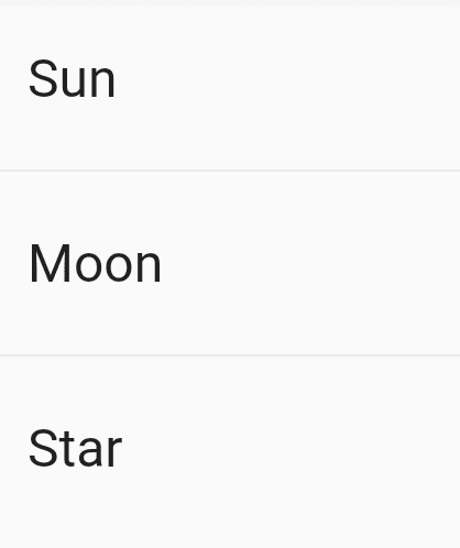
We will get output like below :
Static ListView widget Example
2. ListView.builder() : The ListView.builder() constructs the repeating list of items.when you have a list of items to display, it’s better to use ListView.builder().
The Constructor of ListView.builder() will look like below :
ListView.builder({
    Key key,
    Axis scrollDirection: Axis.vertical,
    bool reverse: false,
    ScrollController controller,
    bool primary,
    ScrollPhysics physics,
    bool shrinkWrap: false,
    EdgeInsetsGeometry padding,
    double itemExtent,
    @required IndexedWidgetBuilder itemBuilder,
    int itemCount,
    bool addAutomaticKeepAlives: true,
    bool addRepaintBoundaries: true,
    bool addSemanticIndexes: true,
    double cacheExtent,
    int semanticChildCount,
    DragStartBehavior dragStartBehavior: DragStartBehavior.start,
  });
The required parameter is a function itemBuilder of type IndexedWidgetBuilder with declaration Widget IndexedWidgetBuilder(BuildContext context, int index).Apart from the standard parameter BuildContext, the parameter index specifies the index of the current item to build. Another parameter itemCount of ListView.builder can specify the total number of items. The itemBuilder function will be called only with indices greater than or equal to 0 and less than itemCount.
ListView.builder code snippet :
ListView.builder(
  itemCount: itemCount,
  itemBuilder: (context, position) {
    return listItem();
  },
),
Define countryArray like below :
final countryArray = [
    'Albania',
    'Andorra',
    'Armenia',
    'Austria',
    'Azerbaijan',
    'Belarus',
    'Belgium',
    'Bosnia and Herzegovina',
    'Bulgaria',
    'Croatia',
    'Cyprus',
    'Czech Republic',
    'Denmark',
    'Estonia',
    'Finland',
    'France',
    'Georgia',
    'Germany',
    'Greece',
    'Hungary',
    'Iceland',
    'Ireland',
    'Italy',
    'Kazakhstan',
    'Kosovo',
    'Latvia',
    'Liechtenstein',
    'Lithuania',
    'Luxembourg',
    'Macedonia',
    'Malta',
    'Moldova',
    'Monaco',
    'Montenegro',
    'Netherlands',
    'Norway',
    'Poland',
    'Portugal',
    'Romania',
    'Russia',
    'San Marino',
    'Serbia',
    'Slovakia',
    'Slovenia',
    'Spain',
    'Sweden',
    'Switzerland',
    'Turkey',
    'Ukraine',
    'United Kingdom',
    'Vatican City'
  ];
Now use it in a ListView.builder() like below :
ListView.builder(
      itemCount: countryArray.length,
      itemBuilder: (context, index) {
        return ListTile(
          title: Text(countryArray[index]),
        );
      },
    );
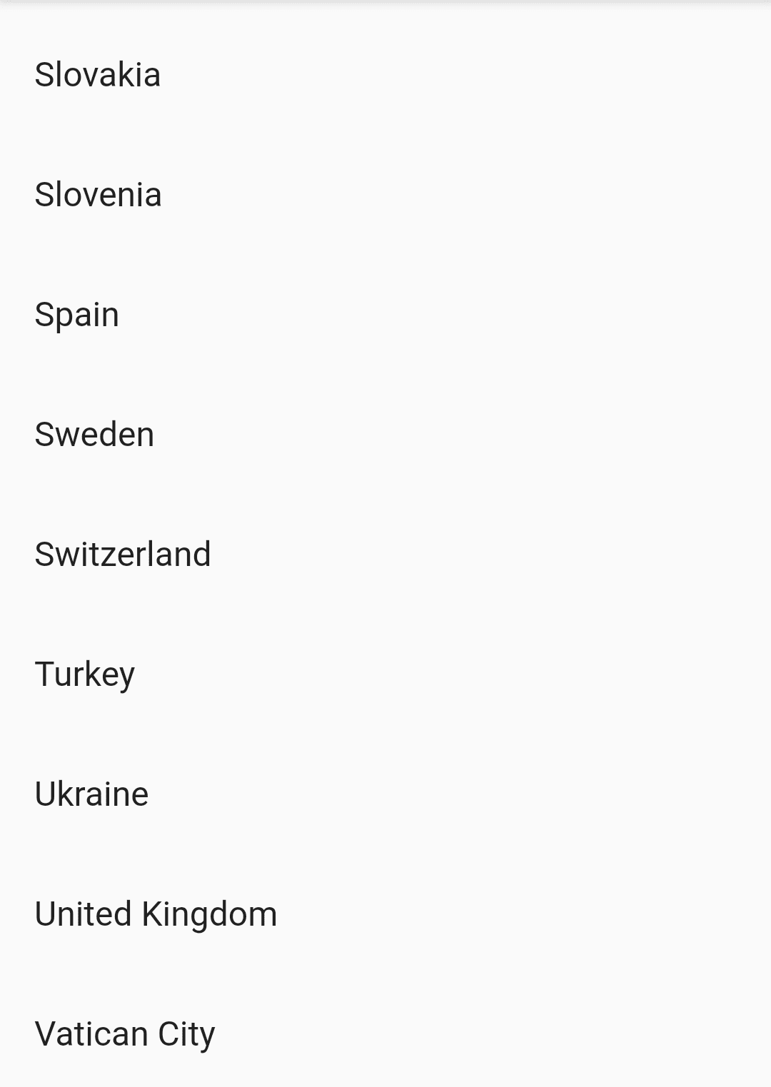
Our output will look like below :
ListView.builder()
3. ListView.separated() :
In the ListView.separated() constructor,we generate the list,and we can specify the separator between each item.
In essence, we construct two interweaved lists one as the main List, one as the separator list. The constructor of Listview.separated() will look like below :
 ListView.separated({
    Key key,
    Axis scrollDirection: Axis.vertical,
    bool reverse: false,
    ScrollController controller,
    bool primary,
    ScrollPhysics physics,
    bool shrinkWrap: false,
    EdgeInsetsGeometry padding,
    @required IndexedWidgetBuilder itemBuilder,
    @required IndexedWidgetBuilder separatorBuilder,
    @required int itemCount,
    bool addAutomaticKeepAlives: true,
    bool addRepaintBoundaries: true,
    bool addSemanticIndexes: true,
    double cacheExtent,
    ScrollViewKeyboardDismissBehavior keyboardDismissBehavior:
        ScrollViewKeyboardDismissBehavior.manual,
  });
ListView.separated code snippet :
ListView.separated(
      itemBuilder: (context, position) {
        return ListItem();
      },
      separatorBuilder: (context, position) {
        return SeparatorItem();
      },
      itemCount: itemCount,
),
Example
ListView.separated(
        itemCount: 1000,
        itemBuilder: (context, index) {
          return ListTile(
            title: Text('Item $index'),
          );
        },
        separatorBuilder: (context, index) {
          return Divider();
        },
      );
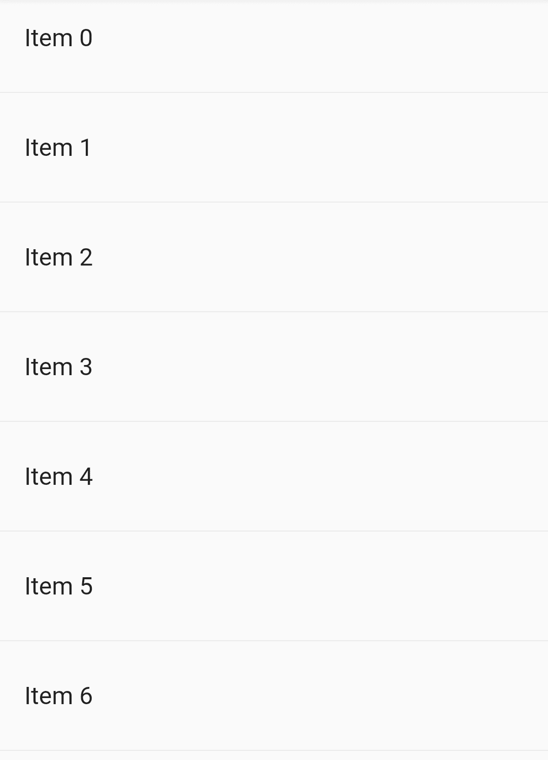
ListView.separated()
Custom list item :
ListView.custom is the third constructor to create ListView. It requires to provide an implementation of SliverChildDelegate. Generally, you don’t need to subclass SliverChildDelegate directly. If you want to customize the behavior of ListView, try to subclass SliverChildListDelegate and SliverChildBuilderDelegate instead.
 ListView.custom({
    Key key,
    Axis scrollDirection: Axis.vertical,
    bool reverse: false,
    ScrollController controller,
    bool primary,
    ScrollPhysics physics,
    bool shrinkWrap: false,
    EdgeInsetsGeometry padding,
    double itemExtent,
    @required SliverChildDelegate childrenDelegate,
    double cacheExtent,
    int semanticChildCount,
  });
Code snippet :
ListView.builder(
      itemBuilder: (context, index) {
        return Card(
          child: Padding(
            padding: const EdgeInsets.all(8.0),
            child: Row(
              children: <Widget>[
                Expanded(
                  child: Column(
                    crossAxisAlignment: CrossAxisAlignment.start,
                    children: <Widget>[
                      Text(
                        'Title',
                        style: TextStyle(fontSize: 16),
                      ),
                      Text('subtitle'),
                    ],
                  ),
                ),
                Expanded(
                  child: Column(
                    crossAxisAlignment: CrossAxisAlignment.start,
                    children: <Widget>[
                      Text(
                        'Title',
                        style: TextStyle(fontSize: 16),
                      ),
                      Text('subtitle'),
                    ],
                  ),
                ),
              ],
            ),
          ),
        );
      },
    );
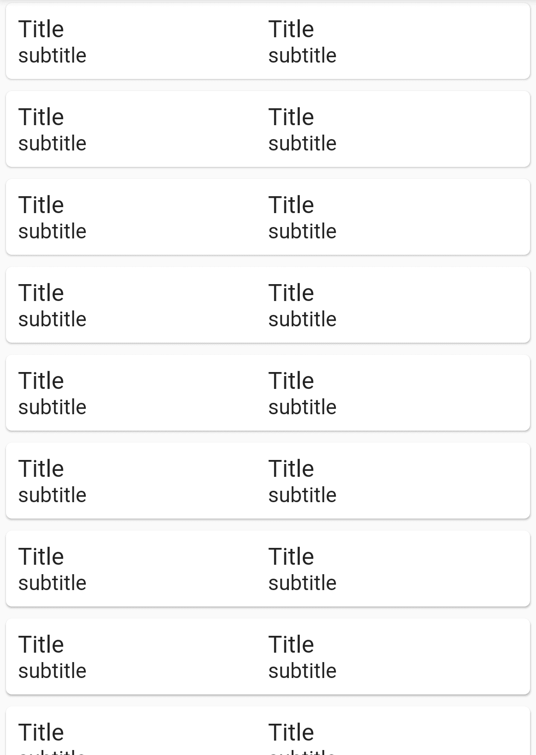
Which will generate output like below :
Custom ListView
Properties of ListView Widget are as listed below :
- Children: Children Hold a list of widgets as their value and arranges them in a list format. This attribute is the most important as the list values are held inside this.
- Padding: Padding takes in the value of the EdgetInsets class. This can be particularly useful if you are trying to arrange one ListView with another. It arranges the entire ListView and gives it a padding property.
- Primary: This should be set, if this is the primary ListView with scrolling property associated with the Parent of this widget. That is if there are multiple ListViews arranged across the UI. If this property is set to true, then only this ListView can be scrolled. If the primary is false, the ListView cannot be scrolled.
- ScrollDirection: ScrollDirection allows the elements inside the ListView to either be scrolled horizontally or vertically. This property can be also used when there are multiple ListViews present and the direction of the scroll has to be provided.
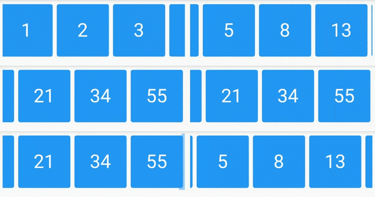
To Scroll items in horizontal direction, scrollDirection property is used. scrollingDirection which can be either Axis.vertical or Axis.horizontal .
Code snippet :
scrollDirection: Axis.horizontal,
Container(
      padding: EdgeInsets.symmetric(
        horizontal: 5.0,
        vertical: 5.0,
      ),
      height: MediaQuery.of(context).size.height * 0.2,
      child: ListView.builder(
          scrollDirection: Axis.horizontal,
          itemCount: numbers.length,
          itemBuilder: (context, index) {
            return Container(
              width: MediaQuery.of(context).size.width * 0.3,
              child: Card(
                color: Colors.blue,
                child: Container(
                  child: Center(
                      child: Text(
                    numbers[index].toString(),
                    style: TextStyle(
                      color: Colors.white,
                      fontSize: 36.0,
                    ),
                  )),
                ),
              ),
            );
          }),
    );
Which will give us output like below :
ListView ScrollDirection
- ShrinkWrap : ShrinkWrap specifies if the extent of the scroll view in the scrollDirection should be determined by the contents being viewed. That is, if the elements are restricted to 10 per window, the Scrolling shows only shows 10 elements at a time and the rest are scrolled out of view.
Thanks for being with us on a Flutter Journey !!!
Thanks for reading.
FlutterAgency.com is our portal Platform dedicated to Flutter Technology and Flutter Developers. The portal is full of cool resources from Flutter like Flutter Widget Guide, Flutter Projects, Code libs and etc.
FlutterAgency.com is one of the most popular online portal dedicated to Flutter Technology and daily thousands of unique visitors come to this portal to enhance their knowledge on Flutter.
Contemporary ventures
Recent blog
ready to get started?
Fill out the form below and we will be in touch soon!
"*" indicates required fields

