LinearProgressIndicator Widget – Flutter Guide By Flutter Agency
When the mobile application has to do something that takes some time to finish, you may need to display a progress indicator message which is used to hold user for a particular moment. In Flutter, one of the suitable widget for that purpose is LinearProgressIndicator Widget. The progress is displayed in a linear bar. If you want to display the progress in a circular shape, the user can consider using CircularProgressIndicator.
What is LinearProgressIndicator Widget?
A LinearProgressIndicator is basically a progress bar that shows the progress in a line. By default, all properties are optional, which means that the indicator will be an indeterminate progress bar. That means that we don’t really know when the process will be finished, as opposed to a determinate LinearProgressIndicator Widget of which the value property should be updated. The constructor of it will look like below :
LinearProgressIndicator({
  Key? key,
  double? value,
  Color? backgroundColor,
  Color? color,
  Animation<color?>? valueColor,
  double? minHeight,
  String? semanticsLabel,
  String? semanticsValue,
  BorderRadiusGeometry borderRadius = BorderRadius.zero,
})
There are two types of progress indicators: determinate and indeterminate.determinate means the completion progress is shown at every time. For example, copying a certain number of files into another folder can use the number of files already copied to determinate the progress. On the contrary, indeterminate doesn’t show the completion progress. It’s suitable for cases when the completion progress cannot be known or if you don’t want the users to know the completion percentage.
How to use LinearProgressIndicator in Flutter?
The following code snippet tells us how to implement LinearProgressIndicator Widget in Flutter.
Container(
      child: Center(
        child: LinearProgressIndicator(),
      ),
    );
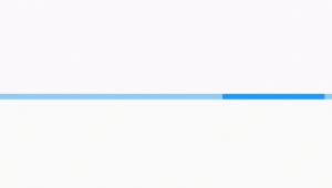
We will output like below : 
LinearProgressIndicator
If you want to show make a determinate progress indicator, that means you want to show how much we have progressed or how long it will take more to finish downloading something. For determinate progress indicator, you need to pass value property whose value ranges from 0.0 until 1.0. If the value is 0.0, it means the progress is 0%. If the value is 1.0, the progress is 100%. A value of 0.2 means the progress is at 20%, you can see it from the area covered by the progress indicator’s color.LinearProgressIndicator(
value: 0.2,
),
We will get output like below : 
Determinate LinearProgressIndicator
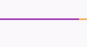
- Color: For background colors, users need to set backgroundColor (Color) property. For the color of the progress indicator, what you need to set is valueColor (Animation<Color>).
backgroundColor: Colors.purple,
         valueColor: new AlwaysStoppedAnimation<Color>(
           Colors.orangeAccent,
         ),

LinearProgressIndicator Background
Properties :
- key: The widget key, used to control if it’s should be replaced.
- value : A value from 0.0 to 1.0 representing the completion progress (for determinate).
- backgroundColor: The background color of the widget.
- Animation<Color> value color: The progress indicator’s color as an animated value.
- semanticsLabel: ySemantics.label for the widget.
- semanticsValue: Semantics.value for the widget.
Conclusion:
In this article, we have been through What is LinearProgressIndicator Widget in Flutter along with how to use it in a Flutter. Thanks for reading !!! Need more assistance with Flutter?Need more assistance with Flutter Development?
Contemporary ventures
Recent blog
ready to get started?
Fill out the form below and we will be in touch soon!
"*" indicates required fields


