How to implement DropDownButton Widget in Flutter?
In Flutter, A DropDownButton is a material design button. So, in this article, we will see how to implement DropDownButton Widget in Flutter.
How to implement DropDownButton Widget in Flutter?
The DropDownButton is a widget that we can use to select one unique value from a set of values. So, it lets the user select one value from a number of items. The default value shows the currently selected value. We can also include a down arrow icon on the list. On clicking the DropDownButton it opens a list list of items. From this list, the user can select the desired option.
Properties of DropDownButton:
- items: We use this property to define various items. We can define this item in our dropdown menu/list. It is a list of items that users can select.
- value: The currently selected item is value.
- style: We use the style property to style our text in the dropdown menu/list like color, font size, font weight, etc.
- alignment: Alignment defines how the hint or selected item is positioned within the button.
- elevation: We use elevation property to elevate the dropdown menu/list.
- icon: You can use this property to display an icon to the dropdown button.
- iconSize: You can use this property to define the size of the icon.
- iconDisabledColor: When you have disabled the dropdown button you can use this property to set icon color.
- iconEnabledColor: When you have enabled the dropdown button you can use this property to set icon color.
- dropdownColor: You can use this property to display the background color of the dropdown.
- isDense: This property reduces the height of the button.
- isExpanded: You can use this property to expand the dropdown button to full width.
- selectedItemBuilder: When the user selects an option from the dropdown list it displays the option on the button. If you want to display some other text instead of the selected option on the button we will use selectedItemBuilder.
- hint: We can display one of the options from the dropdown list on the button or we can set our desired text by default using the hint.
- disabledHint: This property is used to display desired text when the dropdown button is disabled.
Example:
Let’s implement a DropDownButton through a simple example. Below is the Flutter code:
import 'package:flutter/material.dart';

void main() {
  runApp(const MyApp());
}

class MyApp extends StatelessWidget {
  const MyApp({Key? key}) : super(key: key);
  @override
  Widget build(BuildContext context) {
    return MaterialApp(
      title: 'Flutter DropDownButton',
      theme: ThemeData(
        primarySwatch: Colors.red,
      ),
      home: const MyHomePage(),
      debugShowCheckedModeBanner: false,
    );
  }
}

class MyHomePage extends StatefulWidget {
  const MyHomePage({Key? key}) : super(key: key);

  @override
  _MyHomePageState createState() => _MyHomePageState();
}

class _MyHomePageState extends State<MyHomePage> {

  // Initial Selected Value
  String dropdownvalue = 'Item 1';

  // List of items in our dropdown menu
  var items = [
    'Item 1',
    'Item 2',
    'Item 3',
    'Item 4',
    'Item 5',
  ];
  @override
  Widget build(BuildContext context) {
    return Scaffold(
      appBar: AppBar(
        title: const Text("Flutter Agency"),
      ),
      body: Center(
        child: Column(
          mainAxisAlignment: MainAxisAlignment.center,
          children: [
            DropdownButton(

              // Initial Value
              value: dropdownvalue,

              // Down Arrow Icon
              icon: const Icon(Icons.keyboard_arrow_down),

              // Array list of items
              items: items.map((String items) {
                return DropdownMenuItem(
                  value: items,
                  child: Text(items),
                );
              }).toList(),
              // After selecting the desired option,it will
              // change button value to selected value
              onChanged: (String? newValue) {
                setState(() {
                  dropdownvalue = newValue!;
                });
              },
            ),
          ],
        ),
      ),
    );
  }
}
Output:
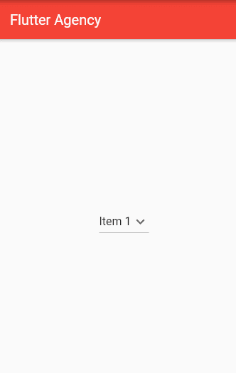
Before clicking the dropdown button:
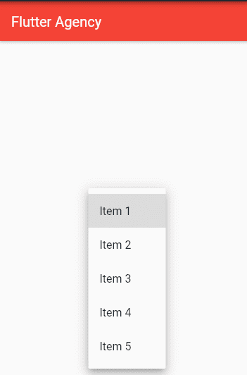
So now on clicking the drop-down button the user can see select one unique option from several items.
Conclusion:
Thanks for being with us on a Flutter Journey!
So, in this article, we have seen how to implement DropDownButton Widget in Flutter. Also, feel free to comment and provide any other suggestions regarding Flutter.
Flutter Agency is our portal Platform dedicated to Flutter Technology and Flutter Developers. Also, the portal is full of cool resources from Flutter like Flutter Widget Guide, Flutter Projects, Code libs and etc.
Flutter Agency is one of the most popular online portals dedicated to Flutter Technology. Daily thousands of unique visitors come to this portal to enhance their knowledge of Flutter.
Contemporary ventures
Recent blog
ready to get started?
Fill out the form below and we will be in touch soon!
"*" indicates required fields


