DefaultTextStyle – Flutter Widget Guide By Flutter Agency
For each Text Widget, Flutter allows you to define a different TextStyle.What if you want to apply the same style for multiple widgets. It can be done easily using DefaultTextStyle.
What is DefaultTextStyle?
DefaultTextStyle Widget is used to apply a default text style to its descendant widgets. Therefore, the DefaultTextStyle Widget must be the ascendant of the widgets where the styles would be applied. But it doesn’t mean a Text Widget must follow the default style. It’s still possible for a widget to have its own style.
The default constructor for DefaultTextStyle will look like below:
DefaultTextStyleWidget({
   Key key,
   @required TextStyle style,
   @required Widget child,
   TextAlign textAlign,
   bool softWrap: true,
   TextOverflow overflow: TextOverflow.clip,
   int maxLines,
   TextWidthBasis textWidthBasis: TextWidthBasis.parent,
   TextHeightBehavior textHeightBehavior,
 });
In Above constructor attribute marked with @required must not be empty.
Code Snippet is as below :
 DefaultTextStyle(
          style: TextStyle(fontSize: 36, color: Colors.blue),
          child:..
 )
 DefaultTextStyle(
              style: TextStyle(fontSize: 36, color: Colors.blue),
              child: Center(
                child: Column(
                  mainAxisAlignment: MainAxisAlignment.center,
                  children: [
                    const Text(
                      'DefaultText first',
                    ),
                    const Text(
                      'DefaultText  two',
                      style: TextStyle(fontSize: 24),
                    ),
                    const Text(
                      'DefaultText  three',
                      style: TextStyle(color: Colors.red),
                    ),
                  ],
                ),
              ),
            ),
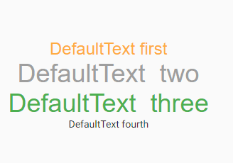
First, we define a DefaultTextStyle with a font size of 36 and blue as the font color. There are three Text widgets under it. The first one doesn’t have its own style, so it uses the default style. The second one has its own style, but it only overrides the font size. Therefore, it still uses blue as the color, but with different font sizes. The third font overrides the color only, so it still uses the default size.
There is also a fourth Text widget, but it’s outside DefaultTextStyle, so it’s not affected by the default style. The above code will generate output like below :

DefaultTextStyle
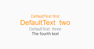
What if one DefaultTextStyle has another DefaultTextStyle as a child widget. Code Snippet for it as below :
Column(
    mainAxisAlignment: MainAxisAlignment.center,
    children: <Widget>[
      DefaultTextStyle(
        style: TextStyle(fontSize: 36, color: Colors.blue),
        child: DefaultTextStyle(
          style: TextStyle(color: Colors.orange),
          child: Center(
            child: Column(
              mainAxisAlignment: MainAxisAlignment.center,
              children: <Widget>[
                const Text(
                  'DefaultText first',
                ),
                const Text(
                  'DefaultText  two',
                  style: TextStyle(fontSize: 24),
                ),
                const Text(
                  'DefaultText  three',
                  style: TextStyle(color: Colors.grey),
                ),
              ],
            ),
          ),
        ),
      ),
      const Text(
        'The fourth text',
      ),
    ],
  );
Which will generate output looks like below :

DefaultTextStyle Inside DefaultTextStyle
Properties of DefaultTextStyle
Below are the available properties of DefaultTextStyle :
- Key key: The widget key, used to control if it’s should be replaced.
- TextStyle style: Default TextStyle for its descendants.
- TextAlign textAlign: How the text should be aligned.
- softWrap: Whether the text should break at soft line breaks.
- Overflow overflow: How visual overflow should be handled.
- maxLines: maximum number of lines for the text.
- TextWidthBasis textWidthBasis: The strategy to use for calculating the width of the Text.
Need more assistance with flutter? Do Contact Us !!!
We would love to assist you Flutter.
FlutterAgency.com is our portal Platform dedicated to Flutter Technology and Flutter Developers. The portal is full of cool resources from Flutter like Flutter Widget Guide, Flutter Projects, Code libs and etc.
FlutterAgency.com is one of the most popular online portal dedicated to Flutter Technology and daily thousands of unique visitors come to this portal to enhance their knowledge on Flutter.
Contemporary ventures
Recent blog
ready to get started?
Fill out the form below and we will be in touch soon!
"*" indicates required fields


