DecoratedBox Widget – Flutter Widget Guide By Flutter Agency
What is DecoratedBox Widget?
DecoratedBox Widget paints a decoration onto another box like a container widget that is a child of DecoratedBox. DecoratedBox which defines the decoration you want.
Container Widget inserts its child by the widths of the borders; this widget does not. DecoratedBox commonly used with BoxDecoration.
DecoratedBox Widget combines with BoxDecoration is a handy and flexible way to add more styling to any Container Widget elements as your needs require.
Default Constructor of DecoratedBox will look like below :
 DecoratedBox({
    Key key,
    @required Decoration decoration,
    DecorationPosition position:                                  DecorationPosition.background,
    Widget child,
  });
The decoration and position arguments must not be null. By default the decoration paints behind the child.
Decorations can be painted in the foreground or background via DecorationPosition (i.e., in front of or behind the child, respectively
Code Snippet will look like below :
 DecoratedBox(
  child :widget(),
)
Properties :
decoration: Represents the decoration to be drawn, its type is Decoration. Decoration. It is an abstract class that defines an interface createBoxPainter(). The main responsibility of the subclass is to create a brush by implementing it. The brush is used to draw decorations.
position: This attribute determines where to draw Decoration, DecorationPositionthe type of enumeration it receives, and the enumeration class has two values:
- background: Draw after the sub-component, that is, background decoration.
- foreground: Draw on the sub-component, namely the foreground.
child: The widget below this widget in the tree. child widget can have only single children. To use multiple children users can make use of Row Widget, Column Widget or Stack Widget
A simple example to will Look like below :
import 'package:flutter/material.dart';

class DecoratedBoxWidget extends StatelessWidget {
  DecoratedBoxWidget({
    Key key,
    @required Decoration decoration,
    DecorationPosition position: DecorationPosition.background,
    Widget child,
  });
  @override
  Widget build(BuildContext context) {
    return Center(
      child: DecoratedBox(
        position: DecorationPosition.background,
        decoration: BoxDecoration(
          color: const Color(0xFFFFFFFF),
          border: Border.all(
            color: const Color(0xFF000000),
            style: BorderStyle.solid,
            width: 4.0,
          ),
          borderRadius: BorderRadius.zero,
          shape: BoxShape.rectangle,
          boxShadow: const <BoxShadow>[
            BoxShadow(
              color: Color(0x66000000),
              blurRadius: 10.0,
              spreadRadius: 4.0,
            )
          ],
        ),
        child: Container(
          child: Container(
            width: 200,
            height: 200,
            padding: EdgeInsets.all(20),
            child: FlutterLogo(),
          ),
        ),
      ),
    );
  }
}
We will get output like below. In the above code, we have wrapped a DecoratedBoxWidget in a Center Widget.
Decorated Box Widget
General Queries on Decorated Box
- How to set the background color of a Flutter OutlineButton?
Consider a code snippet below :
Container(
        color: Colors.green,
        child: OutlineButton(
          onPressed: () {},
          color: Colors.orange,
          highlightColor: Colors.pink,
          child: Container(
            color: Colors.yellow,
            child: Text("A"),
          ),
          shape: CircleBorder(),
        ),
      ),
We will get output like below :
Button Widget
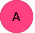
To modify the backgroundColor of an OutlineButton you can use a DecoratedBox and a Theme widget.
Wrap your OutlinedButton inside a DecoratedBox. Set the shape of your DecoratedBox to the same shape your OutlinedButton. Now you can use the color attribute of your DecoratedBox to change the color. The result will still have small padding around the OutlinedButton. To remove this you can wrap the DecoratedBox inside a Theme in which you adjust the ButtonTheme. Inside the ButtonTheme you want to set materialTapTargetSize: MaterialTapTargetSize.shrinkWrap
Consider a solution using a DecoratedBox with below code snippet.
DecoratedBox(
        decoration: ShapeDecoration(
          shape: CircleBorder(),
          color: Colors.pinkAccent,
        ),
        child: Theme(
          data: Theme.of(context).copyWith(
            buttonTheme: ButtonTheme.of(context).copyWith(
              materialTapTargetSize: MaterialTapTargetSize.shrinkWrap,
            ),
          ),
          child: OutlineButton(
            shape: CircleBorder(),
            child: Text('A'),
            onPressed: () => {},
          ),
        ),
      ),
We will get our output as expected as below :
DecoratedBox Widget
- Stack paints Container Widget, but not DecoratedBox?
Consider a code snippet like below :
Widget build(BuildContext context) {
    return Stack(
      children: <Widget>[
        DecoratedBox(
          // doesn't work
          decoration: BoxDecoration(
            color: Colors.red,
          ),
        ),
      ],
    );
When you look at the above code we have a DecoratedBox wrapped with Stack Widget. In this Stack doesn’t render DecoratedBox because DecoratedBox doesn’t have a default size while Container will have a parent size by default.
A Container widget is not just a DecoratedBox. It also uses other widgets, including SizedBox and Alignment.
We can say that
Container(
      color: Colors.red,
)
is not to
DecoratedBox(
  decoration: BoxDecoration(color: Colors.red),
)
but instead to
SizedBox.expand(
  child: DecoratedBox(
    decoration: BoxDecoration(color: Colors.red),
  ),
)
Thanks for reading !!!
Do let us know your suggestion/feedback.
FlutterAgency.com is our portal Platform dedicated to Flutter Technology and Flutter Developers. The portal is full of cool resources from Flutter like Flutter Widget Guide, Flutter Projects, Code libs and etc.
Contemporary ventures
Recent blog
ready to get started?
Fill out the form below and we will be in touch soon!
"*" indicates required fields


