CupertinoSegmentedControl Widget -Flutter Widget Guide By Flutter Agency
In this article, we will go through CupertinoSegmentedControl Widget.
What is CupertinoSegmentedControl Widget?
CupertinoSegmentedControl Widget is an iOS-style segmented control.
It will display the widgets provided in the Map of children in a horizontal list. Used to select between a number of mutually exclusive options. When one option in the segmented control is selected, the other options in the segmented control cease to be selected.
The Default Constructor of it will look like below:
CupertinoSegmentControlWidget({
  Key key,
  @required Map<T, Widget> children,
  @required ValueChanged<T> onValueChanged,
  T groupValue,
  Color unselectedColor,
  Color selectedColor,
  Color borderColor,
  Color pressedColor,
  EdgeInsetsGeometry padding,
});
In Above Constructor all fields marked with @required must not be empty.
Properties:
- Key key: The widget key, used to control if it’s should be replaced.
- Map<T, Widget>: Cupertino Segmented Control widget accepts a map that has a generic type T as its key and Widget as its value. Generic Type T can accept any data type and is a key used to access the value. In the screenshot, we have seen a tab showing Messenger, Active which are actually created using this Map. Don’t worry about how by the end you will understand it.
- ValueChanged<T> onValueChanged: on value changed is a callback function that gets executed when a user attempts to change the tabs by interacting with it. It accepts a Generic type T that denotes the key that we passed to the Map<T, Widget>. This ‘T’ is used to determine the changed Value.
- <T> groupValue: GroupValue is the selected Index or Key value. It is of type T that is a type of the type given to the Map.
- Color unselectedColor: unselectedColor is a property that accepts the value of type Color which applies the color of the Tab that is inactive or unselected. In the screenshot of the messenger app, white is the color that is applied when not selected / Inactive.
- Color selectedColor: SelectedColor is a property that accepts the value of type Color which applies the color of the Tab that is active or selected. In the screenshot of the messenger app, blue is the color that is applied when selected.
- Color borderColor: borderColor property sets the border color that shows the separation between the taps and the outer-line of the tabs. In the messenger app screenshot, the border color is blue.
- Color pressedColor: pressedColor is the property that accepts a value of type Color that applies when you press on the Tabs. It’s effect will be shown only on Tap and is removed as soon as the user releases.
- EdgeInsetsGeometry padding: The padding property sets the padding around the widget.
How to use CupertinoSegmentedControl Widget in Flutter?
The following code snippet tells us how to implement CupertinoSegmentedControl Widget in Flutter.
import 'package:flutter/cupertino.dart';
import 'package:flutter/material.dart';

const Color _colorOne = Color(0x33000000);
const Color _colorTwo = Color(0x24000000);
const Color _colorThree = Color(0x1F000000);

class CupertinoSegmentedControlWidget extends StatefulWidget {
  @override
  _CupertinoSegmentedControlDemoState createState() =>
      _CupertinoSegmentedControlDemoState();
}

class _CupertinoSegmentedControlDemoState
    extends State<CupertinoSegmentedControlWidget> {
  final Map<int, Widget> logoWidgets = const <int, Widget>{
    0: Text('Logo 1'),
    1: Text('Logo 2'),
    2: Text('Logo 3'),
  };

  final Map<int, Widget> icons = const <int, Widget>{
    0: Center(
      child: FlutterLogo(
        colors: Colors.indigo,
        size: 200.0,
      ),
    ),
    1: Center(
      child: FlutterLogo(
        colors: Colors.teal,
        size: 200.0,
      ),
    ),
    2: Center(
      child: FlutterLogo(
        colors: Colors.cyan,
        size: 200.0,
      ),
    ),
  };

  int sharedValue = 0;

  @override
  Widget build(BuildContext context) {
    return Column(
      children: <Widget>[
        const Padding(
          padding: EdgeInsets.all(16.0),
        ),
        SizedBox(
          width: 500.0,
          child: CupertinoSegmentedControl<int>(
            children: logoWidgets,
            onValueChanged: (int val) {
              setState(() {
                sharedValue = val;
              });
            },
            groupValue: sharedValue,
          ),
        ),
        Expanded(
          child: Padding(
            padding: const EdgeInsets.symmetric(
              vertical: 32.0,
              horizontal: 16.0,
            ),
            child: Container(
              padding: const EdgeInsets.symmetric(
                vertical: 64.0,
                horizontal: 16.0,
              ),
              decoration: BoxDecoration(
                color: CupertinoColors.white,
                borderRadius: BorderRadius.circular(3.0),
                boxShadow: const <BoxShadow>[
                  BoxShadow(
                    offset: Offset(0.0, 3.0),
                    blurRadius: 5.0,
                    spreadRadius: -1.0,
                    color: _colorOne,
                  ),
                  BoxShadow(
                    offset: Offset(0.0, 6.0),
                    blurRadius: 10.0,
                    spreadRadius: 0.0,
                    color: _colorTwo,
                  ),
                  BoxShadow(
                    offset: Offset(0.0, 1.0),
                    blurRadius: 18.0,
                    spreadRadius: 0.0,
                    color: _colorThree,
                  ),
                ],
              ),
              child: icons[sharedValue],
            ),
          ),
        ),
      ],
    );
  }
}
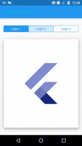
We will get output like below:
CupertinoSegmentedControl Widget
Conclusion:
In this article, we have been through What is CupertinoSegmentedControl Widget in Flutter along with how to implement it in a Flutter.
Thanks for reading !!!
You have a great day ahead.
FlutterAgency.com is our portal Platform dedicated to Flutter Technology and Flutter Developers. The portal is full of cool resources from Flutter like Flutter Widget Guide, Flutter Projects, Code libs and etc.
FlutterAgency.com is one of the most popular online portal dedicated to Flutter Technology and daily thousands of unique visitors come to this portal to enhance their knowledge on Flutter.
Contemporary ventures
Recent blog
ready to get started?
Fill out the form below and we will be in touch soon!
"*" indicates required fields


