CupertinoScrollbar Widget – Flutter Widget Guide By Flutter Agency
In this Cupertino Widget Series we have already discussed various CupertinoActivityIndicator Widget,CupertinoPicker Widget,CupertinoPageTransition Widget So now it’s time to discuss CupertinoScrollbar Widget in detail.
What is CupertinoScrollbar Widget in Flutter?
CupertinoScrollbar Widget is an iOS-style Scrollbar. A Scrollbar is basically used to scroll data in mobile screen and it indicates which portion of a Scrollable Widget is actually visible.
By Default, the CupertinoScrollbar Widget will remain draggable and it also uses PrimaryScrollController.
The Default Constructor of CupertinoScrollbar Widget will look like below:
CupertinoScrollbar CupertinoScrollbar({
  Key? key,
  required Widget child,
  ScrollController? controller,
  bool? thumbVisibility,
  double thickness = defaultThickness,
  double thicknessWhileDragging = defaultThicknessWhileDragging,
  Radius radius = defaultRadius,
  Radius radiusWhileDragging = defaultRadiusWhileDragging,
  bool Function(ScrollNotification)? notificationPredicate,
  ScrollbarOrientation? scrollbarOrientation,
})
In Above Constructor all fields marked with @required must not be empty.
Properties:
1. child (required Widget): The widget below this widget in the tree. The CupertinoScrollbar will be stacked on top of this widget and will display a scrollbar based on its scroll movements. This is typically a scrollable widget.
2. controller (ScrollController?): A ScrollController for the scrollbar. This controller can be used to control the scrolling of the content when the scrollbar is dragged. It’s optional; if not provided, the scrollbar will use the closest ScrollController in the scope if available.
3. key (Key?): The key for the scrollbar widget. Keys allow Flutter to uniquely identify widgets in the widget tree and are useful for preserving state when widgets move in the tree.
4. notificationPredicate (bool Function(ScrollNotification)?): A predicate function that determines which ScrollNotifications will trigger the scrollbar to update. It’s useful when there are multiple scrollable widgets under CupertinoScrollbar, and you want to control which scroll changes will affect the scrollbar visibility and size.
5. radius (Radius): The radius of the scrollbar’s corners when it is not being dragged. This property allows customizing the shape of the scrollbar, making it rounder or more rectangular. The default value is platform-dependent.
6. radiusWhileDragging (Radius): The radius of the scrollbar’s corners when it is being dragged. This property allows for a different scrollbar shape while dragging, which can provide a visual indication that the scrollbar is in an active state. The default value is platform-dependent.
7. scrollbarOrientation (ScrollbarOrientation?): Specifies the orientation of the scrollbar, whether it should be vertical or horizontal. It’s useful for scroll views that can scroll in both directions, allowing developers to specify which direction the scrollbar should be associated with.
8. thickness (double): The thickness of the scrollbar when it is not being dragged. This value determines how wide the scrollbar is when it is visible but not in use. The defaultThickness is platform-dependent.
9. thicknessWhileDragging (double): The thickness of the scrollbar when it is being dragged. This allows for a different scrollbar width during interaction, potentially making it easier to grab with a pointer device. The defaultThicknessWhileDragging is platform-dependent.
10. thumbVisibility (bool?): Controls the visibility of the scrollbar thumb. When set to true, the scrollbar thumb will always be visible. If false or null, the thumb will only be shown while the user is scrolling or during a drag gesture. This can be used to make the scrollbar more prominent or less intrusive depending on the application’s needs.
How to use CupertinoScrollbar Widget in Flutter?
The following code snippet tells us how to implement CupertinoScrollbar Widget in Flutter.
import 'package:flutter/cupertino.dart';
import 'package:flutter/material.dart';

void main() {
  runApp(const MyApp());
}

class MyApp extends StatelessWidget {
  const MyApp({Key? key}) : super(key: key);

  @override
  Widget build(BuildContext context) {
    return const MaterialApp(
      home: MyHomePage(),
    );
  }
}

class MyHomePage extends StatefulWidget {
  const MyHomePage({Key? key}) : super(key: key);

  @override
  _MyHomePageState createState() => _MyHomePageState();
}

class _MyHomePageState extends State {
  final ScrollController _scrollController = ScrollController();

  @override
  Widget build(BuildContext context) {
    return Scaffold(

      body: CupertinoScrollbar(
        key: const ValueKey('custom-scrollbar'),
        controller: _scrollController,
        thumbVisibility: true,
        thickness: 10.0,
        thicknessWhileDragging: 10.0,
        radius: const Radius.circular(8.0),
        radiusWhileDragging: const Radius.circular(10.0),
        notificationPredicate: (ScrollNotification notification) {
          return notification.depth == 0;
        },
        scrollbarOrientation: ScrollbarOrientation.right,
        child: ListView.builder(
          controller: _scrollController,
          itemCount: 100,
          itemBuilder: (context, index) => ListTile(
            title: Text('Item $index'),
          ),
        ),
      ),
    );
  }
}
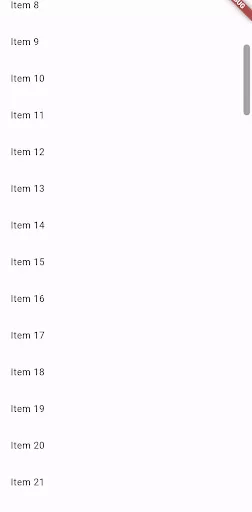
The above code will give us output like below:

Conclusion:
In this article, we have been through What is CupertinoScrollbar Widget in Flutter along with how to implement it in a Flutter.
Thanks for reading!!!
Keep Fluttering !!!
FlutterAgency.com is our portal Platform dedicated to Flutter Technology and Flutter Developers. The portal is full of cool resources from Flutter like Flutter Widget Guide, Flutter Projects, Code libs and etc.
FlutterAgency.com is one of the most popular online portal dedicated to Flutter Technology and daily thousands of unique visitors come to this portal to enhance their knowledge on Flutter.
Contemporary ventures
Recent blog
ready to get started?
Fill out the form below and we will be in touch soon!
"*" indicates required fields


