CupertinoPicker Widget – Flutter Widget Guide By Flutter Agency
Earlier, we have been through many Cupertino Widget like CupertinoActionSheet Widget, CupertinoActivityIndicator, and many more so now in this article we will discuss CupertinoPicker Widget in detail.
What is CupertinoPicker Widget?
CupertinoPicker Widget is an iOS-styled picker.
CupertinoPicker Widget displays its children widgets on a wheel for selection and calls back when the currently selected item changes.
By default, the first child in children will be the initially selected child. The index of a different child can be specified in scrollController, to make that child the initially selected child.
It can be used with showCupertinoModalPopup to display the picker modally at the bottom of the screen. When calling showCupertinoModalPopup, be sure to set semanticsDismissible to true to enable dismissing the modal via semantics.
Sizes itself to its parent. All children are sized to the same size based on itemExtent.
By default, descendent texts are shown with CupertinoTextThemeData.pickerTextStyle.
Default Constructor for it will look like the below:
CupertinoPicker(
{Key? key,
double diameterRatio = _kDefaultDiameterRatio,
Color? backgroundColor,
double offAxisFraction = 0.0,
bool useMagnifier = false,
double magnification = 1.0,
FixedExtentScrollController? scrollController,
double squeeze = _kSqueeze,
required double itemExtent,
required ValueChanged<int>? onSelectedItemChanged,
required List<Widget> children,
Widget? selectionOverlay = const CupertinoPickerDefaultSelectionOverlay(),
bool looping = false}
)
Other properties will look like below:
CupertinoPicker.builder(
{Key? key,
double diameterRatio = _kDefaultDiameterRatio,
Color? backgroundColor,
double offAxisFraction = 0.0,
bool useMagnifier = false,
double magnification = 1.0,
FixedExtentScrollController? scrollController,
double squeeze = _kSqueeze,
required double itemExtent,
required ValueChanged<int>? onSelectedItemChanged,
required NullableIndexedWidgetBuilder itemBuilder,
int? childCount,
Widget? selectionOverlay = const CupertinoPickerDefaultSelectionOverlay()}
)
In Above Constructor All fields marked with @required must not be empty.
Properties:
- Color backgroundColor: This property will specify the Background color behind the children.
- ListWheelChildDelegate childDelegate: A delegate that lazily instantiates children.
- double diameterRatio: Relative ratio between this picker’s height and the simulated cylinder’s diameter. Smaller values create more pronounced curvatures in the scrollable wheel.
- double itemExtent: It will specify the uniform height of all children. All children will be given the BoxConstraints to match this exact height. Must not be null and must be positive.
- double magnification: The zoomed-in rate of the magnifier, if it is used. The default value is 1.0, which will not change anything. If the value is > 1.0, the center item will be zoomed in by that rate, and it will also be rendered as flat, not cylindrical like the rest of the list. The item will be zoomed out if magnification < 1.0. Must be positive.
- double offAxisFraction: How much the wheel is horizontally off-center, as a fraction of its width. This property creates the visual effect of looking at a vertical wheel from its side where its vanishing points at the edge curves to one side instead of looking at the wheel head-on. The value is the horizontal distance between the wheel’s center and the vertical vanishing line at the edges of the wheel, represented as a fraction of the wheel’s width.
- ValueChanged<int> onSelectedItemChange: An option callback when the currently centered item changes.Value changes when the item closest to the center changes. This can be called during scrolls and during ballistic flings. To get the value only when the scrolling settles, use a NotificationListener, listen for ScrollEndNotification and read its FixedExtentMetrics.
- FixedExtentScrollController scrollController: This Property will set a FixedExtentScrollController to read and control the current item and to set the initial item.
- double squeeze: The angular compactness of the children on the wheel. This denotes a ratio of the number of children on the wheel vs the number of children that would fit on a flat list of equivalent size, assuming diameter ratio of 1.
- bool useMagnifier: Whether to use the magnifier for the center item of the wheel.
- double offAxisFraction: How much the wheel is horizontally off-center, as a fraction of its width. This property creates the visual effect of looking at a vertical wheel from its side where its vanishing points at the edge curves to one side instead of looking at the wheel head-on. The value is the horizontal distance between the wheel’s center and the vertical vanishing line at the edges of the wheel, represented as a fraction of the wheel’s width.
How to use CupertinoPicker Widget in Flutter?
The following code snippet tells us how to implement CupertinoPicker Widget in Flutter.
import 'package:flutter/cupertino.dart';
import 'package:flutter/material.dart';
void main() {
  runApp(const MyApp());
}
class MyApp extends StatelessWidget {
  const MyApp({super.key});
  @override
  Widget build(BuildContext context) {
    return const MaterialApp(
      home: MyHomePage(),
    );
  }
}
class MyHomePage extends StatefulWidget {
  final double itemExtent = 100;

  const MyHomePage({super.key});
  @override
  State<MyHomePage> createState() => _MyHomePageState();
}
class _MyHomePageState extends State<MyHomePage> {
  double total = 1;
  FixedExtentScrollController? firstController;
  FixedExtentScrollController? secondController;
  @override
  void initState() {
    super.initState();
    firstController = FixedExtentScrollController(initialItem: 0);
    secondController = FixedExtentScrollController(initialItem: 0);
  }
  @override
  void dispose() {
    firstController?.dispose();
    secondController?.dispose();
    super.dispose();
  }
  void _pickerHandler() {
    setState(
      () => total = (firstController?.selectedItem ?? 0 + 1).toDouble() +
          (secondController?.selectedItem == 0 ? 0 : .5),
    );
  }
  @override
  Widget build(BuildContext context) {
    return Scaffold(
      body: Center(
        child: Row(
          children: <Widget>[
            Expanded(
              child: Center(
                child: CupertinoPicker(
                  itemExtent: widget.itemExtent,
                  scrollController: firstController,
                  onSelectedItemChanged: (int index) => _pickerHandler(),
                  children: List<Widget>.generate(10, (int index) {
                    return Center(
                      child: Text(
                        (++index).toString(),
                      ),
                    );
                  }),
                ),
              ),
            ),
            Expanded(
              child: Center(
                child: CupertinoPicker(
                  itemExtent: 100,
                  scrollController: secondController,
                  onSelectedItemChanged: (int index) => _pickerHandler(),
                  children: const <Widget>[
                    Center(
                      child: Text(
                        '.0',
                      ),
                    ),
                    Center(
                      child: Text(
                        '.5',
                      ),
                    ),
                  ],
                ),
              ),
            ),
          ],
        ),
      ),
    );
  }
}
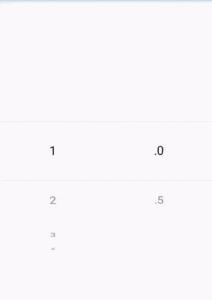
We will get output like the below:
CupertinoPicker Widget
Conclusion:
In this article, we have been through What is CupertinoPicker Widget in Flutter along with how to implement it in a Flutter.
Thanks for reading!!!
Do let us know your suggestion/feedback for the same.
FlutterAgency.com is our portal Platform dedicated to Flutter Technology and Flutter Developers. The portal is full of cool resources from Flutter like Flutter Widget Guide, Flutter Projects, Code libs and etc.
FlutterAgency.com is one of the most popular online portal dedicated to Flutter Technology and daily thousands of unique visitors come to this portal to enhance their knowledge on Flutter.
Contemporary ventures
Recent blog
ready to get started?
Fill out the form below and we will be in touch soon!
"*" indicates required fields


