How To Create Buttons With Different Styles In Flutter
In this article, we will learn how to create buttons with different styles in flutter. Every project has different designs and because of that, we need to create buttons with different styles in flutter.
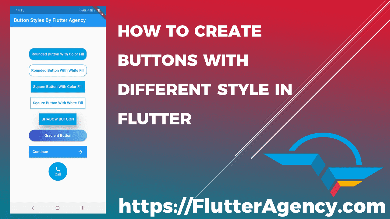
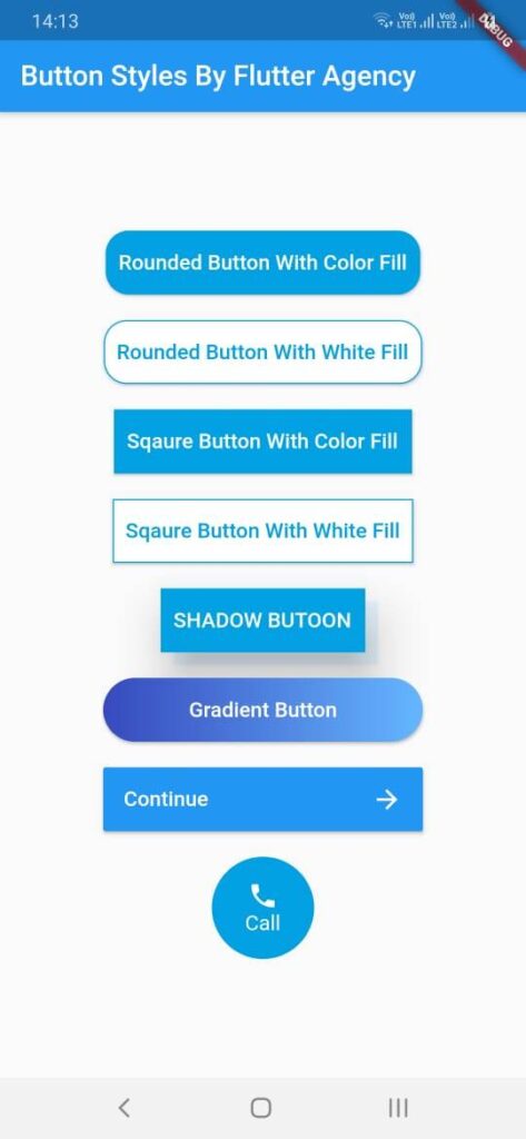
Our final output will look like below.
Different Button Styles
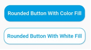
Let’s start with the first button. In this, we need to design a button with rounded edges, and to do that we have used the shape property of RaisedButton. In shape property, we have applied RoundedRectangleBorder shape and provided border-radius property to it. We have created two buttons with rounded edges one with filled background and another with a white background. Below is the code for the same.
Container(
              margin: EdgeInsets.all(10),
              height: 50.0,
              child: ElevatedButton(
                style: ElevatedButton.styleFrom(
                  primary: Color.fromRGBO(0, 160, 227, 1), // Button color
                  onPrimary: Colors.white, // Text color
                  shape: RoundedRectangleBorder(
                    borderRadius: BorderRadius.circular(18.0),
                    side: BorderSide(color: Color.fromRGBO(0, 160, 227, 1)),
                  ),
                  padding: EdgeInsets.all(10.0),
                ),
                onPressed: () {},
                child: Text(
                  "Rounded Button With Color Fill",
                  style: TextStyle(fontSize: 15),
                ),
              ),
            ),
            Container(
              margin: EdgeInsets.all(10),
              height: 50.0,
              child: ElevatedButton(
                style: ElevatedButton.styleFrom(
                  primary: Colors.white, // Button color
                  onPrimary: Color.fromRGBO(0, 160, 227, 1), // Text color
                  shape: RoundedRectangleBorder(
                    borderRadius: BorderRadius.circular(18.0),
                    side: BorderSide(color: Color.fromRGBO(0, 160, 227, 1)),
                  ),
                  padding: EdgeInsets.all(10.0),
                ),
                onPressed: () {},
                child: Text(
                  "Rounded Button With White Fill",
                  style: TextStyle(fontSize: 15),
                ),
              ),
            ),
Below is the output of the above code.
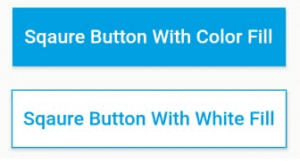
Next, We might also need to design a square button in Flutter. For the square button, we have used the above code and modified borderRadius property to 0. That’s it, and the button is now square. Below is the code for the same.
Container(
          margin: EdgeInsets.all(10),
          height: 50.0,
          child: ElevatedButton(
            style: ElevatedButton.styleFrom(
              primary: Color.fromRGBO(0, 160, 227, 1), // background color
              onPrimary: Colors.white, // text color
              padding: EdgeInsets.all(10.0),
              side: BorderSide(color: Color.fromRGBO(0, 160, 227, 1)),
              shape: RoundedRectangleBorder(
                borderRadius: BorderRadius.circular(0.0),
              ),
            ),
            onPressed: () {},
            child: Text(
              "Square Button With Color Fill",
              style: TextStyle(fontSize: 15),
            ),
          ),
        ),
        Container(
          margin: EdgeInsets.all(10),
          height: 50.0,
          child: ElevatedButton(
            style: ElevatedButton.styleFrom(
              primary: Colors.white, // background color
              onPrimary: Color.fromRGBO(0, 160, 227, 1), // text color
              padding: EdgeInsets.all(10.0),
              side: BorderSide(color: Color.fromRGBO(0, 160, 227, 1)),
              shape: RoundedRectangleBorder(
                borderRadius: BorderRadius.circular(0.0),
              ),
            ),
            onPressed: () {},
            child: Text(
              "Square Button With White Fill",
              style: TextStyle(fontSize: 15),
            ),
          ),
        ),
Below is the output of the above code.
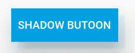
Next, We may get a requirement to design a button with extra elevation and shadow to it. To do that we have wrapped the button to Container and applied BoxDecoration with BoxShadow to the decoration property of the Container widget as this will provide shadow to the button. For Button elevation, we have applied elevation property to RaisedButton. Below is the code for the same.
Container(
            margin: EdgeInsets.all(10),
            height: 50.0,
            decoration: BoxDecoration(
              boxShadow: [
                BoxShadow(
                  color: Colors.blue.withOpacity(0.1),
                  blurRadius: 1,
                  offset: Offset(10, 10),
                ),
              ],
            ),
            child: ElevatedButton(
              style: ElevatedButton.styleFrom(
                primary: Color.fromRGBO(0, 160, 227, 1), // background (button) color
                onPrimary: Colors.white, // foreground (text) color
                padding: EdgeInsets.all(10.0),
                elevation: 30,
                shape: RoundedRectangleBorder(
                  borderRadius: BorderRadius.circular(0.0),
                  side: BorderSide(color: Color.fromRGBO(0, 160, 227, 1)),
                ),
              ),
              onPressed: () {},
              child: Text(
                "Shadow Button".toUpperCase(),
                style: TextStyle(fontSize: 15),
              ),
            ),
          ),
        ),
      ),
Below is the output of the above code.
Next, You may get a requirement to design a button with Gradient color. To do that we have used the Ink widget and its decoration property. We have applied BoxDecoration with gradient property to the decoration property of Ink Widget. Below is the code for the same.
Container(
  height: 50.0,
  margin: EdgeInsets.all(10),
  child: ElevatedButton(
    onPressed: () {},
    style: ElevatedButton.styleFrom(
      shape: RoundedRectangleBorder(
        borderRadius: BorderRadius.circular(80.0),
      ),
      padding: EdgeInsets.all(0.0),
      primary: Colors.transparent, // important for Ink decoration
      shadowColor: Colors.transparent, // removes the shadow
    ),
    child: Ink(
      decoration: BoxDecoration(
        gradient: LinearGradient(
          colors: [Color(0xff374ABE), Color(0xff64B6FF)],
          begin: Alignment.centerLeft,
          end: Alignment.centerRight,
        ),
        borderRadius: BorderRadius.circular(30.0),
      ),
      child: Container(
        constraints: BoxConstraints(maxWidth: 250.0, minHeight: 50.0),
        alignment: Alignment.center,
        child: Text(
          "Gradient Button",
          textAlign: TextAlign.center,
          style: TextStyle(color: Colors.white, fontSize: 15),
        ),
      ),
    ),
  ),
);
Below is the output of the above code.

We may also want to use icons in a button along with text or without text. To design such buttons, we have used Container Widget as a child of RaisedButton. Inside the Container widget, we have used the Row widget to have both text and icon on the same row. Below is the code for the same.
Container(
  constraints: BoxConstraints(maxWidth: 250.0, minHeight: 50.0),
  margin: EdgeInsets.all(10),
  child: ElevatedButton(
    onPressed: () {},
    style: ButtonStyle(
      backgroundColor: MaterialStateProperty.all(Theme.of(context).colorScheme.secondary),
    ),
    child: Padding(
      padding: EdgeInsets.all(0),
      child: Container(
        alignment: Alignment.center,
        child: Row(
          mainAxisAlignment: MainAxisAlignment.spaceBetween,
          children: [
            Text(
              'Continue',
              style: TextStyle(
                fontSize: 15,
                color: Colors.white,
              ),
            ),
            Icon(
              Icons.arrow_forward,
              color: Colors.white,
            )
          ],
        ),
      ),
    ),
  ),
)
Below is the output of the above code.

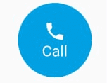
Last, We have designed a button in Oval shape as we need to implement such buttons in different scenarios. To do that we have used ClipOval Widget wrapped in SizedBox to create an oval shape of fixed size. Inside the ClipOval widget, we have used Material Widget where we have used the InkWell button. Below is the code for the same.
Container(
              margin: EdgeInsets.all(10),
              height: 80.0,
              child: SizedBox.fromSize(
                size: Size(80, 80), // button width and height
                child: ClipOval(
                  child: Material(
                    color: Color.fromRGBO(0, 160, 227, 1), // button color
                    child: InkWell(
                      splashColor: Color.fromRGBO(248, 177, 1, 1),
                      // splash color
                      onTap: () {},
                      // button pressed
                      child: Column(
                        mainAxisAlignment: MainAxisAlignment.center,
                        children: <Widget>[
                          Icon(
                            Icons.call,
                            color: Colors.white,
                          ), // icon
                          Text(
                            "Call",
                            style: TextStyle(
                              fontSize: 15,
                              color: Colors.white,
                            ),
                          ), // text
                        ],
                      ),
                    ),
                  ),
                ),
              ),
            )
Below is the output of the above code.
Below is the Github URL with the complete source code for the above examples. Please give stars to it.
In Flutter it’s really easy to design different styles of Buttons. We have tried to cover most here, but let us know if you want us to design and share any other type of button style. We would be happy to help you. Cheers!
Contemporary ventures
Recent blog
ready to get started?
Fill out the form below and we will be in touch soon!
"*" indicates required fields

