Container Widget – Flutter Widget Guide By Flutter Agency
In this article, we will learn about Container Widget.
What is a Container Widget?
Container Widget is nothing but the parent widget that contains a child widget and manages its a property like height, width, color, background, and so on.
It will be used by many widgets to add styling properties. Container Widget will hold parameters as below :
Container({
 Key? key,
 AlignmentGeometry? alignment,
 EdgeInsetsGeometry? padding,
 Color? color,
 Decoration? decoration,
 Decoration? foregroundDecoration,
 double? width,
 double? height,
 BoxConstraints? constraints,
 EdgeInsetsGeometry? margin,
 Matrix4? transform,
 AlignmentGeometry? transformAlignment,
 Widget? child,
 Clip clipBehavior = Clip.none,
})
- Child: This property is used to add child property to the Container Widget like we have added Flutter Logo as below.
The code snippet will look like below :
Container(
            child: FlutterLogo(
              size: 300,
            ),
          ),
The above code will generate code like below :
Container Child Property
- Color: Color property will apply color to a particular Container Widget. There several ways to apply color like
- color : Colors.orangeAccent
- color : color(0xFFFFFFFF)
- Color c = const Color.fromRGBO(66, 165, 245, 1.0)
Here RGBO Stands for R = Red, G = Green, B = Blue, O = Opacity with the color number.
The code snippet will look like below :
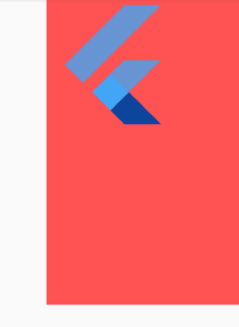
Container(
           color: Colors.redAccent,
           child: FlutterLogo(
             size: 300,
           ),
         ),
The above code will give us output like below :
Container Color Properties
- Alignment: User can use of Alignment, FractionalOffset, and AlignmentDirectional class for the alignment property in Container.
Alignment
In Alignment (0,0) means the center of the screen so if you assign Alignment(0,0) to the alignment property then it will be on the center of the screen.
The code snippet will look like below :
Container(
        color: Colors.redAccent,
        child: FlutterLogo(
          size: 200,
        ),
        alignment: Alignment(0, 0),
      ),
The above code will give us output like below :
Alignment Container
Consider Alignment(1.0,1.0) like below :
Container(
      color: Colors.redAccent,
      child: FlutterLogo(
        size: 200,
      ),
      alignment: Alignment(1.0, 1.0),
    );
Consider Alignment(-1.0,-1.0) like below :
Container(
      color: Colors.redAccent,
      child: FlutterLogo(
        size: 200,
      ),
      alignment: Alignment(-1.0, -1.0),
    );
Alignment(1.0,-1.0) will look like below :
Container(
      color: Colors.redAccent,
      child: FlutterLogo(
        size: 200,
      ),
      alignment: Alignment(1.0, -1.0),
    );
Users can use constants that are already defined by Alignment Class. Consider the code snippet as below :
Container(
      color: Colors.redAccent,
      child: FlutterLogo(
        size: 200,
      ),
      alignment: Alignment.bottomRight,
    );
Code snippet like below :
// The top left corner.
static const Alignment topLeft = Alignment(-1.0, -1.0);

// The center point along the top edge.
static const Alignment topCenter = Alignment(0.0, -1.0);

// The top right corner.
static const Alignment topRight = Alignment(1.0, -1.0);

// The center point along the left edge.
static const Alignment centerLeft = Alignment(-1.0, 0.0);

// The center point, both horizontally and vertically.
static const Alignment center = Alignment(0.0, 0.0);

// The center point along the right edge.
static const Alignment centerRight = Alignment(1.0, 0.0);

// The bottom left corner.
static const Alignment bottomLeft = Alignment(-1.0, 1.0);

// The center point along the bottom edge.
static const Alignment bottomCenter = Alignment(0.0, 1.0);

/// The bottom right corner.
static const Alignment bottomRight = Alignment(1.0, 1.0);
- FractionalOffset: You can also user FractionalOffset with the alignment property of the Container.
In FractionalOffset, (0,0) means the top left of the screen so if you assign Alignment(0,0) to the alignment property then it will be on the top left of the screen.
FractionalOffset(double dx, double dy)
The code snippet will look like below :
Container(
      color: Colors.redAccent,
      child: FlutterLogo(
        size: 200,
      ),
      alignment: FractionalOffset(0, 0),
    );
Users can use constants that are already defined by FractionalOffset Class.
Container(
      color: Colors.redAccent,
      child: FlutterLogo(
        size: 200,
      ),
      alignment: FractionalOffset.topLeft,
    );
There are many other constants :
/// The top left corner.
static const FractionalOffset topLeft = FractionalOffset(0.0, 0.0);

/// The center point along the top edge.
static const FractionalOffset topCenter = FractionalOffset(0.5, 0.0);

/// The top right corner.
static const FractionalOffset topRight = FractionalOffset(1.0, 0.0);

/// The center point along the left edge.
static const FractionalOffset centerLeft = FractionalOffset(0.0, 0.5);

/// The center point, both horizontally and vertically.
static const FractionalOffset center = FractionalOffset(0.5, 0.5);

/// The center point along the right edge.
static const FractionalOffset centerRight = FractionalOffset(1.0, 0.5);

/// The bottom left corner.
static const FractionalOffset bottomLeft = FractionalOffset(0.0, 1.0);

/// The center point along the bottom edge.
static const FractionalOffset bottomCenter = FractionalOffset(0.5, 1.0);
- AlignmentDirectional: Users can also use AlignmentDirectional with the alignment property of the Container.
Code Snippet will look like below :
AlignmentDirectional(this.start, this.y)
An offset that’s expressed as a fraction of a Size, but whose horizontal component is dependent on the writing direction.
Users can provide padding to the container by using properties as listed below :
Container(
  color: Colors.amber,
  child: FlutterLogo(
    size: 200,
  ),alignment: AlignmentDirectional(-1,1),
)
We will get output like below :
Container Widget
/// The top corner on the "start" side.
static const AlignmentDirectional topStart = AlignmentDirectional(-1.0, -1.0);

/// The center point along the top edge.
///
/// Consider using [Alignment.topCenter] instead, as it does not need
/// to be [resolve]d to be used.
static const AlignmentDirectional topCenter = AlignmentDirectional(0.0, -1.0);

/// The top corner on the "end" side.
static const AlignmentDirectional topEnd = AlignmentDirectional(1.0, -1.0);

/// The center point along the "start" edge.
static const AlignmentDirectional centerStart = AlignmentDirectional(-1.0, 0.0);

/// The center point, both horizontally and vertically.
///
/// Consider using [Alignment.center] instead, as it does not need to
/// be [resolve]d to be used.
static const AlignmentDirectional center = AlignmentDirectional(0.0, 0.0);

/// The center point along the "end" edge.
static const AlignmentDirectional centerEnd = AlignmentDirectional(1.0, 0.0);

/// The bottom corner on the "start" side.
static const AlignmentDirectional bottomStart = AlignmentDirectional(-1.0, 1.0);

/// The center point along the bottom edge.
///
/// Consider using [Alignment.bottomCenter] instead, as it does not
/// need to be [resolve]d to be used.
static const AlignmentDirectional bottomCenter = AlignmentDirectional(0.0, 1.0);

/// The bottom corner on the "end" side.
static const AlignmentDirectional bottomEnd = AlignmentDirectional(1.0, 1.0);
Constraint:
Container(
  color: Colors.amber,
  child: FlutterLogo(
    size: 200,
  ),
  alignment: Alignment.center,
  constraints: BoxConstraints(
    maxHeight: 400,
    maxWidth: 400,
    minHeight: 100,
    minWidth: 100,
  ),
)
Decoration: The decoration parameter is to paint behind the child. we can use the BoxDecoration class to decorate the container.
- Margin: A margin is a property specifying to add space to surround the container. we do it with EdgeInsets.
EdgeInsets.all :
EdgeInsets.all(double value)
Container(
      margin: EdgeInsets.all(50),
      color: Colors.redAccent,
      child: FlutterLogo(
        size: 200,
      ),
      alignment: FractionalOffset.topLeft,
    );
We will get output like below:
EdgeInsets.all Container
EdgeInsets.symmetric :
EdgeInsets.symmetric({ double vertical = 0.0,
                           double horizontal = 0.0 })
Container(
  alignment: Alignment.center,
  color: Colors.redAccent,
  child: FlutterLogo(
    size: 200,
  ),
  margin: EdgeInsets.symmetric(horizontal: 70, vertical: 30),
)
We will get output like below:
EdgeInsets.symmetric
EdgeInsets.fromLTRB :
EdgeInsets.fromLTRB(this.left, this.top, this.right, this.bottom)
Example :
Container(
  alignment: Alignment.center,
  color: Colors.amber,
  child: FlutterLogo(
    size: 200,
  ),
  margin: EdgeInsets.fromLTRB(20, 30, 40, 50),
)
EdgeInsets.only :
EdgeInsets.only({
  this.left = 0.0,
  this.top = 0.0,
  this.right = 0.0,
  this.bottom = 0.0
});
The code snippet will look like below :
Container(
  alignment: Alignment.center,
  color: Colors.amber,
  child: FlutterLogo(
    size: 200,
  ),
  margin: EdgeInsets.only(left: 70, bottom: 50),
)
We will get output like below:
EdgeInsets.only()
- Padding:
When we add padding to a widget, we just add space inside of a widget, unlike margin which adds space outside the widget.
Container(
  alignment: Alignment.center,
  color: Colors.amber,
  child: FlutterLogo(
    size: 200,
  ),
  padding: EdgeInsets.only(left: 70, bottom: 50),
)
We will get output like below:
Container Padding
- Height/Width: Both of these properties is used to provide fixed height and width to Container Widget but which is not Best practice.
Need more assistance?
We would love to assist you.
FlutterAgency.com is our portal Platform dedicated to Flutter Technology and Flutter Developers. The portal is full of cool resources from Flutter like Flutter Widget Guide, Flutter Projects, Code libs and etc.
FlutterAgency is one of the most popular online portals dedicated to Flutter Technology and daily thousands of unique visitors come to this portal to enhance their knowledge on Flutter.
Contemporary ventures
Recent blog
ready to get started?
Fill out the form below and we will be in touch soon!
"*" indicates required fields

