A comprehensive guide to using Flutter to create a beautiful AnimatedSearchBox
In the following tutorial, I’ll walk you through the steps of creating an animated called box in Flutter. This component gives your app’s users a great user experience by merging a search input field and an animated dropdown.
Ensure the Flutter mobile app development environment is set up on your machine before we begin. Let’s start by going through each step in creating the AnimatedSearchBox.
Steps of developing AnimatedSearchBox
Step 1: Install and Imports
First, create a new Flutter file or modify an existing one using the code. Import the required Flutter packages initially:
import 'package:flutter/material.dart';
Step 2: AnimatedSearchBoxController Class Definition
Create the AnimatedSearchBoxController class first, as it will control the AnimatedSearchBox’s state and behaviour. The list of items to be presented and the selected value will be included. The algorithm to filter items depending on user search should also be added.
Step 3: AnimatedDropdownItem Class Definition
Create the AnimatedDropdownItem class now to represent a dropdown list item. It must have properties for the value and text of the item.
Step 4: Building the AnimatedSearchBox Class
Let’s begin creating the class for the animated search box. The class will allow for the customization of several factors, including background colour, text style, and dimensions. Also, a search input form with an animated dropdown will be included.
Step 5: Making the user interface
Create the AnimatedSearchBox’s user interface inside the build method. Included in this will be a stack of widgets consisting of a column and an animated search field.
Step 6: Creating the Animated Dropdown
The _AnimatedSearchDropdown class, which will manage the animated dropdown, should now be implemented. This will cover the logic for handling item selection as well as how to show, expand, and contract the dropdown.

Step 7: Make the Animated Dropdown State
The animated dropdown’s state will be managed by the _AnimatedSearchDropdownState class. It will have animation logic for dropdowns, expansions, and contractions.
Step 8: Implementing Dropdown Logic
Things become intriguing at this point. Implement the logic to display the item list, manage item selection, and show and hide the dropdown.
Step 9: Implementing the Dropdown User Interface
Create the dropdown overlay’s user interface containing the item list and the necessary gestures.
Step 10: Finalizing the State
The implementation for the search input field and handling user interactions complete the _AnimatedSearchDropdownState class.
import 'package:animated_dropdown_button/animated_dropdown_button.dart';
import 'package:flutter/material.dart';


void main() {
  runApp(const MyApp());
}


class MyApp extends StatelessWidget {
  const MyApp({super.key});


  // This widget is the root of your application.
  @override
  Widget build(BuildContext context) {
    return MaterialApp(
      title: 'Flutter Agency ANIMATED DROPDOWN',
      debugShowCheckedModeBanner: false,
      theme: ThemeData(
        colorScheme: ColorScheme.fromSeed(
            seedColor: const Color.fromARGB(255, 42, 99, 222)),
        useMaterial3: true,
      ),
      home: const MyHomePage(),
    );
  }
}


class MyHomePage extends StatefulWidget {
  const MyHomePage({super.key});


  @override
  State<MyHomePage> createState() => _MyHomePageState();
}


class TitleModel extends AnimatedDropdownItem {
  final String name;
  TitleModel(this.name);
  @override
  String get text => name;
  @override
  String get value => name;
}


class _MyHomePageState extends State<MyHomePage> {
  late final AnimatedSearchBoxController animatedSearchController;


  final AnimatedDropdownButtonController animalsController =
      AnimatedDropdownButtonController(
    items: [
      "Flutter Agency",
      "Introduction to Flutter",
      "Flutter Widgets",
      "State Management",
    ],
    initialValue: "Flutter Agency",
  );


  @override
  void initState() {
    super.initState();
    animatedSearchController = AnimatedSearchBoxController(
      items: animals,
      initialValue: TitleModel(
        'Flutter Agency',
      ),
    );
  }


  @override
  Widget build(BuildContext context) {
    return Scaffold(
      // resizeToAvoidBottomInset: false,
      appBar: AppBar(
        backgroundColor: Theme.of(context).colorScheme.inversePrimary,
        title: const Column(
          children: [
            Text(
              'Flutter Agency',
              textAlign: TextAlign.center,
              style: TextStyle(
                fontSize: 20,
                fontWeight: FontWeight.w500,
              ),
            ),
          ],
        ),
        centerTitle: true,
      ),
      body: Container(
        height: MediaQuery.of(context).size.height,
        width: MediaQuery.of(context).size.width,
        color: const Color.fromARGB(255, 165, 149, 149),
        child: SingleChildScrollView(
          child: Padding(
            padding: const EdgeInsets.all(16.0),
            child: Column(
              crossAxisAlignment: CrossAxisAlignment.start,
              children: <Widget>[
                const SizedBox(height: 50),
                Column(
                  crossAxisAlignment: CrossAxisAlignment.start,
                  children: [
                    const Text(
                      'Animated Search Box',
                      textAlign: TextAlign.center,
                      style: TextStyle(
                        fontSize: 20,
                        fontWeight: FontWeight.w500,
                      ),
                    ),
                    AnimatedSearchBox(
                      width: 336,
                      controller: animatedSearchController,
                      backgroundColor: Colors.white,
                      hintText: 'Type an Topic name',
                    ),
                  ],
                ),
                const SizedBox(
                  height: 200,
                ),
                Column(
                  crossAxisAlignment: CrossAxisAlignment.start,
                  children: [
                    const Text(
                      'ANIMATED DROPDOWN',
                      textAlign: TextAlign.center,
                      style: TextStyle(
                        fontSize: 20,
                        fontWeight: FontWeight.w500,
                      ),
                    ),
                    AnimatedDropdownButton(
                      controller: animalsController,
                      backgroundColor: Colors.red,
                    ),
                  ],
                ),
              ],
            ),
          ),
        ),
      ),
    );
  }
}


final List<TitleModel> animals = [
  TitleModel("Flutter Agency"),
  TitleModel("State Management"),
  TitleModel("Flutter Widgets"),
  TitleModel("Introduction to Flutter"),
  TitleModel("Creating Beautiful UIs with Flutter Widgets"),
  TitleModel("State Management in Flutter Apps"),
  TitleModel("Flutter Navigation and Routing Techniques"),
  TitleModel("Flutter Animation and Customization Tips"),
];
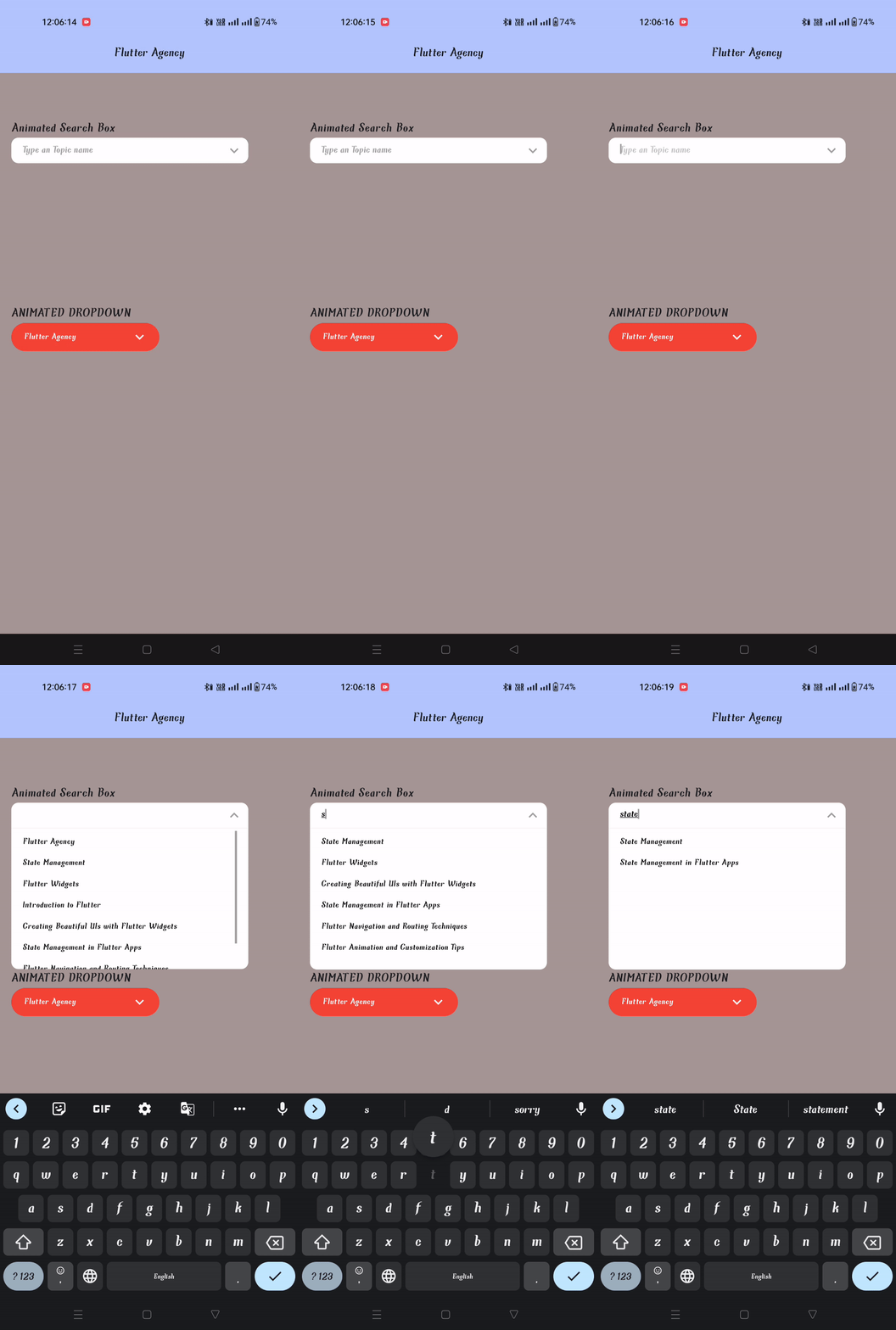
Output
OverlayEntry and LayerLink
Two essential concepts for designing sophisticated user interfaces and interactive overlays in Flutter are LayerLink and OverlayEntry. They are crucial to the display of floating overlays like modals, dropdowns, and pop-ups that can be displayed above the screen’s primary content.
A position within a widget (usually a target) and a position within an overlay layer can be connected using the LayerLink class. By defining this positional relationship, you can ensure that the overlay layer’s elements are accurate.
Consider a scenario where you want a widget on the main screen to have a specific position with an element in the overlay layer. You may establish this connection using LayerLink to ensure the floating element stays aligned as the target widget moves or is redrawn.
A class called OverlayEntry stands for an overlay element that may be inserted into the Flutter overlay layer. It is applied to the display of floating elements over the primary content of the screen. OverlayEntry components are practical because they let you design custom overlays like modals, pop-ups, and dropdowns.
A widget that will serve as the overlay’s content must be provided when establishing an OverlayEntry. Flutter will display this widget in the overlay layer above the other UI elements. Adding, updating, and removing the OverlayEntry as needed is possible, enabling the dynamic display of floating content.
Conclusion
Congratulations! You’ve successfully used Flutter to create an interactive search component named AnimatedSearchBox. A search input field and an animated dropdown are combined in this component to provide an engaging user experience. To enhance the user experience, adapt it to the look and feel of your app. Thanks to this step-by-step tutorial, You have a solid foundation to begin adding unique components to your Flutter UIs. Happy coding!
Therefore, we are an outstanding mobile app development company with a Flutter app development team at your fingertips. Let us know if you have an app concept and want to create your own Flutter app. Tell us about your requirements now!
Frequently Asked Questions (FAQs)
1. What is Animatedserachbox in Flutter?
AnimatedSearchBox is a Flutter package that provides a beautiful and animated search bar widget. Label, labelStyle, searchDecoration, and other options enable complete customization. It also maintains an onChange state.
2. In Flutter, how do you create a search box?
Use an AlertDialog widget to wrap the search bar to create a search bar with an Alert dialog in Flutter. This generates a button that, when pressed, displays a search bar-equipped Alert dialog. A text area in the search bar will be where users can type their search terms.
3. Are there any recommendations for Flutter apps with AnimatedSearchBoxe to optimize performance?
Yes, ensuring responsive and smooth user experiences, improving search algorithms, implementing appropriate state management (e.g., Provider, Bloc), and analyzing your app’s speed with Flutter DevTools are crucial.
Contemporary ventures
Recent blog
ready to get started?
Fill out the form below and we will be in touch soon!
"*" indicates required fields


