A Complete Guide to Flutter Swiper View Widget with Credit Card UI
A widely used Flutter package called “flutter_swiper” offers a highly flexible and customizable swiper (or slider) widget. It allows app developers to make dynamic content that users can swipe through, such as image sliders and onboarding screens, for their apps. This package is frequently used in Flutter mobile app development to improve the user experience and provide content in a visually pleasing way.
Flutter Credit Card
A credit card widget package with support for entering card information and card flip animations is called Flutter Credit Card. You can quickly implement the UI for a credit card with the help of a Flutter package.
Steps for Implementing Flutter Credit Card
Step 1:
Include the dependencies.
This means that you have to add the dependency in the pubspec – yaml file.
Dependency:
flutter_credit_card: ^0.1.4
Step 2:
Import the Flutter package into your code.
import 'package:flutter_credit_card/flutter_credit_card.dart';
Step 3:
Then, run the Flutter packages into the root directory of your development of mobile app.
Step 4:
Enable the AndroidX.
Add this to your gradle.properties file:
org.gradle.jvmargs=-Xmx1536M
android.enableR8=true
android.useAndroidX=true
android.enableJetifier=true
CodeFile:
import 'package:flutter/material.dart';
import 'package:flutter_credit_card/flutter_credit_card.dart';

class CreditCardPage extends StatefulWidget {
  @override
  State<StatefulWidget> createState() {
    return CreditCardPageState();
  }
}

class CreditCardPageState extends State<CreditCardPage> {
  String cardNumber = '';
  String expiryDate = '';
  String cardHolderName = '';
  String cvvCode = '';
  bool isCvvFocused = false;
  final GlobalKey<FormState> formKey = GlobalKey<FormState>();

  @override
  Widget build(BuildContext context) {
    return Scaffold(
      backgroundColor: Colors.teal[50],
      appBar: AppBar(
        backgroundColor: Colors.blue.shade300,
        centerTitle: true,
        automaticallyImplyLeading: false,
        title: SizedBox(
          height: 50,
          child: Image.network(
              'https://d1own1in5yzwrz.cloudfront.net/wp-content/uploads/2023/05/light-logo.png'),
        ),
      ),
      resizeToAvoidBottomInset: true,
      body: SafeArea(
        child: Column(
          children: <Widget>[
            CreditCardWidget(
              cardBgColor: Colors.redAccent,
              cardNumber: cardNumber,
              expiryDate: expiryDate,
              cardHolderName: cardHolderName,
              cvvCode: cvvCode,
              showBackView: isCvvFocused,
              obscureCardNumber: true,
              obscureCardCvv: true,
              onCreditCardWidgetChange: (CreditCardBrand) {},
            ),
            Expanded(
              child: SingleChildScrollView(
                child: Column(
                  children: [
                    CreditCardForm(
                      formKey: formKey,
                      onCreditCardModelChange: onCreditCardModelChange,
                      obscureCvv: true,
                      obscureNumber: true,
                      cardNumber: '',
                      expiryDate: '',
                      cardHolderName: '',
                      cvvCode: '',
                    ),
                    SizedBox(height: 20),
                    ElevatedButton(
                      onPressed: () {
                        if (formKey.currentState!.validate()) {
                          print('valid!');
                          _showValidDialog(context, "Valid",
                              "Your card is successfully valid!");
                        } else {
                          print('invalid!');
                        }
                      },
                      style: ElevatedButton.styleFrom(
                        backgroundColor: Colors.blue,
                        foregroundColor: Colors.white,
                      ),
                      child: Text('Validate'),
                    ),
                  ],
                ),
              ),
            ),
          ],
        ),
      ),
    );
  }

  Future<void> _showValidDialog(
      BuildContext context, String title, String content) async {
    await showDialog(
      context: context,
      builder: (BuildContext context) {
        return AlertDialog(
          backgroundColor: Color(0xff1b447b),
          title: Text(title),
          content: Text(content),
          actions: [
            TextButton(
              child: Text(
                "Ok",
                style: TextStyle(fontSize: 18, color: Colors.blue.shade300),
              ),
              onPressed: () {
                Navigator.of(context).pop();
              },
            ),
          ],
        );
      },
    );
  }

  void onCreditCardModelChange(CreditCardModel creditCardModel) {
    setState(() {
      cardNumber = creditCardModel.cardNumber;
      expiryDate = creditCardModel.expiryDate;
      cardHolderName = creditCardModel.cardHolderName;
      cvvCode = creditCardModel.cvvCode;
      isCvvFocused = creditCardModel.isCvvFocused;
    });
  }
}
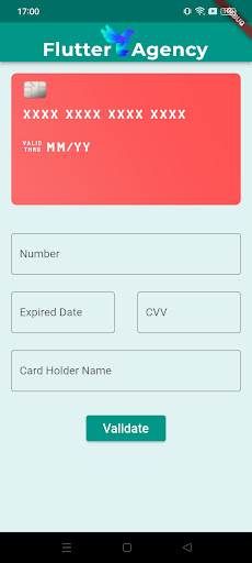
Output
Introduction to flutter_swiper
You must include ‘flutter_swiper’ as a dependency in your ‘pubspec. yaml’ file before using it in your Flutter project:
Dependency:
flutter_swiper_view: ^1.1.8
Run ‘flutter pub get’ to fetch and install the package after adding the dependency.
The ‘flutter_swiper’ package can now be imported into your Dart code:
import 'package:flutter/material.dart';
import 'package:flutter_swiper_view/flutter_swiper_view.dart';

Developing a Simple Swiper Widget
Let’s begin by building a simple swiper widget that shows a list of photographs. Below is the simple code of swiper widget:
This code will create a swiper widget that displays the photographs in the photoUrls list. The user can swipe left and right to view the different photographs.
class SimpleSwiperExample extends StatelessWidget {
final List<String> imageUrls = [
'https://example.com/image1.jpg',
'https://example.com/image2.jpg',
'https://example.com/image3.jpg',
];

@override
Widget build(BuildContext context) {
return Scaffold(
appBar: AppBar(
title: Text('Simple Swiper Example'),
),
body: Swiper(
itemCount: imageUrls.length,
itemBuilder: (BuildContext context, int index) {
return Image.network(
imageUrls[index],
fit: BoxFit.cover,
);
},
autoplay: true,
pagination: SwiperPagination(),
control: SwiperControl(),
),
);
}
}
You can use this code in a Scaffold widget to create a complete Flutter app. Here is an example:
import 'dart:math';


class CreditCardScreen extends StatelessWidget {
  final List<String> cardNumbers = [
    "**** **** **** 1234",
    "**** **** **** 5678",
    "**** **** **** 9012",
  ];


  final List<String> cardHolders = [
    "John Doe",
    "Jane Smith",
    "Alice Johnson",
  ];


  @override
  Widget build(BuildContext context) {
    return Scaffold(
      backgroundColor:
          Color((Random().nextDouble() * 0xFFFFFF).toInt()).withOpacity(1.0),
      appBar: AppBar(
        title: const Text('Credit Cards'),
      ),
      body: Center(
        child: Swiper(
          itemCount: cardNumbers.length,
          layout: SwiperLayout.STACK,
          itemWidth: 300,
          itemHeight: 200,
          itemBuilder: (BuildContext context, int index) {
            return CreditCardWidget(
              cardNumber: cardNumbers[index],
              cardHolder: cardHolders[index],
            );
          },
        ),
      ),
    );
  }
}


class CreditCardWidget extends StatelessWidget {
  final String cardNumber;
  final String cardHolder;


  CreditCardWidget({required this.cardNumber, required this.cardHolder});


  @override
  Widget build(BuildContext context) {
    return Card(
      elevation: 4.0,
      shape: RoundedRectangleBorder(
        borderRadius: BorderRadius.circular(16.0),
      ),
      child: Container(
        padding: const EdgeInsets.all(16.0),
        child: Column(
          crossAxisAlignment: CrossAxisAlignment.start,
          children: [
            Text(
              cardNumber,
              style: const TextStyle(
                fontSize: 20.0,
                fontWeight: FontWeight.bold,
              ),
            ),
            const SizedBox(height: 16.0),
            const Text(
              'Card Holder',
              style: TextStyle(
                color: Colors.grey,
                fontSize: 12.0,
              ),
            ),
            Text(
              cardHolder,
              style: const TextStyle(
                fontSize: 18.0,
                fontWeight: FontWeight.bold,
              ),
            ),
          ],
        ),
      ),
    );
  }
}
Output
Conclusion
In this article, I have explained the basics of the Flutter Swiper View Widget with the help of the Credit Card UI, with a simple example that you can customize as per your choice. This will give you sufficient data for using the Swiper View widget in the Credit Card UI of Flutter. Happy Coding!
Hence, by following these steps, you can enhance your Flutter app’s user interface and provide an immersive experience for your users. To take your Flutter app development to the next level and ensure the successful implementation of such UI components, you must hire dedicated Flutter app development team with the expertise to bring your ideas into reality and deliver exceptional user experiences. Start building captivating Flutter applications today!
Frequently Asked Questions (FAQs)
1. How does Flutter add a credit card?
Due to Card detection, you can rapidly implement the Credit card’s UI using a Flutter package. The following dependencies must first be added to the pubspec.yaml file of a new Flutter project. To add the dependencies, issue the command “flutter pub get” at this time.
2. How is Flutter’s swiper used in your project?
Our project’s primary element is Flutter’s Swiper, which enables us to design an interactive and visually stunning credit card UI. The overall user experience is improved since it makes it possible for users to navigate between credit card panels with simple swipe actions.
3. What is a Flutter card’s layout?
An optional icon or button is included in the Visual Layout’s header region, which also contains heading and subheading text. Then there is the middle area, where we usually have some media, like a picture. We can add some supporting descriptive language after the media component.
Contemporary ventures
Recent blog
ready to get started?
Fill out the form below and we will be in touch soon!
"*" indicates required fields


