How to Use an Autocomplete Widget in Flutter?
In some circumstances, it would be useful if you could present a list of options for customers to choose from if you have a text field in your Flutter application. As a result, users do not have to input the entire text, which improves the user experience.
So for doing this we will see the autocomplete widget in this article. The user can type into a text input and select from a list of options with this widget. You must call the constructor to use the Autocomplete widget. Getting support from a dedicated Flutter developer will reduce your breakdown in widget implementation. Flutter engineer will also assist in creating enterprise-level applications.
const Autocomplete<T extends Object>(
{Key? key,
required AutocompleteOptionsBuilder<T> optionsBuilder,
AutocompleteOptionToString<T> displayStringForOption = RawAutocomplete.defaultStringForOption,
AutocompleteFieldViewBuilder fieldViewBuilder = _defaultFieldViewBuilder,
AutocompleteOnSelected<T>? onSelected,
double optionsMaxHeight = 200.0,
AutocompleteOptionsViewBuilder<T>? optionsViewBuilder,
OptionsViewOpenDirection optionsViewOpenDirection = OptionsViewOpenDirection.down,
TextEditingValue? initialValue}
)
Properties of Autocomplete class:
1. Key key: The key for a widget that controls how it is replaced with another widget.
2. required AutocompleteOptionsBuilder< T > optionsBuilder: Given the current TextEditingValue, this method returns the selectable choices objects.
3. AutocompleteOptionToString< T > displayStringForOption: Returns the option’s string to be shown.
4. AutocompleteFieldViewBuilder fieldViewBuilder: Utilized to create the field whose values are used to generate the choices. If no value is specified, a standard Material-style text field will be created by default.
5. AutocompleteOnSelected< T >? onSelected: When the user selects an option, this method will be called.
6. AutocompleteOptionsBuilder< T >? optionsViewBuilder: Built from a list of options objects to create selectable options widgets.
Object T is the generic type of the Autocomplete class. This indicates that the option item can be any object, not just a string.
OptionsBuilder is a required named argument. For that parameter, you must pass a function that returns a list of alternatives from which the user can choose.
Create your own AutocompleteOptionsBuilder and pass it as optionsBuilder to customize the set of options available to choose from. The AutocompleteOptionsBuilder is a function that takes a TextEditingValue parameter and returns a T Iterable. You can filter the list of options to be displayed based on the current text by using the provided TextEditingValue.
Autocomplete<String>(
      optionsBuilder: (TextEditingValue textEditingValue) {
        if (textEditingValue.text == '') {
          return const Iterable<String>.empty();
        }
        return data.where((String option) {
          return option.contains(textEditingValue.text.toLowerCase());
        });
      },
      onSelected: (String selection) {
        debugPrint('You just selected $selection');
      },
    );
You can capture the event by sending a callback function as the onSelected argument when the user selects an item from the options. The T parameter is passed to the callback function, which returns void.
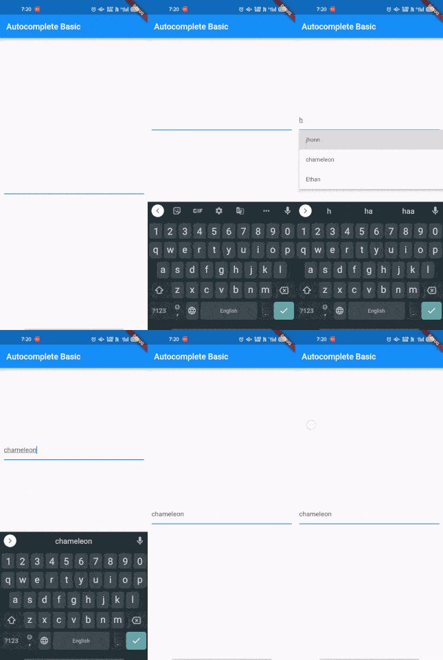
Let’s see a full example of an autoComplete widget.
import 'package:flutter/material.dart';
void main() {
  runApp(const MyApp());
}
class MyApp extends StatelessWidget {
  const MyApp({Key? key}) : super(key: key);
  @override
  Widget build(BuildContext context) {
    return MaterialApp(
      home: Scaffold(
        appBar: AppBar(
          title: const Text('Autocomplete Basic'),
        ),
        body: const Center(
          child: Padding(
            padding: EdgeInsets.all(10.0),
            child: AutocompleteText(),
          ),
        ),
      ),
    );
  }
}

class AutocompleteText extends StatelessWidget {
  const AutocompleteText({Key? key}) : super(key: key);
  static const List<String> data = <String>[
    'Adrian',
    'Axel',
    'jhonn',
    'bobcat',
    'chameleon',
    'Oliver',
    'William',
    'Ethan',
    'Everett',
    'Jayden',
  ];

  @override
  Widget build(BuildContext context) {
    return Autocomplete<String>(
      optionsBuilder: (TextEditingValue textEditingValue) {
        if (textEditingValue.text == '') {
          return const Iterable<String>.empty();
        }
        return data.where((String option) {
          return option.contains(textEditingValue.text.toLowerCase());
        });
      },
      onSelected: (String selection) {
        debugPrint('You just selected $selection');
      },
    );
  }
}
Output

Conclusion
In this article, we have seen how to create an AutoComplete widget. By allowing users to choose from a list of values, the AutoComplete widget can help them have a better user experience. Hope you guys enjoy this article. Keep visiting Flutter Agency for Flutter business application development support.

Contemporary ventures
Recent blog
ready to get started?
Fill out the form below and we will be in touch soon!
"*" indicates required fields


