AnimatedModalBarrier Widget – Flutter Widget Guide By Flutter Agency
In this series of AnimatedWidgets, we have been through AnimatedListState Widget, AnimatedDefaultTextStyle Widget, AnimatedCrossFade Widget, AnimatedBuilder Widget so now in this article we will learn about AnimatedModalBarrier Widget with a detailed article on it.
What is AnimatedModalBarrier Widget in Flutter?
AnimatedModalBarrier Widget is a widget that prevents the user from interacting with widgets behind itself and can be configured with an animated color value.
The modal barrier is the scrim that is rendered behind each route, which generally prevents the user from interacting with the route below the current route, and normally partially obscures such routes.
The default constructor of it will look like below:
AnimatedModalBarrier({
Key? key,
required Animation<Color?> color,
bool dismissible = true,
String? semanticsLabel,
 	bool? barrierSemanticsDismissible,
VoidCallback? onDismiss,
 	ValueNotifier? clipDetailsNotifier,
 	String? semanticsOnTapHint
})
In the above constructor, all fields marked with @required must not be empty argument is actually required since you will get an assertion error if you don’t pass it.
Properties:
- Key key: key represents the how one widget should replace another widget in a tree.
- Animation<Color> color: This attribute will set up the barrier color with this color.
- bool dismissible: This attribute will define whether touching the barrier will pop the current route of the Navigator.
- String semanticsLabel: This attribute is used for the barrier if it is dismissible. It is read out by accessibility tools.
- bool barrierSemanticsDismissible: This attribute will specify the semantic modal that is included in the semantic tree or not.
- semanticsOnTapHint: This hint text instructs users what they are able to do when they tap on the ModalBarrier.
- onDismiss: Called when the barrier is being dismissed.
- clipDetailsNotifier: Contains a value of type EdgeInsets that specifies how the SemanticsNode.rect of the widget should be clipped.
First, you need to create an AnimationController. A TickerProvider is required for the vsync argument, so you need to have a State class that extends TickerProviderStateMixin.
class _AnimatedModalBarrierAppState extends State<_AnimatedModalBarrierApp> with SingleTickerProviderStateMixin {
  late Widget _animatedModalBarrier;

  late AnimationController _animationController;
  late Animation _colorTweenAnimation;

  @override
  void initState() {
    super.initState();

    ColorTween _colorTween = ColorTween(
      begin: Color.fromARGB(100, 255, 255, 255),
      end: Color.fromARGB(100, 127, 127, 127),
    );

    _animationController = AnimationController(
      vsync: this,
      duration: const Duration(seconds: 3),
    );

    _colorTweenAnimation = _colorTween.animate(_animationController)
      ..addListener(() {
        setState(() {}); // Update the state when animation value changes
      });

    _animatedModalBarrier = AnimatedModalBarrier(
      color: _colorTweenAnimation,
    );

    _animationController.forward();
  }

}
As AnimatedModalBarrier works by preventing the user to interact with the widgets between itself, the easiest implementation is by using a Stack and putting the widgets where the interactions will be disabled before the AnimatedModalBarrier. In the below example, interactions with the RaisedButton Widget is disabled.
How to use AnimatedModalBarrier Widget in Flutter?
The following code snippet tells us how to implement AnimatedModalBarrier Widget in Flutter.
import 'dart:async';
import 'package:flutter/material.dart';

class AnimatedModalBarrierWidget extends StatefulWidget {
  @override
  State createState() {
    return AnimatedModalBarrierWidgetState();
  }
}

class AnimatedModalBarrierWidgetState extends State
    with SingleTickerProviderStateMixin {
  bool _isLoading = false;
  late Widget _animatedModalBarrier;

  late AnimationController _animationController;
  late Animation _colorTweenAnimation;

  @override
  void initState() {
    super.initState();
    ColorTween _colorTween = ColorTween(
      begin: Color.fromARGB(100, 255, 255, 255),
      end: Color.fromARGB(100, 127, 127, 127),
    );

    _animationController =
        AnimationController(vsync: this, duration: const Duration(seconds: 3));
    _colorTweenAnimation = _colorTween.animate(_animationController);

    _animatedModalBarrier = AnimatedModalBarrier(
      color: _colorTweenAnimation,
      dismissible: true,
    );
  }

  List buildWidgetList(BuildContext context) {
    List widgets = [
      RaisedButton(
        child: Text('Button'),
        onPressed: () {
          setState(() {
            _isLoading = true;
          });

          _animationController.reset();
          _animationController.forward();

          ScaffoldMessenger.of(context)
              .showSnackBar(SnackBar(content: Text('Button is pressed')));

          Future.delayed(const Duration(seconds: 5), () {
            setState(() {
              _isLoading = false;
            });
          });
        },
      ),
    ];

    if (_isLoading) {
      widgets.add(_animatedModalBarrier);
    }

    return widgets;
  }

  @override
  Widget build(BuildContext context) {
    return Scaffold(
      body: Builder(
        builder: (context) => Center(
          child: Padding(
            padding: EdgeInsets.all(15.0),
            child: Column(
              mainAxisAlignment: MainAxisAlignment.center,
              children: [
                Container(
                  height: 100.0,
                  width: 250.0,
                  // alignment: FractionalOffset.center,
                  child: Stack(
                    alignment: AlignmentDirectional.center,
                    children: buildWidgetList(context),
                  ),
                ),
              ],
            ),
          ),
        ),
      ),
    );
  }

  @override
  void dispose() {
    _animationController.dispose(); // Dispose the animation controller
    super.dispose();
  }
}
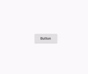
We will get output like below:
AnimatedModalBarrier Widget
Thanks for reading!!!
Need One-Stop Complete Solution for Flutter Development?
Conclusion:
In this article, we have been through What is AnimatedModalBarrier Widget in Flutter along with how to implement it in a Flutter.
FlutterAgency.com is our portal Platform dedicated to Flutter Technology and Flutter Developers. The portal is full of cool resources from Flutter like Flutter Widget Guide, Flutter Projects, Code libs and etc.
FlutterAgency.com is one of the most popular online portal dedicated to Flutter Technology and daily thousands of unique visitors come to this portal to enhance their knowledge on Flutter.
Contemporary ventures
Recent blog
ready to get started?
Fill out the form below and we will be in touch soon!
"*" indicates required fields


