AlertDialog Widget – Flutter Widget Guide By Flutter Agency
An AlertDialog Widget is a useful feature that notifies the user with important information to make a decision or provide the ability to choose a specific action or list of actions. It is a pop-up box that appears at the top of the app content and the middle of the screen. It can be dismissed manually by the user before resuming interaction with the app.
We can use it to pause the user interaction with the current screen and show some intermediate action to the user like show error, take user email to process the next step kind of stuff.
When comes to the Dialog in Flutter there are multiple ways of implement like
1. Alert Dialog
2. Custom Dialog
3. Full-Screen Dialog
We will get into AlertDialog Widget as below :
Showing alerts for users is an important aspect of a mobile app user interface. In this article, We will learn how to show AlertDialog Widget in a flutter with example.
Default Constructor for it will look like below :
AlertDialog({
  Key? key,
  Widget? icon,
  EdgeInsetsGeometry? iconPadding,
  Color? iconColor,
  Widget? title,
  EdgeInsetsGeometry? titlePadding,
  TextStyle? titleTextStyle,
  Widget? content,
  EdgeInsetsGeometry? contentPadding,
  TextStyle? contentTextStyle,
  List<Widget>? actions,
  EdgeInsetsGeometry? actionsPadding,
  MainAxisAlignment? actionsAlignment,
  OverflowBarAlignment? actionsOverflowAlignment,
  VerticalDirection? actionsOverflowDirection,
  double? actionsOverflowButtonSpacing,
  EdgeInsetsGeometry? buttonPadding,
  Color? backgroundColor,
  double? elevation,
  Color? shadowColor,
  Color? surfaceTintColor,
  String? semanticLabel,
  EdgeInsets insetPadding = _defaultInsetPadding,
  Clip clipBehavior = Clip.none,
  ShapeBorder? shape,
  AlignmentGeometry? alignment,
  bool scrollable = false,
})
Properties :
- Title: The title, as the name suggests, occupies the top part of the AlertDialog. It gives the AlertDialog box a Title. Make sure to give it as short as possible to let the user know about its use very easily.
- Actions: Lets the use of different Widgets to be present at the bottom of the AlertDialog. If there is a requirement to create a button to choose between a Yes or No, then is defined in the Actions section only.
- Content: Lets you define what the body of the AlertDialog should be. It is going to be a Text but can also hold any Layout widgets inside this.
- ContentPadding: Lets the Flutter engine know how much padding is required for the Content inside the AlertDialog. Creating Padding will let the AlertDialog adjust accordingly. Takes in an Edgetsets class as its value.
- Shape: An important attribute for AlertDialog class is the use of the Shape attribute. It lets the shape of the AlertDialog be modified. In order to curve the edges or create a different shape for the AlertDialog box, the shape attribute can be used.
Code Snippet will look like below :
Center(
        child: ElevatedButton(
          onPressed: () => showAlert(context),
          child: Text('Tap to Show Alert Dialog Box'),
          style: ElevatedButton.styleFrom(
            padding: EdgeInsets.fromLTRB(10, 10, 10, 10),
          ),
        ),
      ),
FlatButton Widget
It is a material design widget that informs the user about some scenarios which need acknowledgment. We can show an optional title and optional actions with it.
Code Snippet will look like below :
AlertDialog(
          title: new Text('Alert Message Title Text.'),
          actions: <Widget>[
          ],
        );
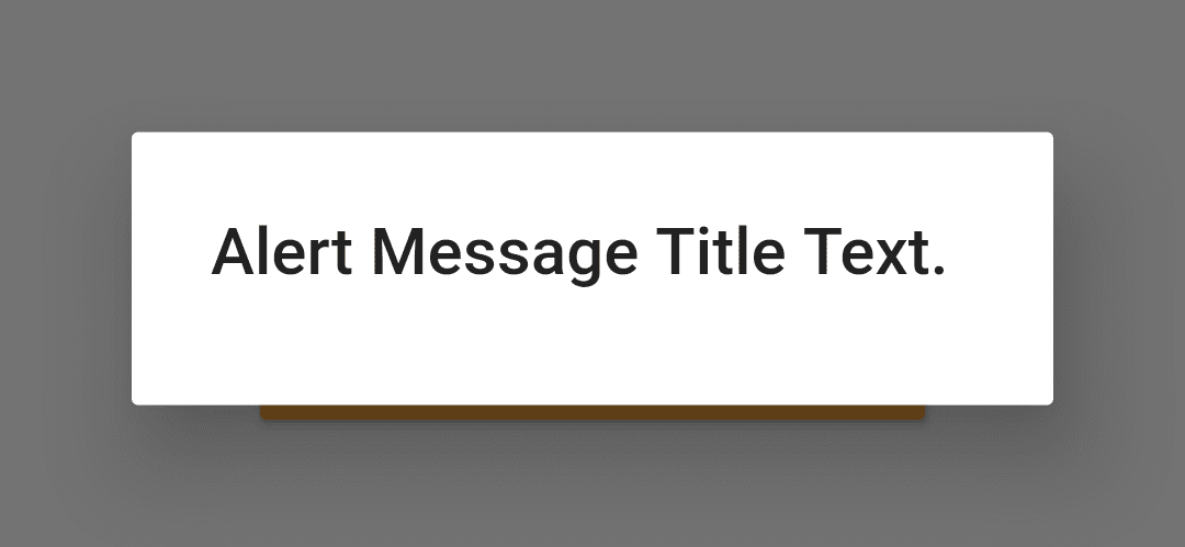
Which will generate output like below :
AlertDialog Widget
Create showAlert() like below :
  showAlert(BuildContext context) {
    showDialog(
      context: context,
      builder: (BuildContext context) {
        return AlertDialog(
          title: new Text('Alert Message Title Text.'),
          actions: <Widget>[
          ],
        );
      },
    );
  }
Let’s define one child in it like below :
ElevatedButton(
  child: Text("OK"),
  onPressed: () {
    Navigator.of(context).pop();
  },
  style: ElevatedButton.styleFrom(
    primary: Colors.blue, // Background color
    onPrimary: Colors.white, // Text color
  ),
)
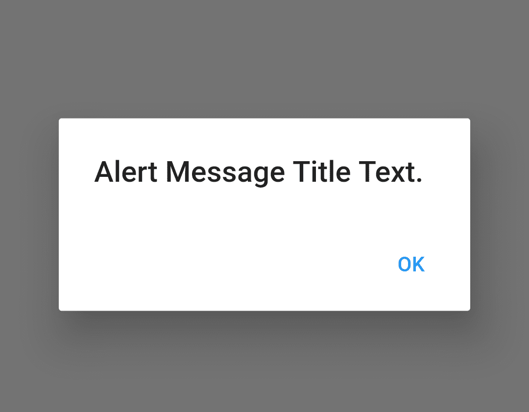
In the above code when we tap on FlatButton we will get it as output like below :
AlertBox with One Button
AlertBox with two-button will look like below :
showAlert(BuildContext context) {
  showDialog(
    context: context,
    builder: (BuildContext context) {
      return AlertDialog(
        title: Text('Alert Message Title Text.'),
        actions: <Widget>[
          TextButton(
            child: Text(
              "Cancel",
              style: Theme.of(context).textTheme.bodySmall?.copyWith(
                    fontWeight: FontWeight.w600,
                    color: Colors.blue,
                  ),
            ),
            onPressed: () {
              Navigator.of(context).pop();
            },
          ),
          TextButton(
            child: Text(
              "Continue",
              style: Theme.of(context).textTheme.bodySmall?.copyWith(
                    fontWeight: FontWeight.w600,
                    color: Colors.blue,
                  ),
            ),
            onPressed: () {
              Navigator.of(context).pop();
            },
          ),
        ],
      );
    },
  );
}
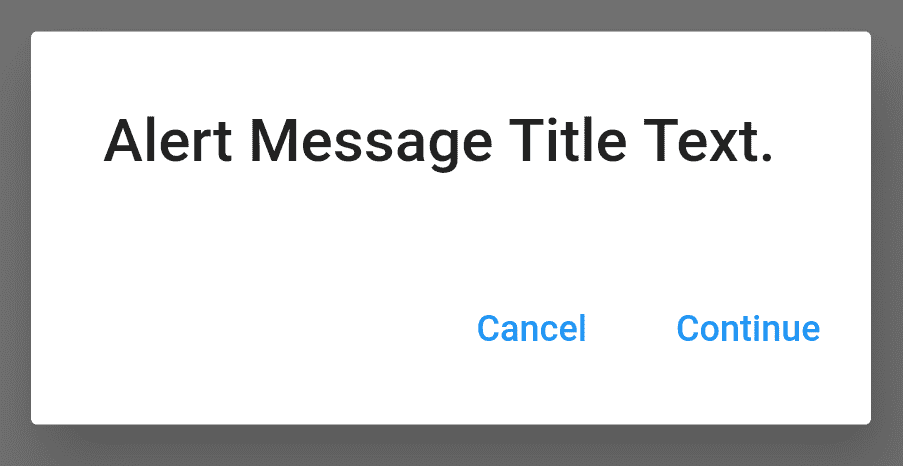
Which will generate two-button output like below :
AlertBox with Two Button
Complete Source Code
import 'package:flutter/material.dart';

class AlertDialogWidget extends StatefulWidget {
  @override
  _AlertDialogWidgetState createState() => _AlertDialogWidgetState();
}

class _AlertDialogWidgetState extends State<AlertDialogWidget> {
  void showAlert(BuildContext context) {
    showDialog(
      context: context,
      builder: (BuildContext context) {
        return AlertDialog(
          title: Text('Alert Message Title Text.'),
          actions: <Widget>[
            TextButton(
              child: Text(
                "Cancel",
                style: Theme.of(context).textTheme.bodySmall?.copyWith(
                      fontWeight: FontWeight.w600,
                      color: Colors.blue,
                    ),
              ),
              onPressed: () {
                Navigator.of(context).pop();
              },
            ),
            TextButton(
              child: Text(
                "Continue",
                style: Theme.of(context).textTheme.bodySmall?.copyWith(
                      fontWeight: FontWeight.w600,
                      color: Colors.blue,
                    ),
              ),
              onPressed: () {
                Navigator.of(context).pop();
              },
            ),
          ],
        );
      },
    );
  }

  @override
  Widget build(BuildContext context) {
    return Center(
      child: ElevatedButton(
        onPressed: () => showAlert(context),
        child: Text(
          'Tap to Show Alert Dialog Box',
        ),
        style: ElevatedButton.styleFrom(

          padding: EdgeInsets.fromLTRB(10, 10, 10, 10),
        ),
      ),
    );
  }
}
Need More Assistance?
Do Contact Us !!!
FlutterAgency.com is our portal Platform dedicated to Flutter Technology and Flutter Developers. The portal is full of cool resources from Flutter like Flutter Widget Guide, Flutter Projects, Code libs and etc.
FlutterAgency.com is one of the most popular online portal dedicated to Flutter Technology and daily thousands of unique visitors come to this portal to enhance their knowledge on Flutter.
Contemporary ventures
Recent blog
ready to get started?
Fill out the form below and we will be in touch soon!
"*" indicates required fields

