DropDownButton Widget – Flutter Guide By Flutter Agency
What is Drop Down Button Widget?
If user have and input field and want the users to select only from certain values, one of the most common input types is dropdown. In Fluter, it can be done easily using a DropDownButton Widget.
The constructor of the DropDownButton Widget will look like below :
DropdownButton<T>(
{Key? key,
required List<DropdownMenuItem<T>>? items,
DropdownButtonBuilder? selectedItemBuilder,
T? value,
Widget? hint,
Widget? disabledHint,
required ValueChanged<T?>? onChanged,
VoidCallback? onTap,
int elevation = 8,
TextStyle? style,
Widget? underline,
Widget? icon,
Color? iconDisabledColor,
Color? iconEnabledColor,
double iconSize = 24.0,
bool isDense = false,
bool isExpanded = false,
double? itemHeight = kMinInteractiveDimension,
Color? focusColor,
FocusNode? focusNode,
bool autofocus = false,
Color? dropdownColor,
double? menuMaxHeight,
bool? enableFeedback,
AlignmentGeometry alignment = AlignmentDirectional.centerStart,
BorderRadius? borderRadius}
)
To use the widget, there are two required properties: items and onChanged. items are of type List>, where T is the value type. It can be a number, a String, or any other type. For each DropdownMenuItem, you need to define value and child. The value must be of type T which means it must be the same across all options. For example, if you construct with DropdownButton, the value of all options must be String. child widget is the widget that will be rendered for that option item. onChanged is a function with one parameter.
Every time the value changes, it will be called with the new value as the argument. Inside onChanged, usually, we update the state that stores the dropdown value.
Code Snippet will look like below
DropdownButton<String>(
          items: [
		  Item1,
		  Item2,
		  Item3,
		  Item4
          ],
          onChanged: (String value) {
            setState(() {
              _value = value;
            });
          },
          hint: Text('Select Item'),
          value: _value,
        ),
There are two non-required options that you’ll most likely use. First values, which stores the current value. If the value matches a DropDownMenuItem’s value, the option item will be displayed as a selected item. It can be used to set the initial value as well. The other option is a hint, which is a widget that will be shown if no value selected.
Example :
 import 'package:flutter/material.dart';
void main() {
  runApp(const MyApp());
}
class MyApp extends StatelessWidget {
  const MyApp({super.key});
  @override
  Widget build(BuildContext context) {
    return const MaterialApp(
      home: MyHomePage(),
    );
  }
}
class MyHomePage extends StatefulWidget {
  const MyHomePage({super.key,});
  @override
  State<MyHomePage> createState() => _MyHomePageState();
}
class _MyHomePageState extends State<MyHomePage> {
  String? _value;
  @override
  Widget build(BuildContext context) {
    return Scaffold(
      appBar: AppBar(
        title: const Text("DropdownMenuItem"),
      ),
      body: Center(
        child: DropdownButton<String>(
          items: const [
            DropdownMenuItem<String>(
              value: 'one',
              child: Text('Item 1'),
            ),
            DropdownMenuItem<String>(
              value: 'two',
              child: Text('Item 2'),
            ),
            DropdownMenuItem<String>(
              value: 'three',
              child: Text('Item 3'),
            ),
          ],
          onChanged: (String? value) {
            setState(() {
              _value = value;
            });
          },
          hint: const Text('Select Item'),
          value: _value,
        ),
      ),
    );
  }
}
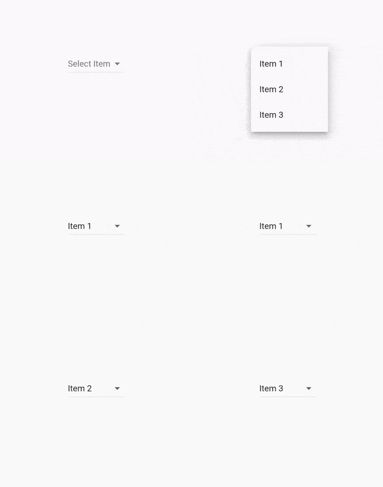
The above code will give us output like the below :

DropDownButton Widget
Properties :
key: The widget’s key
List<DropdownMenuItem<T>>: The options.
T value: The current value.
Widget hint: A widget that will be displayed if a value is null.
disableHint: The widget that will be displayed in the dropdown is disabled.
onChanged: Function that will be executed every time the value changes.
elevation: Z-coordinate of the options.
style: Text style inside the dropdown.
underline Widget that will be used for drawing the drop-down button’s underline. The default is 0.0 width bottom border with color 0xFFBDBDBD.
icon: The dropdown’s icon. The default is Icons.arrow_drop_down
iconDisabledColor: Icon color when it’s disabled. If the thems’ ThemeData.brightness is Brightness.light, default is Colors.grey.shade700.. If it’s Brightness. dark, default is Colors.white70.
iconEnabledColor: Icon color when it’s enabled. If the thems’ ThemeData.brightness is Brightness.light, default is Colors.grey.shade700.. If it’s Brightness. dark, default is Colors.white70.
iconSize: The icon size. The default is 24.0.
isDense: Whether to reduce the button’s height. The default is false.
isExpanded: Whether to set the dropdown’s inner contents to horizontally fill its parent. The default is false.
Thanks for reading !!!
FlutterAgency is our portal Platform dedicated to Flutter Technology and Flutter Developers. The portal is full of cool resources from Flutter like Flutter Widget Guide, Flutter Projects, Code libs and etc.
FlutterAgency is one of the most popular online portal dedicated to Flutter Technology and daily thousands of unique visitors come to this portal to enhance their knowledge on Flutter.
Contemporary ventures
Recent blog
ready to get started?
Fill out the form below and we will be in touch soon!
"*" indicates required fields


