CustomScrollView Widget – Flutter Widget Guide By Flutter Agency
What is CustomScrollView Widget in Flutter?
CustomScrollView Widget is basically a ScrollView with some effects. With CustomScrollView Widget, you can create various scrolling effects like grids, lists, and expanding headers.
CustomScrollView constructor will look like below :
 CustomScrollView(
{Key? key,
Axis scrollDirection = Axis.vertical,
bool reverse = false,
ScrollController? controller,
bool? primary,
ScrollPhysics? physics,
ScrollBehavior? scrollBehavior,
bool shrinkWrap = false,
Key? center,
double anchor = 0.0,
double? cacheExtent,
List<Widget> slivers = const <Widget>[],
int? semanticChildCount,
DragStartBehavior dragStartBehavior = DragStartBehavior.start,
ScrollViewKeyboardDismissBehavior keyboardDismissBehavior = ScrollViewKeyboardDismissBehavior.manual,
String? restorationId,
Clip clipBehavior = Clip.hardEdge}
)
In the Above constructor, all fields marked with @required must not be empty.
How to use CustomScrollView Widget in Flutter?
The following code snippet tells us how to implement CustomScrollView Widget in Flutter.
CustomScrollView(
      slivers: <Widget>[
        // Place sliver widgets here
      ],
    );
Here in the above code, we have used slivers, in which you can pass a collection of widgets. Each widget in slivers must have RenderSliver objects. Example of compatible widgets include SliverAppBar, SliverToBoxAdapter,SliverList, and SliverGrid.
The SliverAppBar is a material design app bar that’s compatible with CustomScrollView. Basically it’s an app bar with dynamic height and scroll effects. It’s usually used as the first widget in the slivers list.
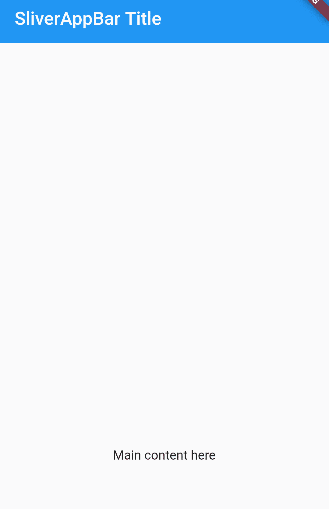
Below is an example of SliverAppBar
 slivers: <Widget>[
        SliverAppBar(
          title: Text("SliverAppBar Title"),
        )
      ],
With SliverAppBar, User can create an app bar whose height adapt automatically when the user scrolls the page.
SliverToBoxAdapter :
SliverToBoxAdapter is a sliver containing a single box widget.
slivers: <Widget>[
    SliverToBoxAdapter(
      child: SizedBox(
        height: 1000,
        child: Center(
          child: Text('Main content here'),
        ),
      ),
    ),
  ],
If you want to have multiple SliverToBoxAdapter Widgets, it’s better to consider using more suitable slivers such as SliverList, SliverFixedExtentList, SliverPrototypeExtentList or SliverGrid. The reason is those slivers only instantiate its visible children – which leads to better performance.
SliverToBoxAdapter
-
SliverList :
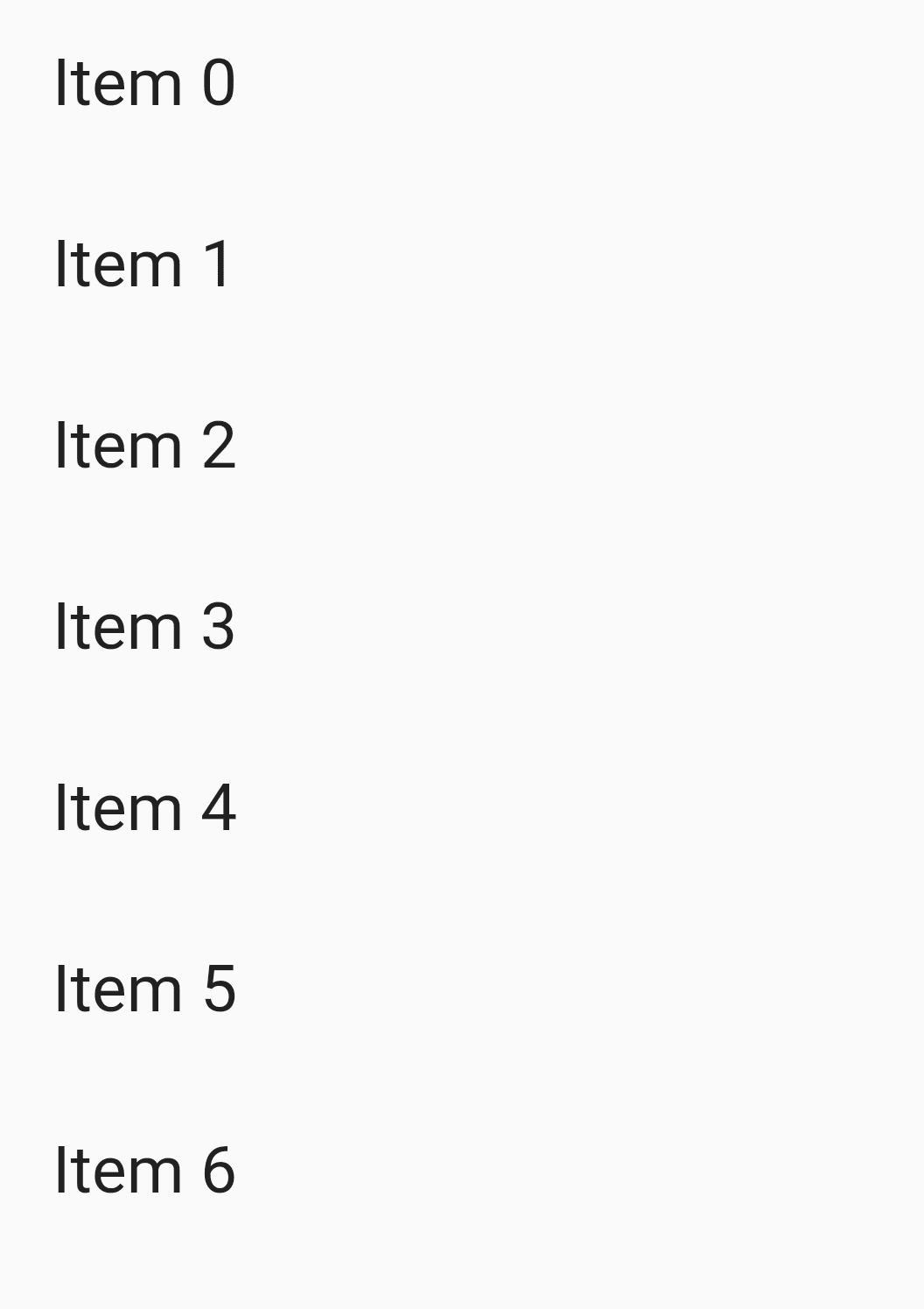
SliverList is a sliver that holds multiple box children in a linear array along the main axis. Below is a simple SliverList that renders a collection of 50 Text widgets.
  slivers: <Widget>[
    SliverList(
      delegate: new SliverChildListDelegate(_buildList(50))
    ),
  ],
_buildList implementation will look like below :
  List<Widget> _buildList(int count) {
    List<Widget> listItems = [];
    for (int i = 0; i < count; i++) {
      listItems.add(
        Padding(
          padding: const EdgeInsets.all(20.0),
          child: Text(
            'Item ${i.toString()}',
            style: const TextStyle(fontSize: 25.0),
          ),
        ),
      );
We will get output like the below:
-
SliverGrid :
If SliverList places its elements in a one-dimensional array, SliverGrid arranges its elements in a two-dimensional array.
 SliverGrid(
    gridDelegate: SliverGridDelegateWithFixedCrossAxisCount(
      crossAxisCount: 5,
    ) ,
    delegate: SliverChildBuilderDelegate((BuildContext context, int index) {
      return new Container(
        color: _randomColor(index),
        height: 200.0
      );
    }),
  ),
Below is _randomColor() Code Snippet :
  Color _randomColor(int index) {
    if (index % 3 == 0) {
      return Colors.pink;
    } else if (index % 3 == 1) {
      return Colors.blueAccent;
    }

    return Colors.amber;
  }

CustomScrollView Output
Conclusion
In this article, we have been through What is CustomScrollView Widget in Flutter along with how to implement it in a Flutter.
Thanks for reading !!!
Do Let us know if you need further assistance !!!
FlutterAgency.com is our portal Platform dedicated to Flutter Technology and Flutter Developers. The portal is full of cool resources from Flutter like Flutter Widget Guide, Flutter Projects, Code libs and etc.
Contemporary ventures
Recent blog
ready to get started?
Fill out the form below and we will be in touch soon!
"*" indicates required fields


