How to Stretch Columns to Full Screen Height In Flutter ?
A Column Widget is a widget where the elements or children are arranged vertically like a column. So, in this article, we will go through how to Stretch columns to Full-Screen Height in a flutter.
Creating multiline text in Flutter is crucial for user-friendly apps. At Flutter Agency, a leading mobile apps development agency, we guide you through implementing these features. Learn how to stretch columns to full-screen height in Flutter with our expert tutorials and resources.
How to Stretch Columns to Full-Screen Height In Flutter?
Each Container Widget contains a column allowing you to add multiple widgets.
return Scaffold(
  backgroundColor: Color(0xFF222222),
    body: SafeArea(
      child: Column(
        mainAxisAlignment: MainAxisAlignment.spaceBetween,
        crossAxisAlignment: CrossAxisAlignment.stretch,
        children: <Widget>[
          Expanded(
            child: Row(
            mainAxisAlignment: MainAxisAlignment.spaceBetween,
            crossAxisAlignment: CrossAxisAlignment.stretch,
              children: <Widget>[
                Expanded(
                  child: Container(
                    color: Colors.red,
                    child: Column(
                    mainAxisAlignment: MainAxisAlignment.start,
                    children: <Widget>[
                    Text('Left', textAlign: TextAlign.center),
                    Text('Left', textAlign: TextAlign.center),
                    Text('Left', textAlign: TextAlign.center),
                    ],
                  ),
                ),
              ),
              Expanded(
                child: Container(
                  color: Colors.green,
                  child: Column(
                  mainAxisAlignment: MainAxisAlignment.end,
                  children: <Widget>[
                  Text('Right', textAlign: TextAlign.center),
                  Text('Right', textAlign: TextAlign.center),
                  Text('Right', textAlign: TextAlign.center),
                  ],
                 ),
                ),
               ),
              ],
             ),
            ),
            Expanded(
            child: Container(
              color: Colors.blue,
              child: Column(
                mainAxisAlignment: MainAxisAlignment.center,
                children: <Widget>[
                Text('Bottom', textAlign: TextAlign.center),
                Text('Bottom', textAlign: TextAlign.center),
                Text('Bottom', textAlign: TextAlign.center),
               ],
             ),
           ),
         ),
       ],
     ),
   ),
 );
So, we will get output like the below:
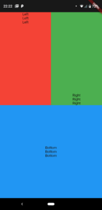
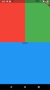
Here’s the way to distribute your containers evenly both horizontally and vertically. Also, the code snippet will look like the below:
return Scaffold(
  backgroundColor: Color(0xFF222222),
  body: Column(
    mainAxisAlignment: MainAxisAlignment.spaceBetween,
    crossAxisAlignment: CrossAxisAlignment.stretch,
    children: <Widget>[
      Expanded(
        child: Row(
          mainAxisAlignment: MainAxisAlignment.spaceBetween,
          crossAxisAlignment: CrossAxisAlignment.stretch,
          children: <Widget>[
            Expanded(
              child: Container(
              color: Colors.red,
              child: Text('Left', textAlign: TextAlign.center),
             ),
           ),
           Expanded(
             child: Container(
             color: Colors.green,
             child: Text('Right', textAlign: TextAlign.center),
             ),
            ),
          ],
        ),
      ),
      Expanded(
        child: Container(
        color: Colors.blue,
        child: Text('Bottom', textAlign: TextAlign.center),
       ),
      ),
    ],
  ),
);
So, we will get a result like the below:
Final Edit version 4:
return Scaffold(
backgroundColor: Color(0xFF222222),
body: Column(
  mainAxisAlignment: MainAxisAlignment.spaceBetween,
  children: <Widget>[
  SizedBox(height: 20),
    Expanded(
    child: Row(
    mainAxisSize: MainAxisSize.max,
    crossAxisAlignment: CrossAxisAlignment.stretch,
      children: <Widget>[
      Expanded(
        child: Column(
          crossAxisAlignment: CrossAxisAlignment.stretch,
            children: <Widget>[
            Expanded(
              child: Container(
              color: Colors.red,
              child: Text('Left', textAlign: TextAlign.center),
             ),
            ),
           ],
          ),
         ),
         Expanded(
         child: Column(
         crossAxisAlignment: CrossAxisAlignment.stretch,
           children: <Widget>[
           Expanded(
             child: Container(
             color: Colors.red,
             child: Text('Right', textAlign: TextAlign.center),
              ),
             ),
            ],
           ),
          ),
         ],
        ),
      ),
      Expanded(
        child: Column(
        mainAxisSize: MainAxisSize.max,
        crossAxisAlignment: CrossAxisAlignment.stretch,
      children: <Widget>[
          Expanded(
          child: Container(
          color: Colors.green,
          child: Text('Bottom', textAlign: TextAlign.center),
           ),
          ),
         ],
        ),
       ),
      ],
     ),
   );
Also, to get columns to take up the full width of the display and to share the height equally we did the following:
return MaterialApp(
  home: Scaffold(
    backgroundColor: Colors.black,
    body: SafeArea(
      child: Column(
        mainAxisAlignment: MainAxisAlignment.center,
        children: <Widget>[
          Expanded(
            child: SizedBox(
              width: double.infinity,
              child: FlatButton(
                onPressed: () {
                  playSound(1);
                },
                color: Colors.blue,
              ),
            ),
          ),
Expanded Widget will share the height while the SizedBox Widget will take up the whole width with width is set to double.infinity.
Conclusion:
Thanks for being with us on a Flutter Journey !!!
In this article, We have been through How to center the Title of a ListTile In Flutter ??
Keep Learning !!! Keep Fluttering !!!
Flutter Agency is our portal Platform dedicated to Flutter Technology and Flutter Developers. The portal is full of cool resources from Flutter like Flutter Widget Guide, Flutter Projects, Code libs and etc.
Flutter Agency is one of the most popular online portals dedicated to Flutter Technology and daily thousands of unique visitors come to this portal to enhance their knowledge of Flutter.
Contemporary ventures
Recent blog
ready to get started?
Fill out the form below and we will be in touch soon!
"*" indicates required fields

