")


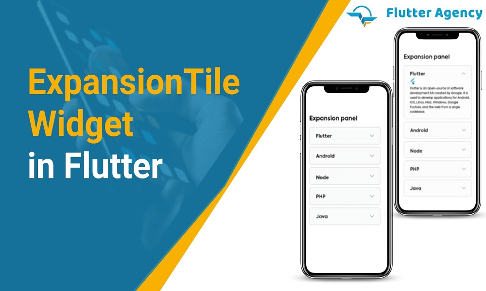
How to Use the ExpansionTile Widget in Flutter?
Flutter is Google’s UI toolkit that enables you to create stunning and seamlessly integrated mobile, web, and desktop applications in a single codebase in a very short amount of time. Flutter provides outstanding programming tools with incredible hot reload.
In this article, we will discuss Flutter’s Expansion Tile Widget. We’ll also put the Expansion Tile Widget example into practice and go over its features and how leading Flutter application development companies like Flutter Agency (www.flutteragency.com) use them in their client Flutter application development.
The expansion tile widget is a very useful widget. You may use this widget to make a detailed tile that can be included in a list view. For many Flutter based mobile applications, we need to display some detailed information on the list, but there isn’t enough room to expand and compress the list for this. At that time, the extension tile widget is used to create it.
Below is the Constructor of the ExpansionTile widget.
ExpansionTile(
{Key? key,
Widget? leading,
required Widget title,
Widget? subtitle,
ValueChanged? onExpansionChanged,
List children = const [],
Widget? trailing,
bool initiallyExpanded = false,
bool maintainState = false,
EdgeInsetsGeometry? tilePadding,
CrossAxisAlignment? expandedCrossAxisAlignment,
Alignment? expandedAlignment,
EdgeInsetsGeometry? childrenPadding,
Color? backgroundColor,
Color? collapsedBackgroundColor,
Color? textColor,
Color? collapsedTextColor,
Color? iconColor,
Color? collapsedIconColor,
ListTileControlAffinity? controlAffinity}
)
What are the properties of ExpansionTile widget?
Widget? leading :
Similar to how the leading list tile widget handles leading, the leading property is used on the first left side of the title.
Widget title :
You can customize the expansion tile widget’s title by using the Title parameter. This will be a piece of equipment that the user will always be able to see.
Widget? subtitle :
There is further information below the title.
ValueChanged? onExpansionChanged :
This function is called with the value true as soon as the tile begins to expand. This function is called with the value false when the tile begins to collapse.
List children :
There are countless widgets stored on the children’s property. A card may be used for a brief text. And the only way the extension tiles will discover this is by clicking on the widget’s title.
Widget? trailing :
Use the trailing property, which is to the right of the title and where you can put both icon and text widget.
bool initiallyExpanded :
Indicates whether the list tile is at first expanded (true) or collapsed (false, the default).
bool maintainState :
Indicates whether the children’s state is preserved when the tile grows and collapses.
EdgeInsetsGeometry? tilePadding :
The insets for the leading, title, subtitle, and tail widgets are specified by this attribute.
CrossAxisAlignment? expandedCrossAxisAlignment :
Describes how each child within children will be aligned when the tile is enlarged.
Alignment? expandedAlignment :
specifies how the children, who are organized in a column widget when the tile is extended, should be aligned.
EdgeInsetsGeometry? childrenPadding :
padding for children is specified.
Color? backgroundColor : The expanded tile’s background is given colour by using the background property. It should be noted that the extended tile, not the title, is given a color.
Color? collapsedBackgroundColor :
when the sublist is collapsed, defines the background color of the tile.
Color? textColor :
As the sublist is expanded, this property is used to set the color of the titles on the tile.
ListTileControlAffinity? controlAffinity :
most frequently used to push the expansion arrow indicator to the tile’s leading or trailing edge.
Example :
import 'package:flutter/material.dart';
void main() async {
  runApp(const MyApp());
}
class MyApp extends StatelessWidget {
  const MyApp({Key? key}) : super(key: key);
  @override
  Widget build(BuildContext context) {
    return const MaterialApp(
      debugShowCheckedModeBanner: false,
      home: HomePage(),
    );
  }
}
class HomePage extends StatefulWidget {
  const HomePage({Key? key}) : super(key: key);
  @override
  _HomePageState createState() => _HomePageState();
}
class _HomePageState extends State {
  @override
  Widget build(BuildContext context) {
    var data = ['data1', 'data2', 'data3', 'data4', 'data5', 'data6', 'data7'];
    return Scaffold(
      appBar: AppBar(
        title: const Text('Expansion Tile'),
      ),
      body: Column(
        children: [
          ExpansionTile(
            title: const Text('ExpansionTile'),
            children: data.map((data) {
              return ListTile(title: Text(data));
            }).toList(),
          ),
        ],
      ),
    );
  }
}
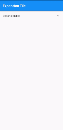
Output:
Conclusion:
This article includes a brief introduction to an expansion tile that I’ve described in a Flutter development . You are free to change it and experiment with it as you see fit. Hope you like this article.
If you need to develop your mobile application, then you can consult with the leading Flutter app company and hire Flutter engineer who will assist you in every way in your project.
Frequently Asked Questions (FAQs)
1. What is the widget in the Flutter application?
Widgets is the central class hierarchy in a Flutter framework. It’s an immutable description for the user interface and it is inflated into the elements which manages the underlying render tree. Widgets themselves don’t have the no mutable state.
2. What is trailing property in Flutter?
This icon widget is used to view after the title. It will show the right-aligned metadata, which is taken into consideration of using a Row with the CrossAxisAlignment.
3. Define Expanded Widget
A expanded widget will expand the child of a Row, Flex, or Column and will fills the available space for the child. It will fill up the space along with its main axis.


Contemporary ventures
Recent blog


Join our newsletter
Read and share new topics about all things Tech.
ready to get started?
Fill out the form below and we will be in touch soon!
"*" indicates required fields