")


Slider Widget – Flutter Widget Guide By Flutter Agency
Slider Widget in Flutter is useful to create a slider like animation. The primary aim of the widget is to give the user an animated slider bar that can adjust a value on the UI. This will eventually be read as a double value and can be used to perform actions in the background.
What is a Slider Widget?
Slider in Flutter plays an important part in the UI element creation. A simple, yet powerful Widget is used to create a very cleaner Sliders on the UI. The Slider Widget in Flutter can be created with a simple class called Slider. This can help in creating a sound up/down or even rating like sliders.
Default Constructor will look like below:
Slider({
  Key? key,
  required double value,
  double? secondaryTrackValue,
  required void Function(double)? onChanged,
  void Function(double)? onChangeStart,
  void Function(double)? onChangeEnd,
  double min = 0.0,
  double max = 1.0,
  int? divisions,
  String? label,
  Color? activeColor,
  Color? inactiveColor,
  Color? secondaryActiveColor,
  Color? thumbColor,
  MaterialStateProperty? overlayColor,
  MouseCursor? mouseCursor,
  String Function(double)? semanticFormatterCallback,
  FocusNode? focusNode,
  bool autofocus = false,
  SliderInteraction? allowedInteraction,
})
In the Above constructor, all fields marked with @required must not be empty.
To create a Slider, we will be making use of the Slider class.
The Slider by itself cannot return the value it is pointing, rather it will only move the slider and it is up to the developer to reset the state of the slider by calling the setState() method on it. Code Snippet will look like below :
Row(
         children: <Widget>[
         Icon(Icons.volume_up),
         Expanded(
         child: Slider(
          ),
         )
         ],
          ),
Properties
- value: Value is an important attribute of the Slider. It gives the Slider Widget an initial position to keep its pointer. The value attribute takes only a double value. Make sure to give this value from a variable like shown below.
Define value like below :
double value = 5.0;
Slider(
           value: value,
            ),
Since there is no min, max attribute specified, the app will crash at this point.
- min: Minimum value of the Slider Widget. The value from which the bar should start with is defined. This takes in an integer value only since there cannot be a floating value starting point. Once the min attribute is defined, it looks like.
Slider(
    value: value,
    min: 1,
  ),
- max: The max attribute defines the maximum value that the slider widget can take.
 Slider(
    value: value,
    min: 1,
    max: 10,
      ),
- divisions: divisions attribute which defines the number of divisions from the min to the max value specified.
Slider(
        value: value,
        min: 1,
        max: 10,
        divisions: 10,
        activeColor: Colors.lightGreen,
        onChanged: (value) {},
      ),
Now Our output will look like below :
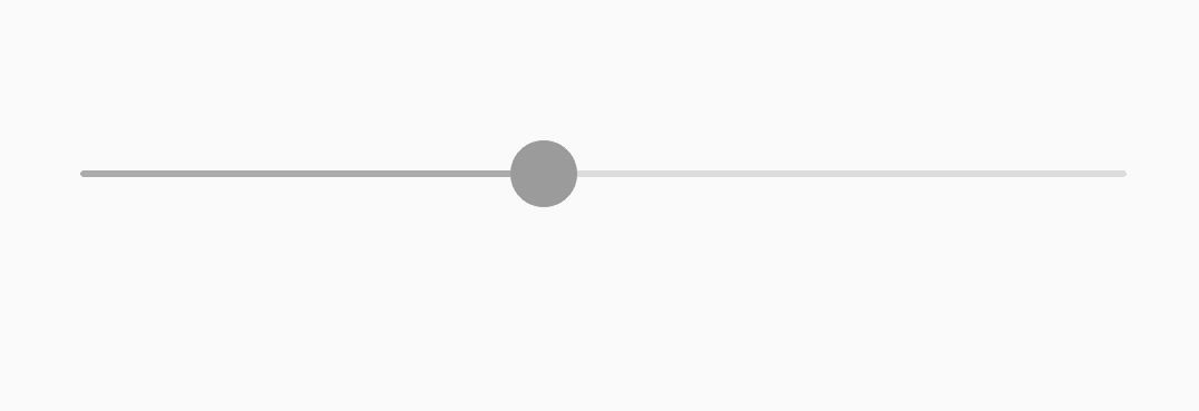
Slider in Flutter
- activecolor : ActiveColor attribute decides what color to have as the primary Color of the Slider Bar. Meaning whichever the user is going to perceive as the Slider Color. Code Snippet will look like below :
Slider(
        value: value,
        min: 1,
        max: 10,
        divisions: 10,
        activeColor: Colors.lightGreen,
        onChanged: (value) {
        },
      ),
- inactiveColor: Inactive Color denotes whichever color is present in the remaining portion of the Slider Bar. This color is usually light when compared to the Primary/active color.
 Slider(
        value: value,
        min: 1,
        max: 10,
        divisions: 10,
        activeColor: Colors.lightGreen,
        inactiveColor: Colors.white54,
        onChanged: (value) {},
      ),
- label: Label attribute lets you define what the user is clicking on while trying to move the Slider.
 Slider(
        value: value,
         min: 1,
         max: 10,
          divisions: 10,
          activeColor: Colors.lightGreen,
          inactiveColor: Colors.white54,
          label: "Slide Volume",
          onChanged: (value){
                  },
                ),
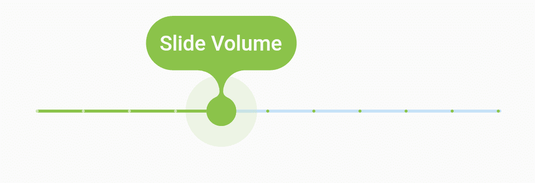
Slider Label
- onChanged(): This is a very important callback in terms of recording what values the user pushes the slider to. The setState() method has to be called with the onChanged() callback’s value.
 onChanged: (_value) {
          setState(() {
            value = _value;
          });
          print(_value);
        },
The complete source code will look like below :
 Slider(
        value: value,
        min: 1,
        max: 10,
        divisions: 10,
        activeColor: Colors.lightGreen,
        label: "Slide Volume",
        onChanged: (_value) {
          setState(() {
            value = _value;
          });
          print(_value);
        },
      ),
We will get output like below:

Slider
Thanks for reading !!!
FlutterAgency.com is our portal Platform dedicated to Flutter Technology and Flutter Developers. The portal is full of cool resources from Flutter like Flutter Widget Guide, Flutter Projects, Code libs and etc.
FlutterAgency.com is one of the most popular online portal dedicated to Flutter Technology and daily thousands of unique visitors come to this portal to enhance their knowledge on Flutter.

Contemporary ventures
Recent blog


Join our newsletter
Read and share new topics about all things Tech.
ready to get started?
Fill out the form below and we will be in touch soon!
"*" indicates required fields