")


ScrollBar Widget – Flutter Widget Guide By Flutter Agency
What is ScrollBar Widget in Flutter?
A ScrollBar Widget that can be dragged for quickly navigation through a vertical list. A ScrollBar Widget indicates which portion of a Scrollable Widget is actually visible.
The constructor of Scrollbar will look like below :
Scrollbar({
 Key? key,
 required Widget child,
 ScrollController? controller,
 bool? thumbVisibility,
 bool? trackVisibility,
 double? thickness,
 Radius? radius,
 bool Function(ScrollNotification)? notificationPredicate,
 bool? interactive,
 ScrollbarOrientation? scrollbarOrientation,
 bool? showTrackOnHover,
})
In the Above constructor, all fields marked with @required must not be empty.
To use this Draggable Scrollbar Functionality we have to add its dependency package into the pubspec.yaml file:
Use the below code to add the dependency package in pubspec.yaml file.
dependencies:

draggable_scrollbar: ^0.1.0
To use the Draggable Scrollbar in Flutter Dart code we have to import into the dart code for coding. without importing Draggable Scrollbar if we use it in coding then it shows error or exception that is a package not found an error.
Flutter has three built-in scroll thumbs, that will be used and also you can create a custom thumb for your own app! depends upon the user’s requirement.
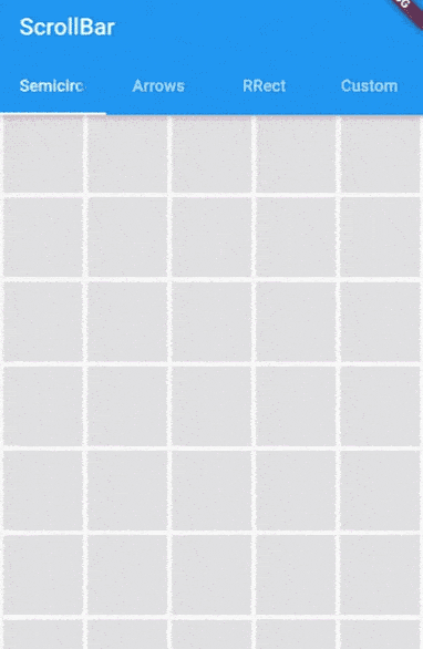
Semicircle Thumb :
class MyWidget extends StatefulWidget {
  @override
  _MyWidgetState createState() => _MyWidgetState();
}

class _MyWidgetState extends State {
  ScrollController controller = ScrollController();
  int numItems = 100; // Assuming 100 items for demonstration

  @override
  Widget build(BuildContext context) {
    return Scaffold(
      body: DraggableScrollbar.semicircle(
        labelTextBuilder: (double offset) {
          final int currentItem = controller.hasClients
              ? (controller.offset /
                      controller.position.maxScrollExtent *
                      numItems)
                  .floor()
              : 0;
          return Text("$currentItem");
        },
        labelConstraints: BoxConstraints.tightFor(width: 80.0, height: 30.0),
        controller: controller,
        child: GridView.builder(
          gridDelegate: SliverGridDelegateWithFixedCrossAxisCount(
            crossAxisCount: 5,
          ),
          itemCount: numItems,
          padding: EdgeInsets.zero,
          itemBuilder: (context, index) {
            return Container(
              alignment: Alignment.center,
              margin: EdgeInsets.all(2.0),
              color: Colors.grey[300],
              child: Text(index.toString()), // To visually indicate the index
            );
          },
          controller: controller,
        ),
      ),
    );
  }
}
In the above code, we have used a GridView Widget.
Arrows thumb + label :
class MyWidget extends StatefulWidget {
  @override
  _MyWidgetState createState() => _MyWidgetState();
}

class _MyWidgetState extends State {
  final ScrollController controller = ScrollController();
  final double _itemExtent = 100.0; // Define the height of each item
  // Assuming 100 items for demonstration

  @override
  Widget build(BuildContext context) {
    return Scaffold(
      body: DraggableScrollbar.arrows(
        alwaysVisibleScrollThumb: true,
        backgroundColor:
            Colors.grey[850]!, // Ensure non-null value; adjust as needed
        padding: EdgeInsets.only(right: 4.0),
        labelTextBuilder: (double offset) => Text(
          "${offset ~/ _itemExtent}",
          style: TextStyle(color: Colors.white),
        ),
        controller: controller,
        child: ListView.builder(
          controller: controller,
          itemCount: 1000,
          itemExtent: _itemExtent,
          itemBuilder: (context, index) {
            return Container(
              padding: EdgeInsets.all(8.0),
              child: Material(
                elevation: 4.0,
                borderRadius: BorderRadius.circular(4.0),
                color: Colors.purple[index % 9 * 100], // Adjust color as needed
                child: Center(
                  child: Text(
                    index.toString(),
                  ),
                ),
              ),
            );
          },
        ),
      ),
    );
  }
}
Rounded Rectangle Thumb :
class MyWidget extends StatefulWidget {
  @override
  _MyWidgetState createState() => _MyWidgetState();
}

class _MyWidgetState extends State {
  final ScrollController controller = ScrollController();

  @override
  Widget build(BuildContext context) {
    return DraggableScrollbar.rrect(
      controller: controller,
      labelTextBuilder: (offset) => Text("${offset.floor()}"),
      child: ListView.builder(
        controller: controller,
        itemCount: 1000,
        itemExtent: 100.0,
        itemBuilder: (context, index) {
          return Container(
            padding: EdgeInsets.all(8.0),
            child: Material(
              elevation: 4.0,
              borderRadius: BorderRadius.circular(4.0),
              color:
                  Colors.green[(index % 9) * 100], // Ensure valid color index
              child: Center(
                child: Text(index.toString()),
              ),
            ),
          );
        },
      ),
    );
  }
}
Custom :
class MyListView extends StatefulWidget {
  @override
  _MyListViewState createState() => _MyListViewState();
}

class _MyListViewState extends State {
  late ScrollController controller;

  @override
  void initState() {
    super.initState();
    controller = ScrollController();
  }

  @override
  void dispose() {
    controller.dispose();
    super.dispose();
  }

  @override
  Widget build(BuildContext context) {
    // Ensure DraggableScrollbar is defined or imported from a package.
    return DraggableScrollbar(
      controller: controller,
      heightScrollThumb: 48.0,
      backgroundColor: Colors.blue,
      scrollThumbBuilder: (
        Color backgroundColor,
        Animation thumbAnimation,
        Animation labelAnimation,
        double height, {
        Text? labelText,
        BoxConstraints? labelConstraints,
      }) {
        return FadeTransition(
          opacity: thumbAnimation,
          child: Container(
            height: height,
            width: 20.0,
            color: backgroundColor,
          ),
        );
      },
      child: ListView.builder(
        controller: controller,
        itemCount: 1000,
        itemExtent: 100.0,
        itemBuilder: (context, index) {
          return Container(
            padding: EdgeInsets.all(8.0),
            child: Material(
              elevation: 4.0,
              borderRadius: BorderRadius.circular(4.0),
              color: Colors.cyan[(index % 9) * 100], // Ensure a valid color
              child: Center(
                child: Text(index.toString()),
              ),
            ),
          );
        },
      ),
    );
  }
}
How to use a ScrollBar Widget in Flutter?
The following code snippet tells us how to implement ScrollBar Widget in Flutter.
import 'package:draggable_scrollbar/draggable_scrollbar.dart';
import 'package:flutter/material.dart';
// If you're using a package for DraggableScrollbar, import it here.

void main() => runApp(MyApp());

class MyApp extends StatelessWidget {
  @override
  Widget build(BuildContext context) {
    return MaterialApp(
      home: Scaffold(
        appBar: AppBar(
          title: Text('Custom Draggable Scrollbar'),
        ),
        body: MyListView(),
      ),
    );
  }
}

class MyListView extends StatefulWidget {
  @override
  _MyListViewState createState() => _MyListViewState();
}

class _MyListViewState extends State {
  late ScrollController controller;

  @override
  void initState() {
    super.initState();
    controller = ScrollController();
  }

  @override
  void dispose() {
    controller.dispose();
    super.dispose();
  }

  @override
  Widget build(BuildContext context) {
    // Ensure DraggableScrollbar is defined or imported from a package.
    return DraggableScrollbar(
      controller: controller,
      heightScrollThumb: 48.0,
      backgroundColor: Colors.blue,
      scrollThumbBuilder: (
        Color backgroundColor,
        Animation thumbAnimation,
        Animation labelAnimation,
        double height, {
        Text? labelText,
        BoxConstraints? labelConstraints,
      }) {
        return FadeTransition(
          opacity: thumbAnimation,
          child: Container(
            height: height,
            width: 20.0,
            color: backgroundColor,
          ),
        );
      },
      child: ListView.builder(
        controller: controller,
        itemCount: 1000,
        itemExtent: 100.0,
        itemBuilder: (context, index) {
          return Container(
            padding: EdgeInsets.all(8.0),
            child: Material(
              elevation: 4.0,
              borderRadius: BorderRadius.circular(4.0),
              color: Colors.cyan[(index % 9) * 100], // Ensure a valid color
              child: Center(
                child: Text(index.toString()),
              ),
            ),
          );
        },
      ),
    );
  }
}
We will get output like below:
ScrollBar in Flutter
Conclusion:
In this article, we have been through What is ScrollBar Widget in Flutter along with how to implement it in a Flutter.
Thanks for being with us.
Do let us know your valuable feedback/suggestion to serve you better.
FlutterAgency.com is our portal Platform dedicated to Flutter Technology and Flutter Developers. The portal is full of cool resources from Flutter like Flutter Widget Guide, Flutter Projects, Code libs and etc.
FlutterAgency.com is one of the most popular online portal dedicated to Flutter Technology and daily thousands of unique visitors come to this portal to enhance their knowledge on Flutter.

Contemporary ventures
Recent blog


Join our newsletter
Read and share new topics about all things Tech.
ready to get started?
Fill out the form below and we will be in touch soon!
"*" indicates required fields