")


IconButton Widget – Flutter Widget Guide By Flutter Agency
What is IconButton Widget?
IconButton Widget acts just like a button, but with an icon instead of a usual button.
IconButton is available to use by importing ‘package:flutter/material.dart‘. Most likely, you’ve already imported that library. To create an IconButton, just call the constructor. There are two required parameters: icon and onPressed(). an icon is an icon to be displayed, it must be a Widget, usually an Icon. onPressed() is a callback function called when the button is tapped.
Users can execute a set of statements when the IconButton Widget is pressed using onPressed property. Also, you get the animations like splash when you click this IconButton, just like a regular button. If you do not specify onPressed property (not even null), the IconButton is displayed as a disabled button.
Code Snippet
IconButton()
IconButton Widget – Properties
- icon: This property takes in the value of an Icon() which can store the icons. The primary attribute of the Widget is to create an IconButton Widget to let the user click on it.
Code Snippet
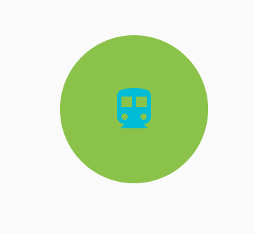
IconButton(
          icon: Icon(
            Icons.directions_transit,
          ),
          onPressed: () {},
        ),
Which will give us output like below :
Icon Button
- color: Color attribute lets the developer control the color of the IconButton. It takes the Colors class as its value.
color: Colors.cyan,
This makes the IconButton look like,
Icon Color
- disabledColor: The problem with the color attribute is that, unless the onPressed() callback present, it is in the disabled state only. It becomes important to create a disabled color also. Using the attribute disabledColor which takes in a Color class
IconButton(
  icon: Icon(Icons.directions_transit),
  color: Colors.cyan,
  disabledColor: Colors.pinkAccent,
)
We will get output like below:

disabledColor
- highlightColor: HighlightColor represents the secondary color of the Button when it is pressed. The highlightColor represents what the IconButton color is apart from the color attribute.
Highlight Color
- onPressed: Callback that gets fired whenever the user clicks on the IconButton widget. You can perform any event inside the onPressed method. Check the example code below.
IconButton(
            icon: Icon(Icons.directions_transit),
            color: Colors.cyan,
            disabledColor: Colors.pinkAccent,
            highlightColor: Colors.lightGreen,
             onPressed: (){
               print("IconButton is clicked");
             },
          )
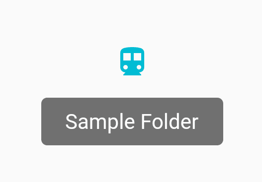
- toolTip: The toolTip attribute lets you create a simple Text to come up on the UI when you hover over the IconButton Widget. You can create a ToolTip like below,
tooltip: "Sample Folder",
We will get output like below:
- splash color: Primary color of the button when pressed, represented as a circular overlay that appears above the highlightColor overlay.
splashColor: Colors.orangeAccent,
- alignment: Aligns the Icon inside the Boundary. It takes in the Alignment class as its value. The value should be a combination of Top, Bottom, Left, Right, Center.
alignment: Alignment.topLeft,
IconButton Widget is primarily used inside a ListView Widget a ParentWidget to create better dynamics to the Application.
Drop your comments/suggestions if you like this article.
Keep Learning.
FlutterAgency.com is our portal Platform dedicated to Flutter Technology and Flutter Developers. The portal is full of cool resources from Flutter like Flutter Widget Guide, Flutter Projects, Code libs and etc.
FlutterAgency.com is one of the most popular online portal dedicated to Flutter Technology and daily thousands of unique visitors come to this portal to enhance their knowledge on Flutter.

Contemporary ventures
Recent blog


Join our newsletter
Read and share new topics about all things Tech.
ready to get started?
Fill out the form below and we will be in touch soon!
"*" indicates required fields