")


CupertinoButton Widget – Flutter Widget Guide By FlutterAgency
Cupertino is a set of flutter widget helpful in implementing a current iOS design. In this article, we will go through CupertinoButton Widget. with a detailed article as well example for the same.
What is CupertinoButton Widget?
CupertinoButton Widget is an iOS-style button that Takes in a text or an icon that fades out and in touch. May optionally have a background.
There are basically two types of buttons which are as listed below:
- CupertinoButton()
- CupertinoButton.filled()
We will discuss both Buttons with examples in this article.
CupertinoButton()
CupertinoButton({
  Key? key,
  required Widget child,
  EdgeInsetsGeometry? padding,
  Color? color,
  Color disabledColor = CupertinoColors.quaternarySystemFill,
  double? minSize = kMinInteractiveDimensionCupertino,
  double? pressedOpacity = 0.4,
  BorderRadius? borderRadius = const BorderRadius.all(Radius.circular(8.0)),
  AlignmentGeometry alignment = Alignment.center,
  required void Function()? onPressed,
})
In the Above Constructor, all fields marked with @required must not be empty.
CupertinoButton.filled()
Creates an iOS-style button with a filled background. Default Constructor will look like below:
CupertinoButton.filled({
  Key? key,
  required Widget child,
  EdgeInsetsGeometry? padding,
  Color disabledColor = CupertinoColors.quaternarySystemFill,
  double? minSize = kMinInteractiveDimensionCupertino,
  double? pressedOpacity = 0.4,
  BorderRadius? borderRadius = const BorderRadius.all(Radius.circular(8.0)),
  AlignmentGeometry alignment = Alignment.center,
  required void Function()? onPressed,
})
In the Above constructor, all fields marked with @required must not be empty.
Properties:
- BorderRadius borderRadius: The radius of the button’s corners when it has a background color.Defaults to round corners of 8 logical pixels.
- Widget child: The widget below this widget in the tree.
- Color color: The color of the button’s background.Defaults to null which produces a button with no background or border.Defaults to the CupertinoTheme’s primaryColor when the CupertinoButton.filled constructor is used.
- Color disabledColor: The color of the button’s background when the button is disabled. Ignored if the CupertinoButton doesn’t also have a color. Defaults to CupertinoColors.quaternarySystemFill when color is specified. Must not be null.
- bool enabled: Whether the button is enabled or disabled. Buttons are disabled by default. To enable a button, set its onPressed property to a non-null value.
- double minSize: Minimum size of the button.Defaults to kMinInteractiveDimensionCupertino which the iOS Human Interface Guidelines recommend as the minimum tappable area.
- VoidCallback onPressed(): The callback that is called when the button is tapped or otherwise activated. If this is set to null, the button will be disabled.
- EdgeInsetsGeometry padding: Padding will specify the amount of space to surround the child inside the bound of the button. The default padding value is 16.0 pixels.
- double pressedOpacity: The opacity that the button will fade to when it is pressed. The button will have an opacity of 1.0 when it is not pressed. This defaults to 0.4. If null, the opacity will not change on pressed if using your own custom effects is desired.
In Material Design we used to declare RaisedButton Widget like the below code snippet.
ElevatedButton(
  onPressed: () {
    // TODO
  },
  child: Text("Click me"),
),
How to use CupertinoButton Widget in Flutter?
The following code snippet tells us how to implement CupertinoButton Widget in Flutter.
child: Container (
  child: Center (
    child: CupertinoButton (
      onPressed: () {
        // Todo
       },
      child: Text ( "CupertinoButton Widget" ),
    ),
  ),
)
We will get output like below:
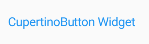
CupertinoButton Widget
CupertinoButtonWidget.filled will have a code snippet like below:
return Container(
  child: Center(
    child: CupertinoButton.filled(
      onPressed: () {},
      child: Text("CupertinoButton Widget"),
    ),
  ),
);
We will get output like below:
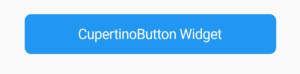
CupertinoButton Widget
General Queries on CupertinoButton Widget
consider a code snippet like below and the user wants the CupertinoButton to be orange but it stays grey.
import 'package:flutter/material.dart';
import 'package:flutter/services.dart';
import 'package:flutter/cupertino.dart';

void main() => runApp(const MyApp());

class MyApp extends StatelessWidget {
  const MyApp({super.key});

  @override
  Widget build(BuildContext context) {
    SystemChrome.setEnabledSystemUIMode(SystemUiMode.manual, overlays: []);

    return MediaQuery(
      data: const MediaQueryData(),
      child: Container(
        decoration: const BoxDecoration(color: Colors.blue),
        child: Directionality(
          textDirection: TextDirection.ltr,
          child: Scaffold(
            body: Column(
              children: [
                Row(
                  mainAxisAlignment: MainAxisAlignment.center,
                  children: [
                    CupertinoButton(
                      color: Colors.orange,
                      borderRadius: BorderRadius.circular(30.0),
                      onPressed: () {},
                      child: const Text(
                        "Get Started",
                        textAlign: TextAlign.center,
                        style: TextStyle(color: Colors.white),
                      ),
                    )
                  ],
                ),
              ],
            ),
          ),
        ),
      ),
    );
  }
}
As per the document, If you don’t provide the onPressed() a call back function, the button will be disabled.
To make it enable you can pass an empty function like this.
CupertinoButton (
              onPressed: ()=>{},
              color: Colors.orange,
              borderRadius: new BorderRadius.circular(30.0),
              child:
              new Text("Get Started",
                textAlign: TextAlign.center,
                style: new TextStyle(color: Colors.white),
              ),
            )
Conclusion:
In this article, we have been through What is CupertinoButton Widget in Flutter along with how to implement it in a Flutter.
Thanks for being with us.
Keep Fluttering!!!
FlutterAgency.com is our portal Platform dedicated to Flutter Technology and Flutter Developers. The portal is full of cool resources from Flutter like Flutter Widget Guide, Flutter Projects, Code libs and etc.
FlutterAgency.com is one of the most popular online portal dedicated to Flutter Technology and daily thousands of unique visitors come to this portal to enhance their knowledge on Flutter.

Contemporary ventures
Recent blog


Join our newsletter
Read and share new topics about all things Tech.
ready to get started?
Fill out the form below and we will be in touch soon!
"*" indicates required fields