")


AnimatedDefaultTextStyle Widget – Flutter Widget Guide By Flutter Agency
Adding an Animation in a Flutter Mobile Application is an important part of an App Development Process. What if we want to animate the text in a Flutter Mobile Application. So, in this article, we will learn about the AnimatedDefaultTextStyle Widget.
Seems exciting?
AnimatedDefaultTextStyle widget is used to animate text in Flutter
What is AnimatedDefaultTextStyle Widget in Flutter?
It is an Animated version of DefaultTextStyle widget. AnimatedDefaultTextStyle widget automatically transitions the default text style over a given duration whenever the given style changes.
Our final output will look like below:
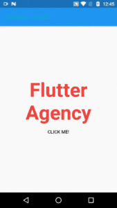
AnimatedDefaultTextStyle Widget
Default Constructor of for it will look like below:
AnimatedDefaultTextStyle({
  Key? key,
  required Widget child,
  required TextStyle style,
  TextAlign? textAlign,
  bool softWrap = true,
  TextOverflow overflow = TextOverflow.clip,
  int? maxLines,
  TextWidthBasis textWidthBasis = TextWidthBasis.parent,
  TextHeightBehavior? textHeightBehavior,
  Curve curve = Curves.linear,
  required Duration duration,
  void Function()? onEnd,
})
In Above constructor attribute marked with @required must not be empty. The textAlign, softWrap, textOverflow, maxLines, textWidthBasis, and textHeightBehavior properties are not animated and take effect immediately when changed.
Properties:
- curve: The curve to apply when animating the parameters of this container.
- duration: This attribute defines the duration over which to animate the parameters of this container.
- onEnd(): onEnd() called every time an animation completes. This can be useful to trigger additional actions e.g. another animation at the end of the current animation.
How to use AnimatedDefaultTextStyle Widget in Flutter?
The Following code snippet tells us how to implement AnimatedDefaultTextStyle Widget in Flutter.
We will go step by step to achieve a final output.
Step 1: Define the necessary variable like _first we have kept it true, font size, color, etc.
bool _first = true;
double _fontSize = 60;
Color _color = Colors.blue;
Step 2: Define AnimatedDefaultTextStyle Widget along with the duration in milliseconds and other properties like Curve:
AnimatedDefaultTextStyle(
           duration: const Duration(milliseconds: 300),
           curve: Curves.bounceInOut,
           style: TextStyle(
             fontSize: _fontSize,
             color: _color,
             fontWeight: FontWeight.bold,
           ),
           child: Text(
             'Flutter Agency',
             textAlign: TextAlign.center,
           ),
         ),
Step 3: Now define a FlatButton Widget on which we will make changes in the properties of a Text Widget.
ElevatedButton(
  onPressed: () {
    setState(() {
      _fontSize = _first ? 90 : 60;
      _color = _first ? Colors.blue : Colors.red;
      _first = !_first;
    });
  },
  child: Text(
    "CLICK ME!",
    style: TextStyle(
      fontSize: _fontSize,
      color: _color,
    ),
  ),
  style: ButtonStyle(
    backgroundColor: MaterialStateProperty.all(_color),   ),
)
In Step 2 we have used a curve default properties user can make use of the different available property.
curve: Curves.easeInCubic,

curve: Curves.easeInCubic,
curve: Curves.bounceOut,

Try it yourself !!!
The complete source code will look like below:
class AnimatedDefaultTextStyleWidget extends StatefulWidget {
  @override
  _AnimatedDefaultTextStyleWidgetState createState() =>
      _AnimatedDefaultTextStyleWidgetState();
}

class _AnimatedDefaultTextStyleWidgetState
    extends State {
  bool _first = true;

  double _fontSize = 60;
  Color _color = Colors.blue;
  @override
  Widget build(BuildContext context) {
    return Center(
      child: Column(
        mainAxisSize: MainAxisSize.min,
        children: [
          SizedBox(
            height: 120,
            child: AnimatedDefaultTextStyle(
              duration: const Duration(milliseconds: 300),
              style: TextStyle(
                fontSize: _fontSize,
                color: _color,
                fontWeight: FontWeight.bold,
              ),
              child: const Text('Flutter'),
            ),
          ),
          ElevatedButton(
            onPressed: () {
              setState(() {
                _fontSize = _first ? 90 : 60;
                _color = _first ? Colors.blue : Colors.red;
                _first = !_first;
              });
            },
            style: ButtonStyle(
              backgroundColor: MaterialStateProperty.all(_color),
            ),
            child: Text(
              "CLICK ME!",
              style: TextStyle(
                fontSize: _fontSize,
                color: _color,
              ),
            ),
          )
        ],
      ),
    );
  }
}
For the animation, the user can choose a curve as well as the duration and the widget will automatically animate to the new default text style. If you require more control over the animation e.g. if you want to stop it mid-animation, consider using a DefaultTextStyleTransition instead. As DefaultTextStyleTransition which takes a provided Animation as an argument. While that allows you to fine-tune the animation, it also requires more development overhead as you have to manually manage the lifecycle of the underlying AnimationController.
Conclusion:
In this article, we dive into What is AnimatedDefaultTextStyle Widget in Flutter along with how to implement it in a Flutter.
Thanks for being with us.
Keep Fluttering !!!
Note:
Any changes in the property will take place within the mentioned duration.
FlutterAgency.com is our portal Platform dedicated to Flutter Technology and Flutter Developers. The portal is full of cool resources from Flutter like Flutter Widget Guide, Flutter Projects, Code libs and etc. The FlutterAgency platform helps daily thousands of unique visitors to enhance their knowledge of Flutter.

Contemporary ventures
Recent blog


Join our newsletter
Read and share new topics about all things Tech.
ready to get started?
Fill out the form below and we will be in touch soon!
"*" indicates required fields